
Modern Maiollica
My first Maiollica collection!
Inspired by my work at The Courtauld as an educator and used as inspiration for GCSE students, I wanted to learn, through making how this historical technique was created in order to deepen my own knowledge.
Red Earthenware clay, bis fired to 1000 degrees, coated with a tin white, leaded glaze (lots of masks and gloves)
Painted directly on top of pre-fired glaze are pigments and oxides which are then low fired once more.
My first Maiollica collection!
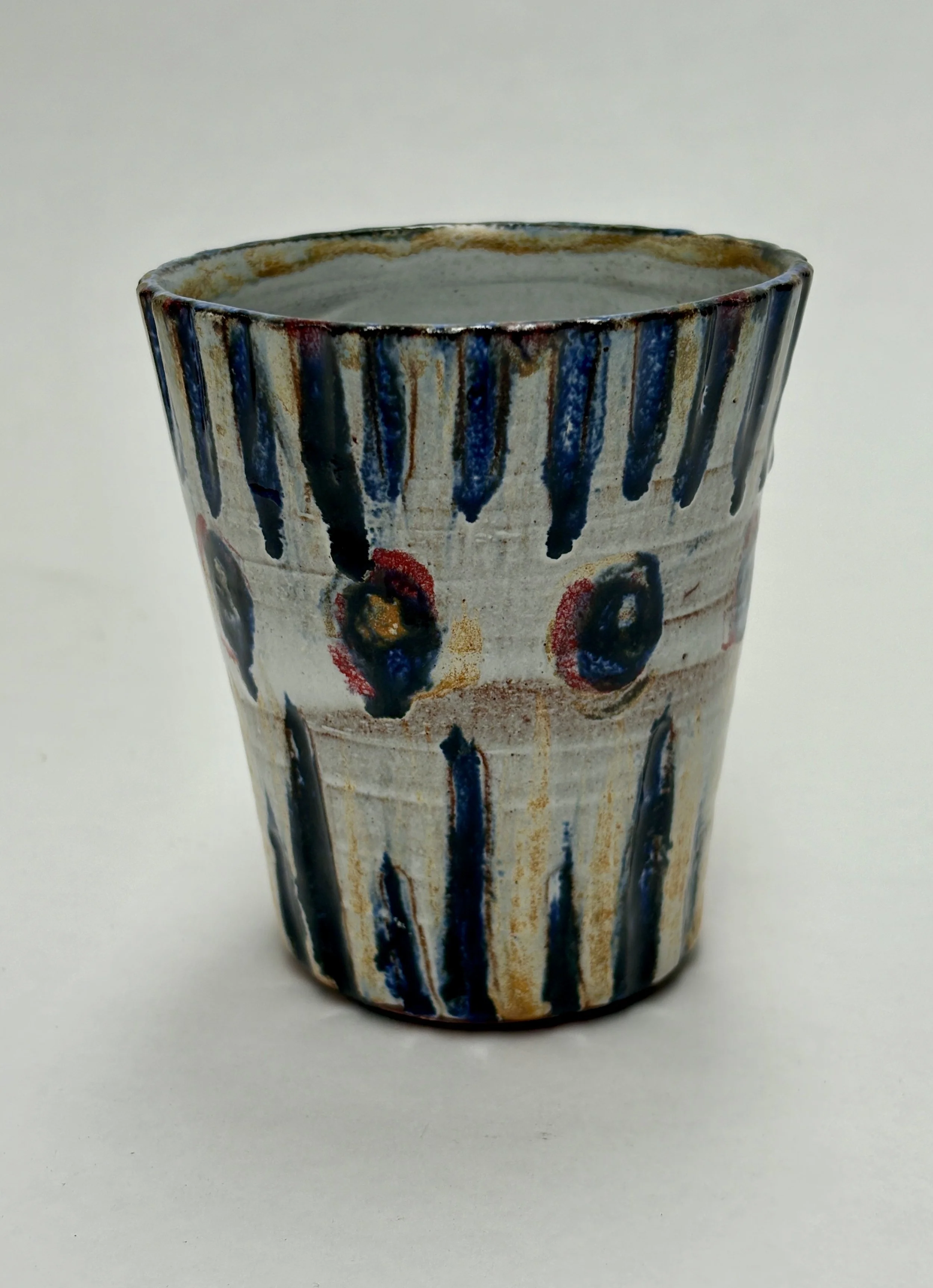
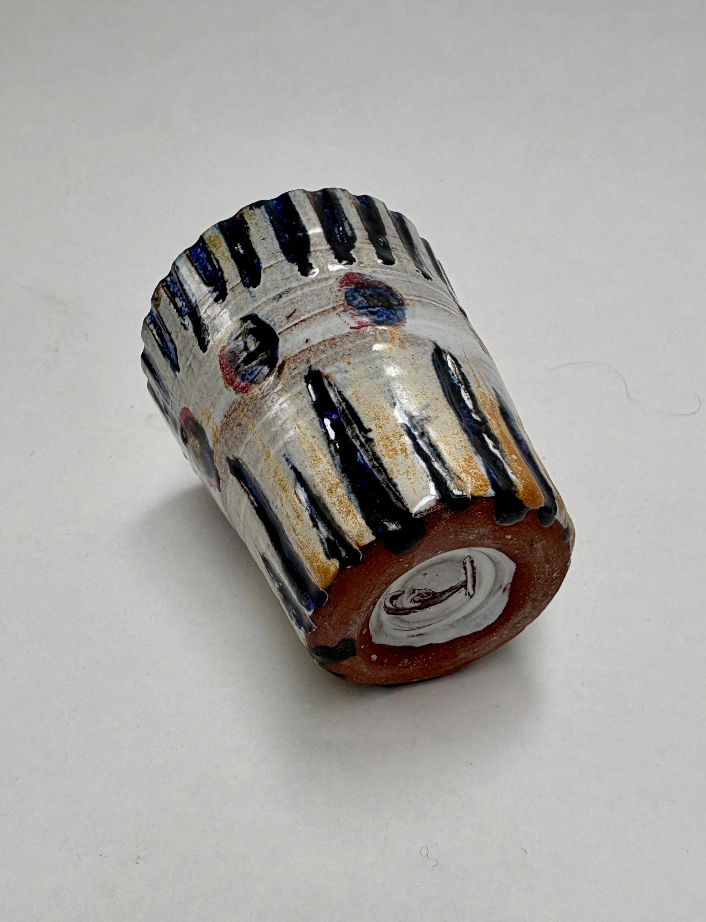
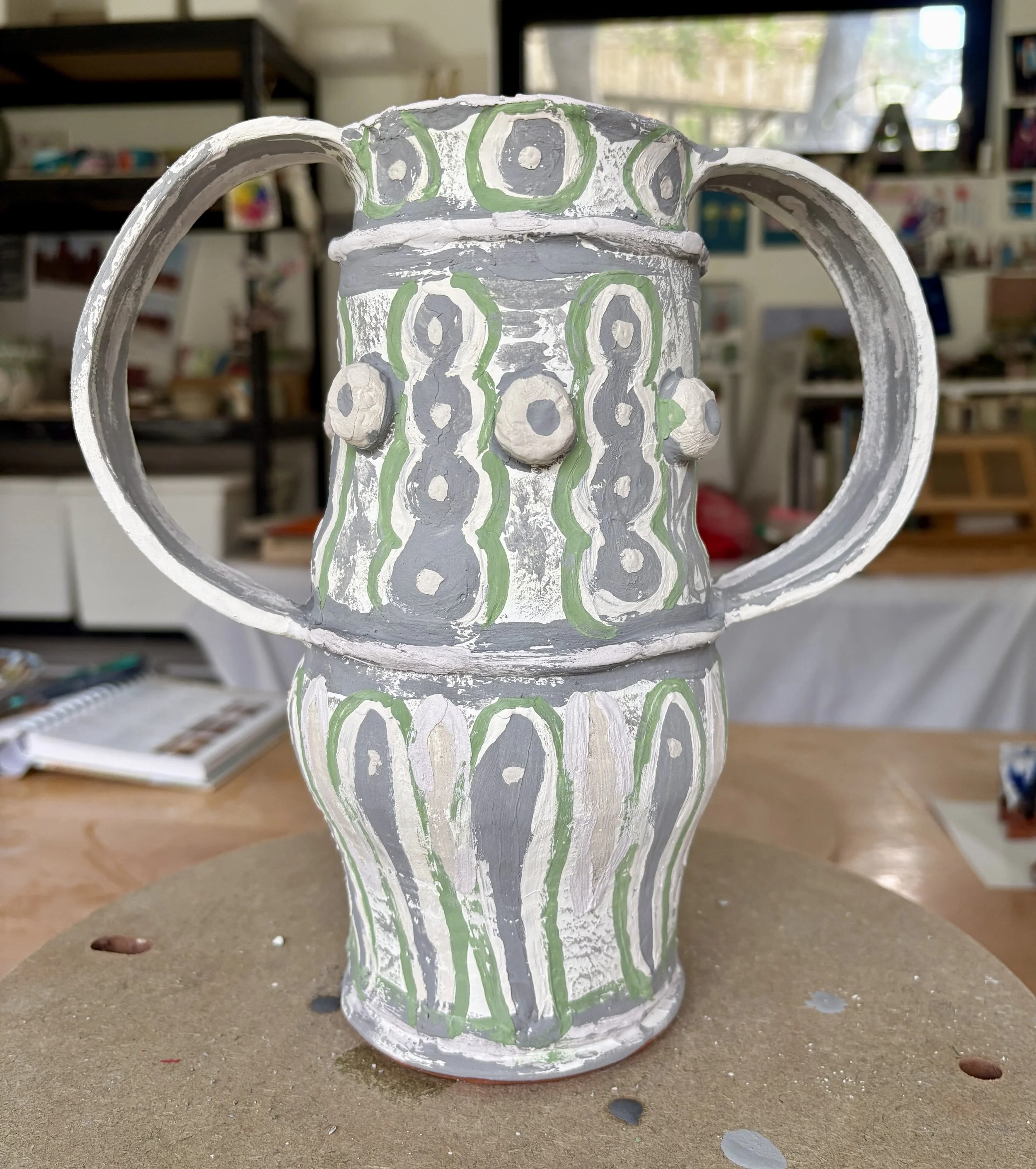
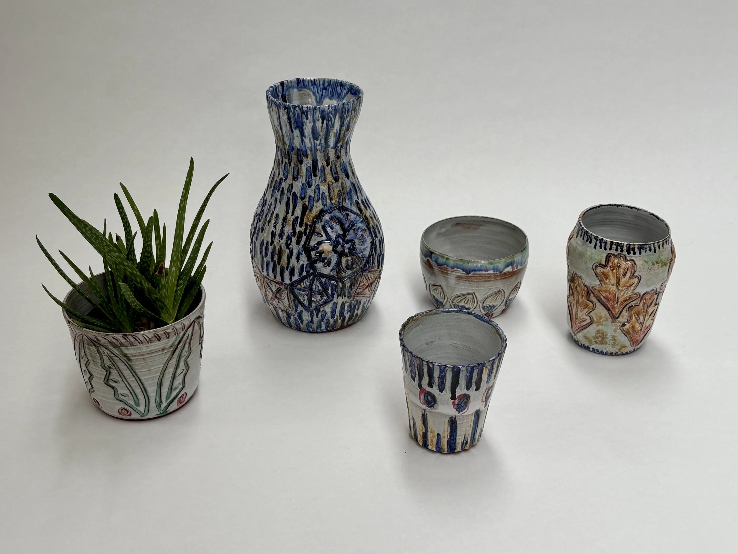
The second round of work began to take on a new life and now I know where I want to go with it….you will see more of those beakers!

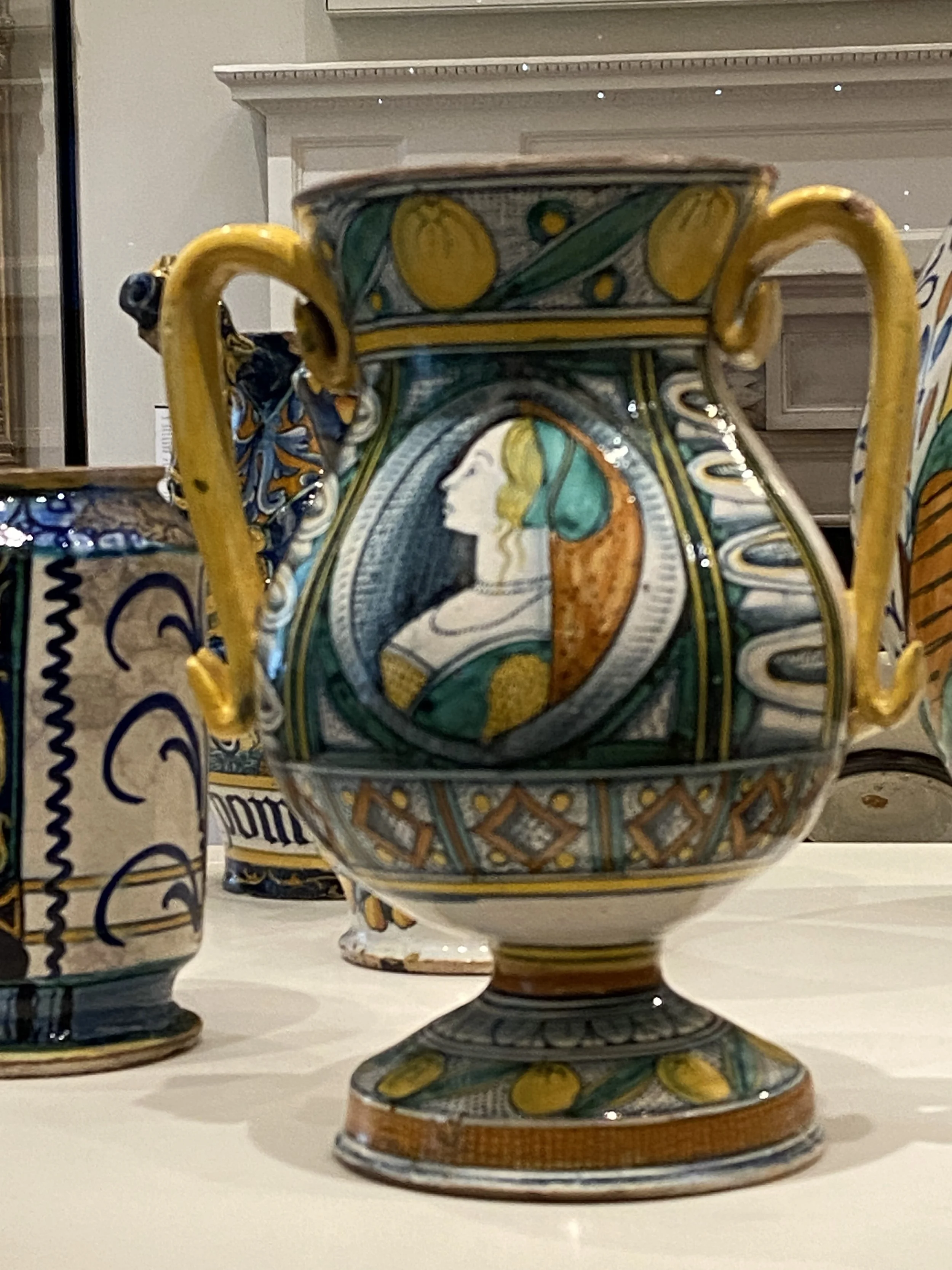
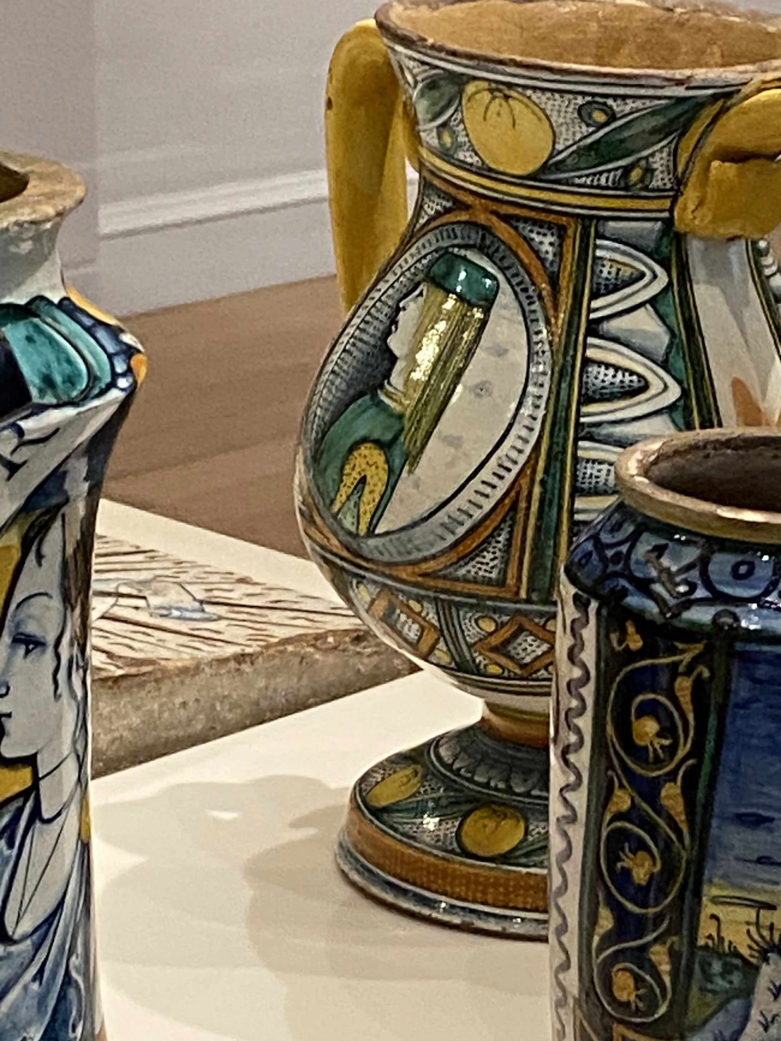
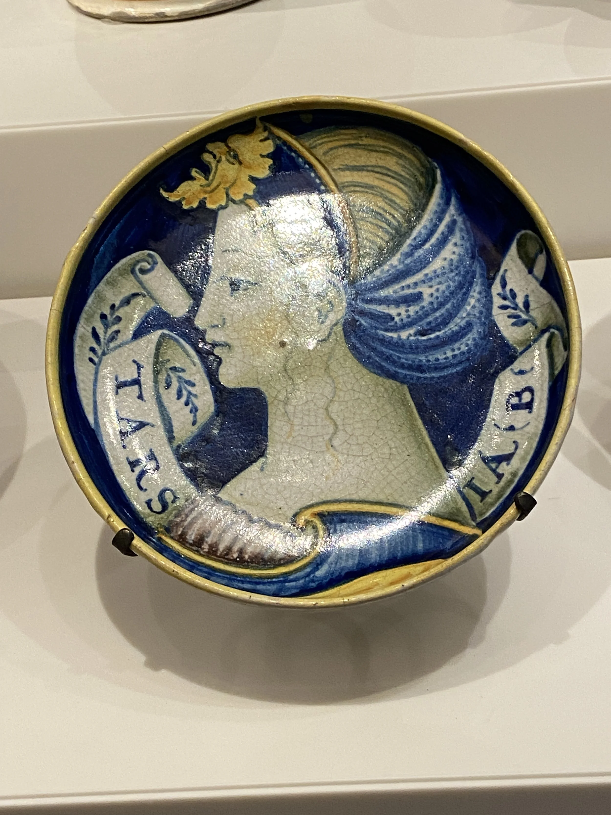
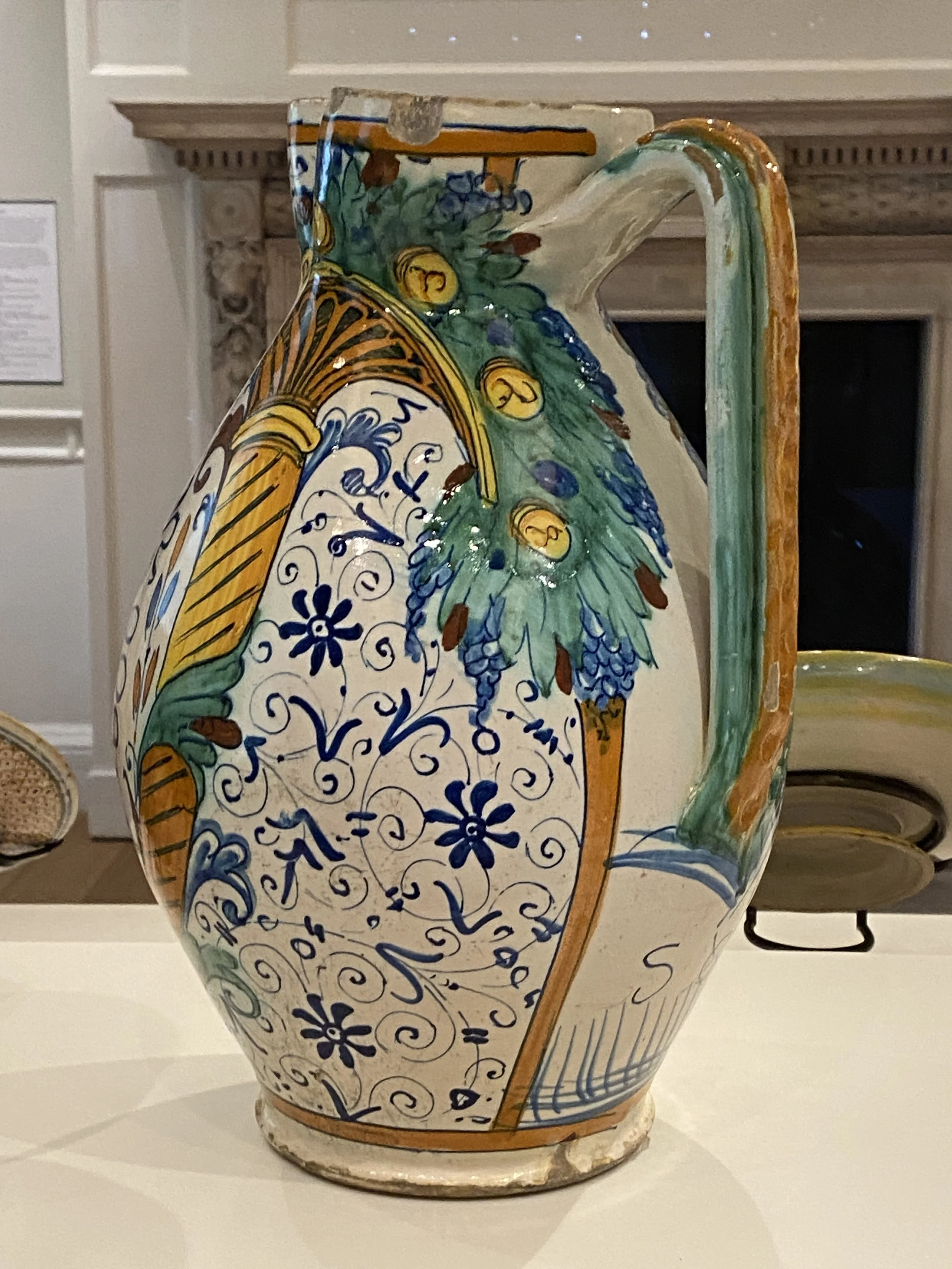
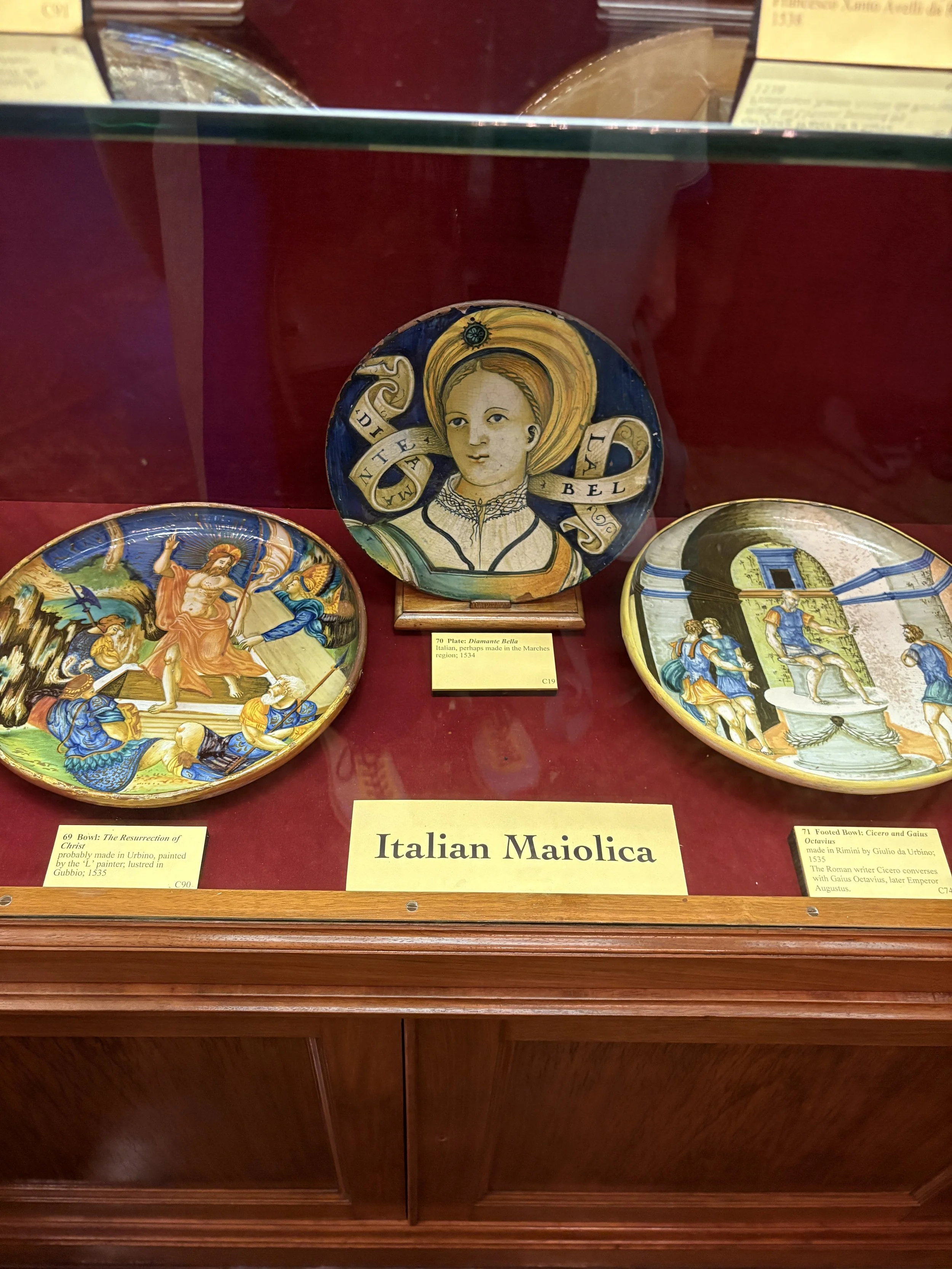
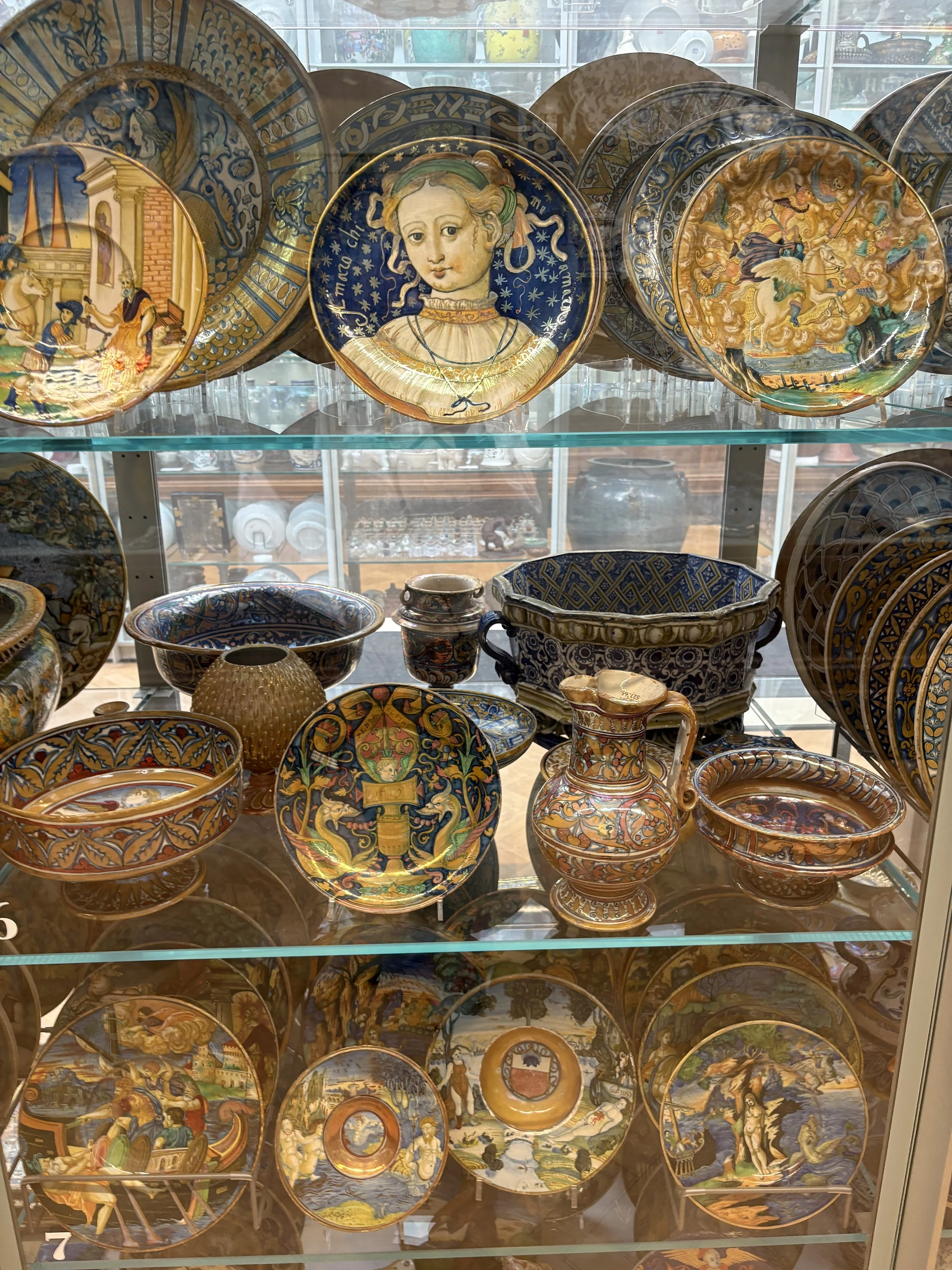
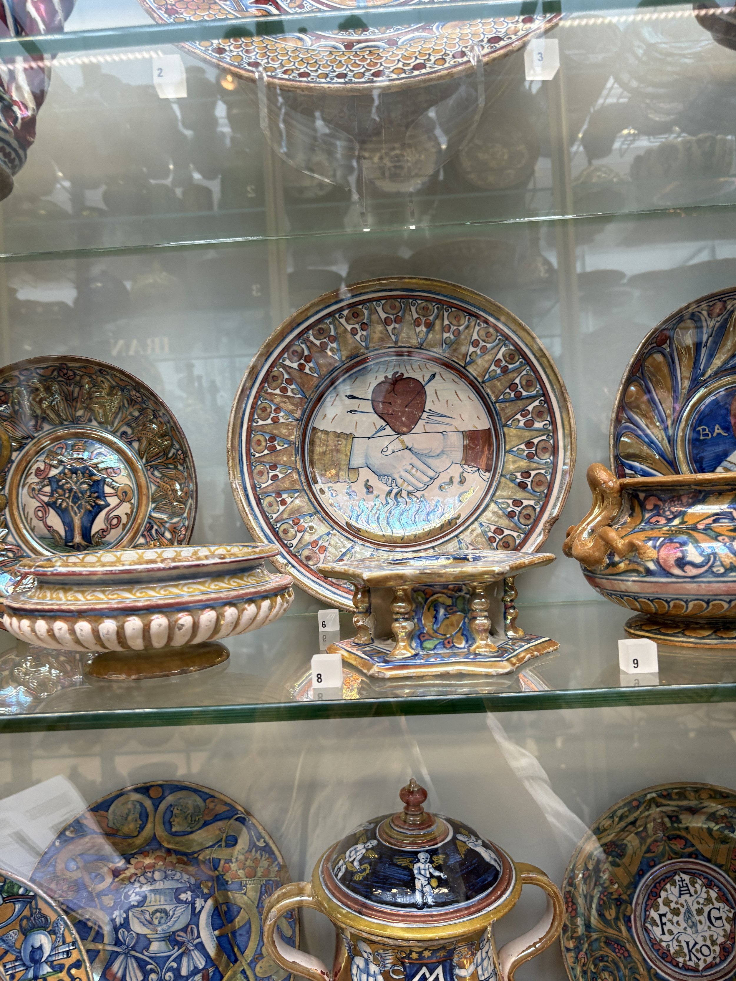
My work as an Art Historian and Educator took me to the ceramics collections of The Courtauld, the Victoria and Albert Museum and the Wallace Collection, where I probed more deeply into into idealised beauties painted onto ceramics, storytelling and the use of symbolism in the Renaissance. I explored these ideas with the students I worked with, encouraging them to think in similar ways and relate their ideas to contemporary concerns.


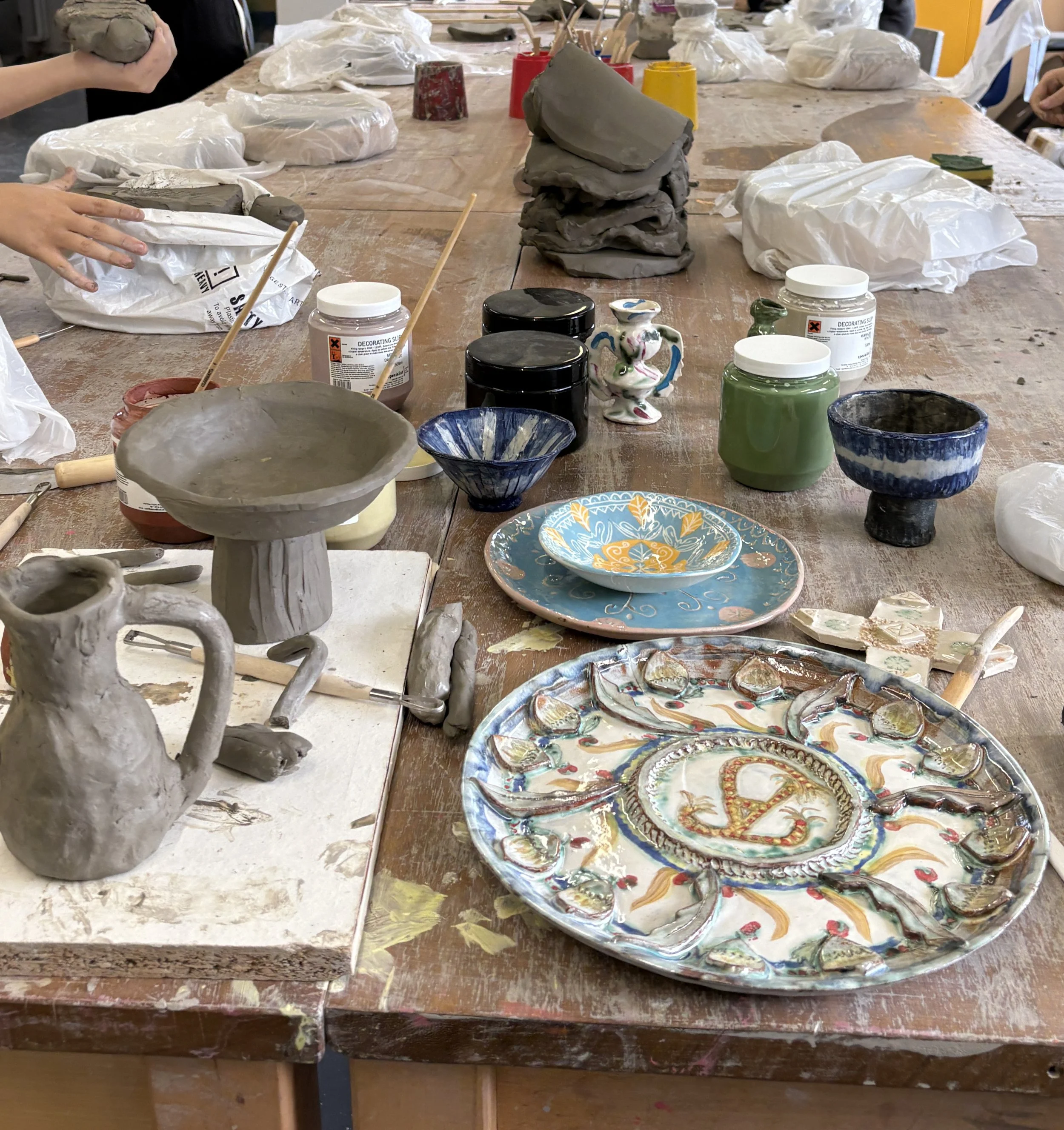
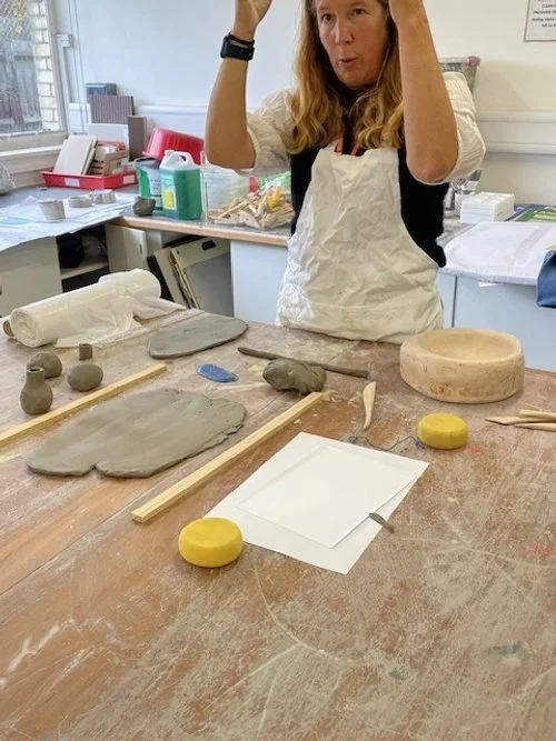
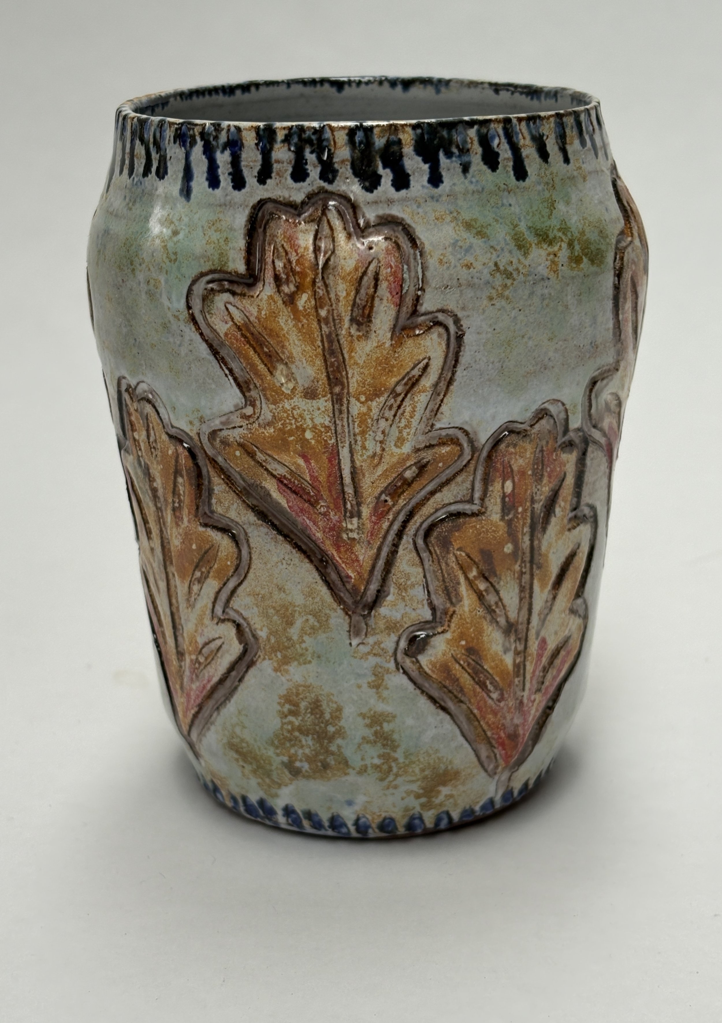
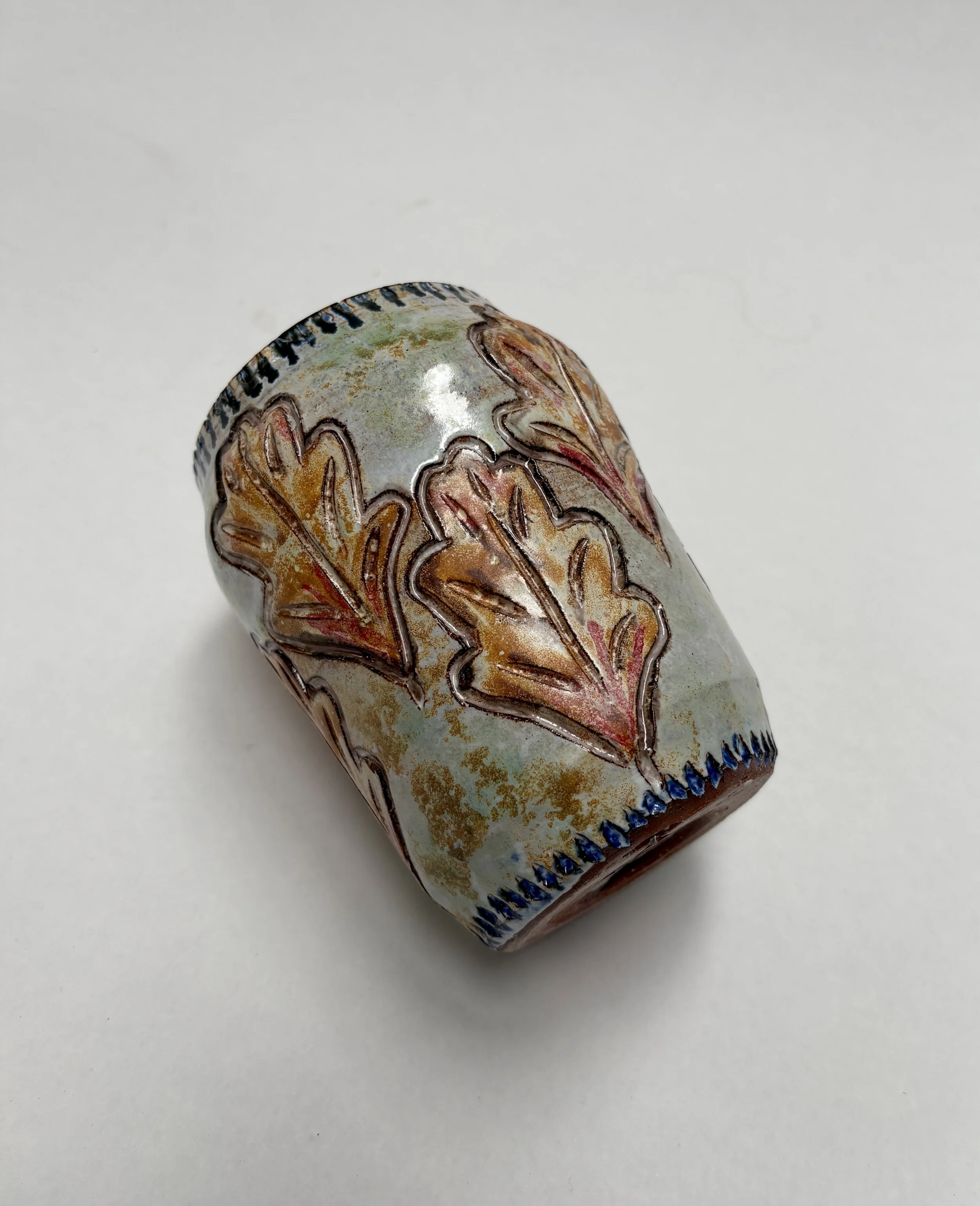
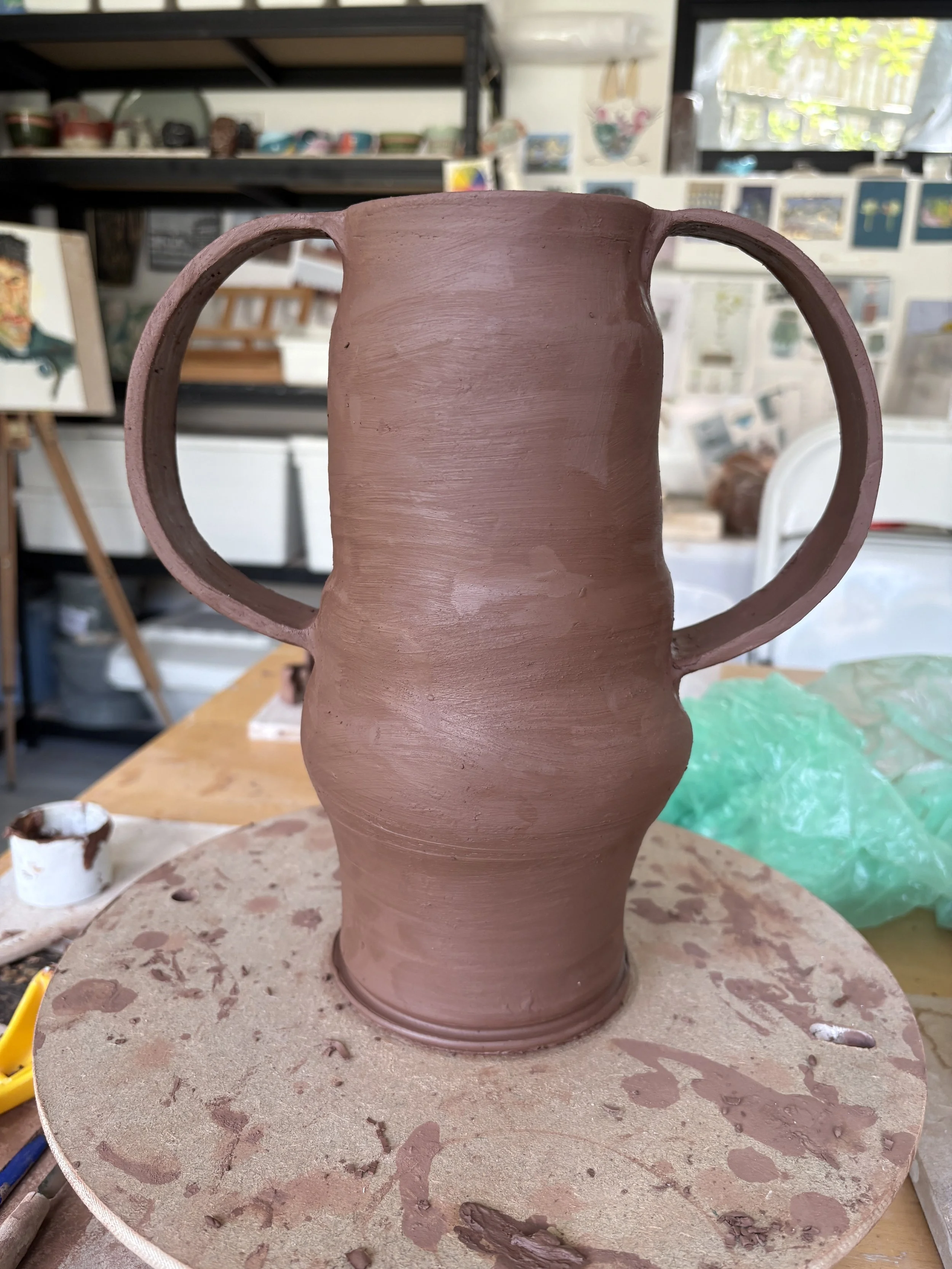
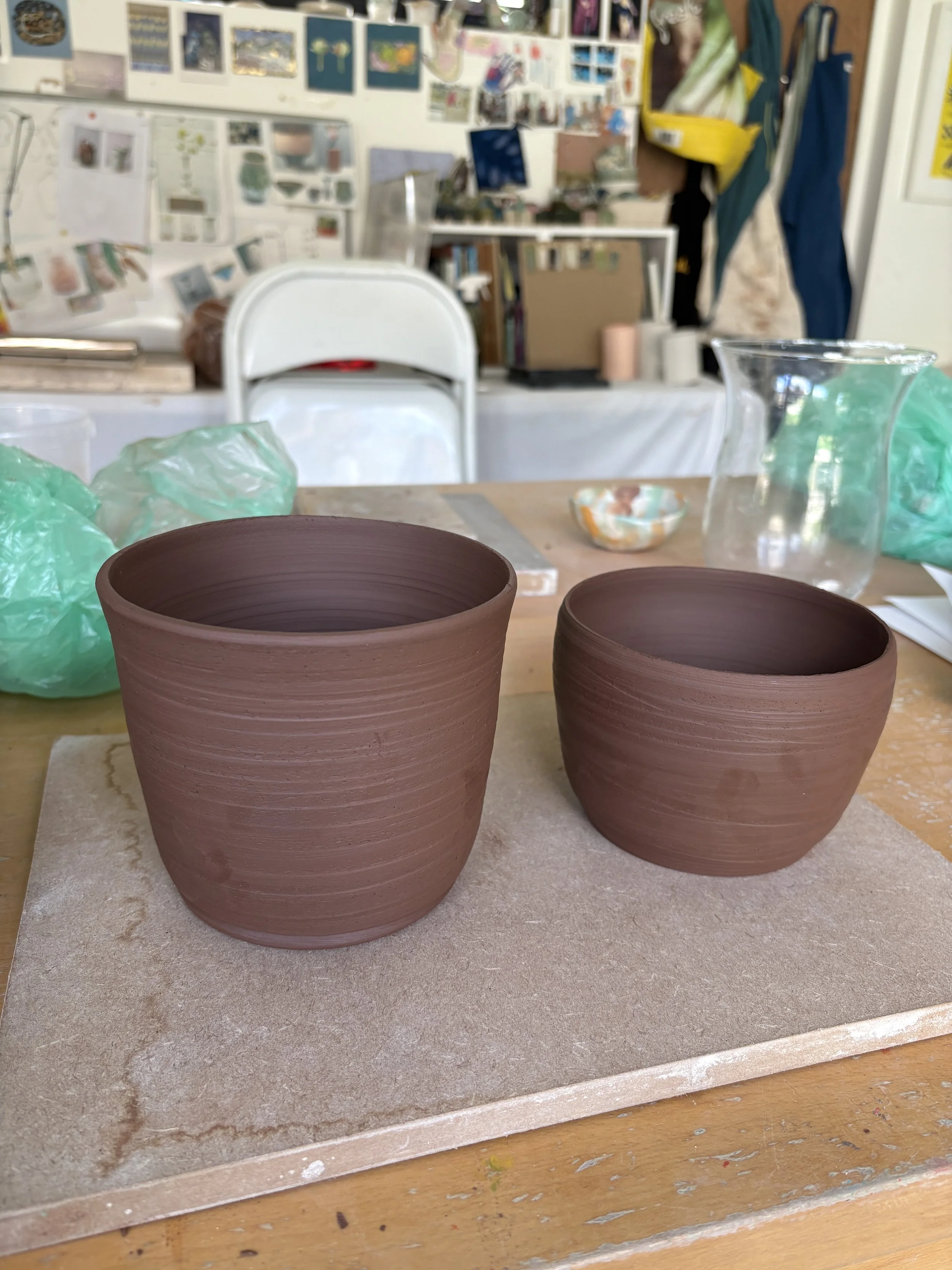
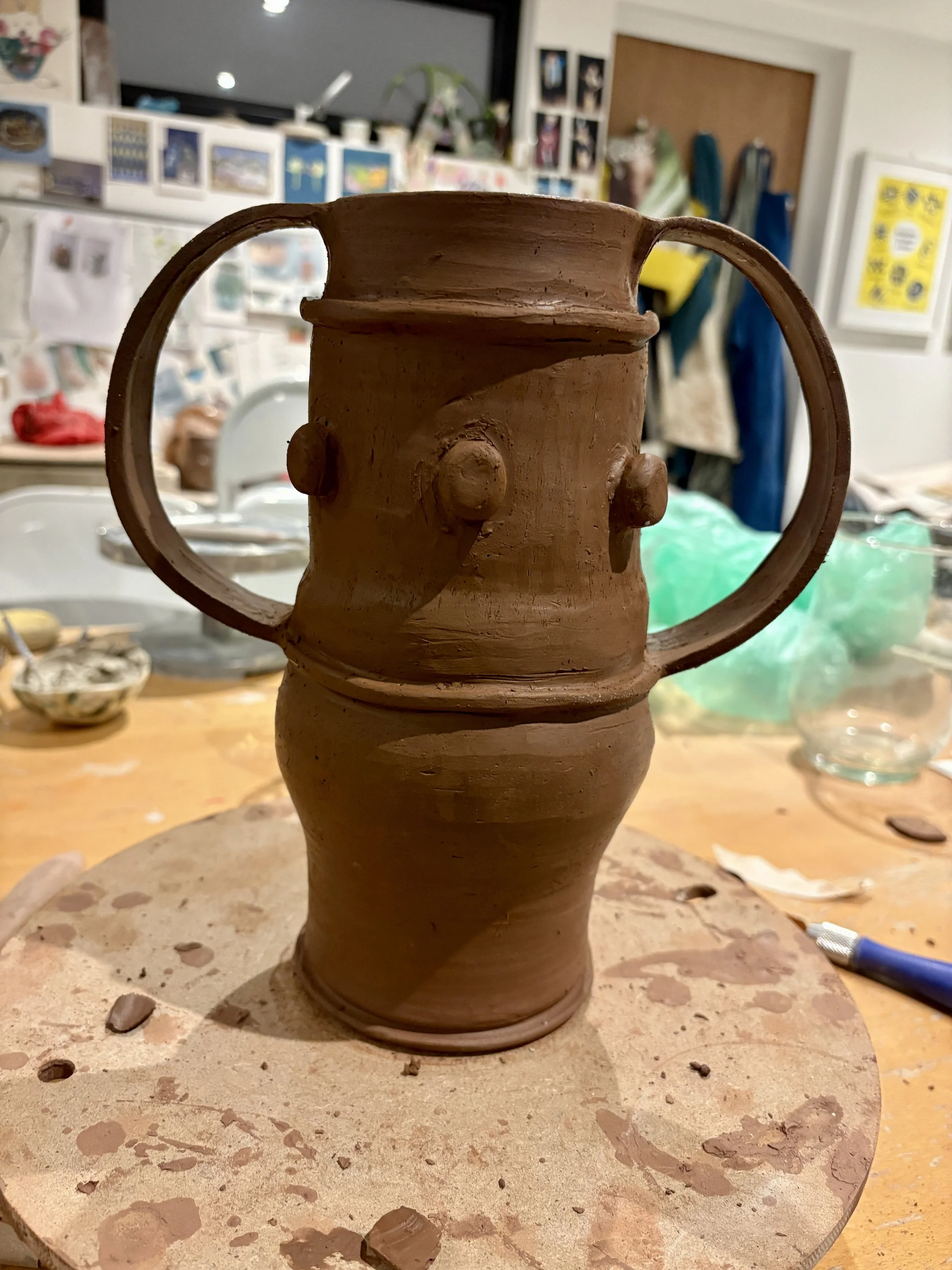
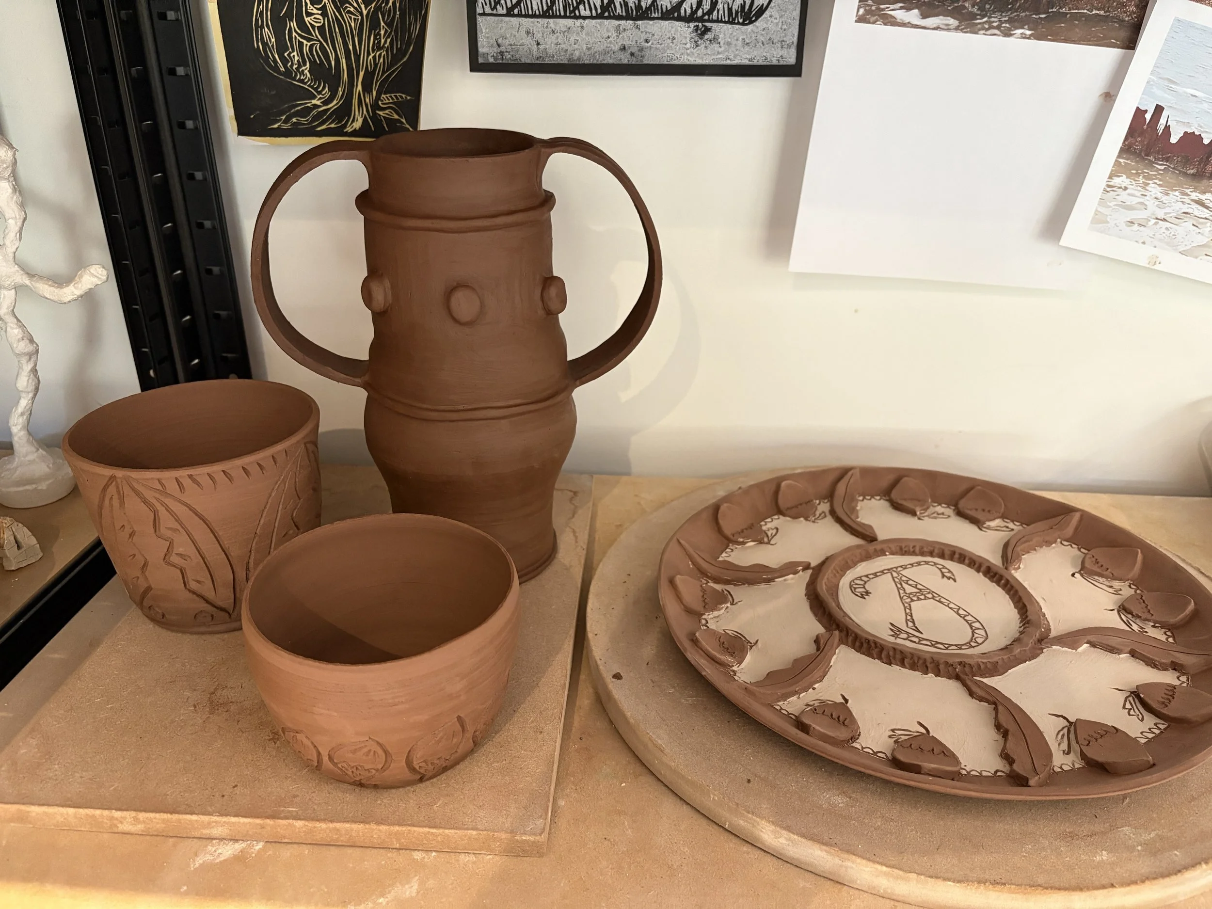
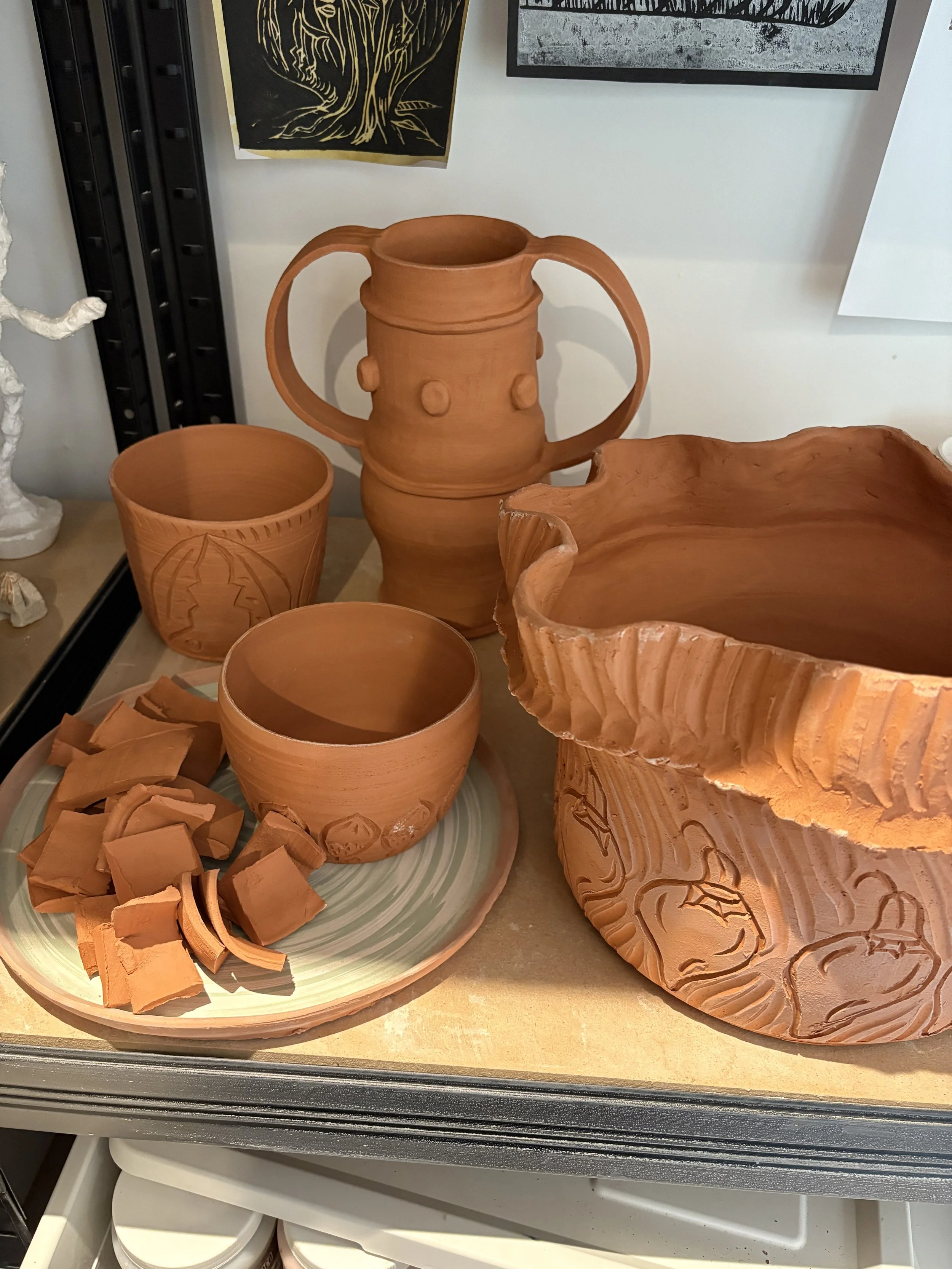
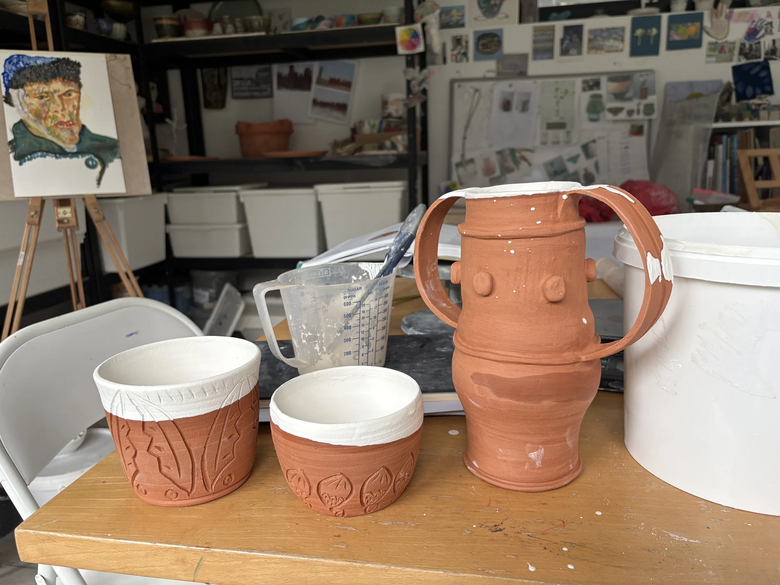
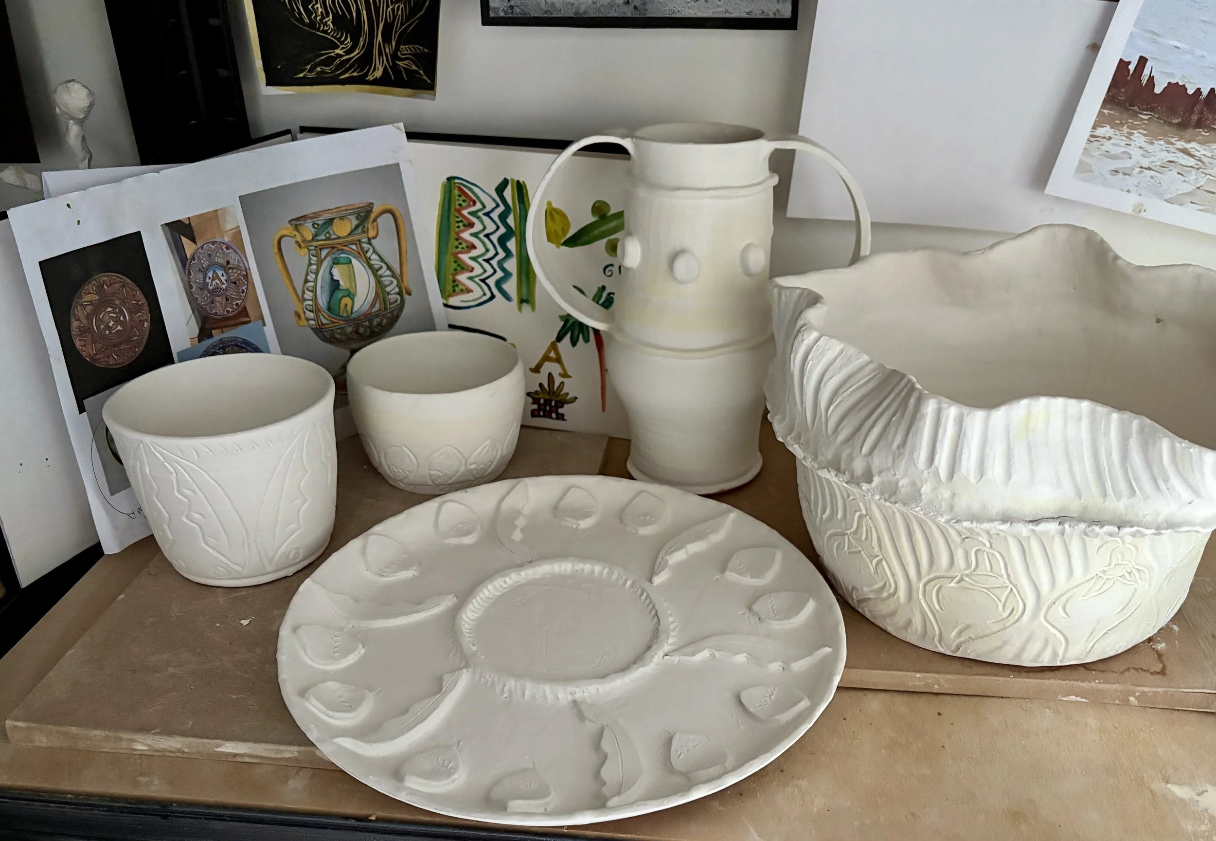
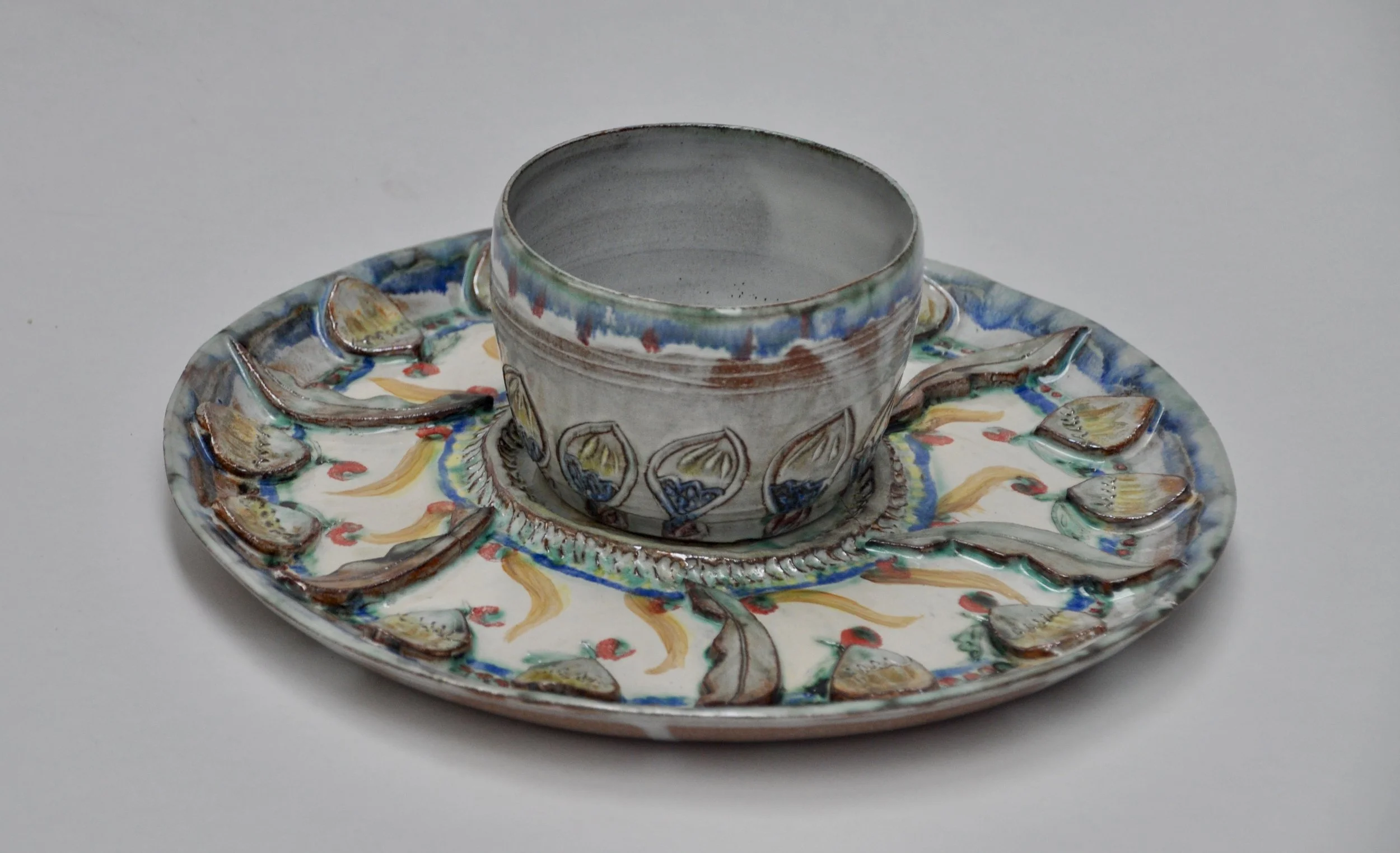
I used red earthenware clay to throw and handbill a selection of plates, pots and vessels inspired by the objects I had seen.
Here they are ready to be fired before trying out the white tin glaze I made myself.
Here is the first batch of red earthenware pots with their silky white Tin glaze, ready to be painted and decorated with oxides in the traditional Maiolica technique!
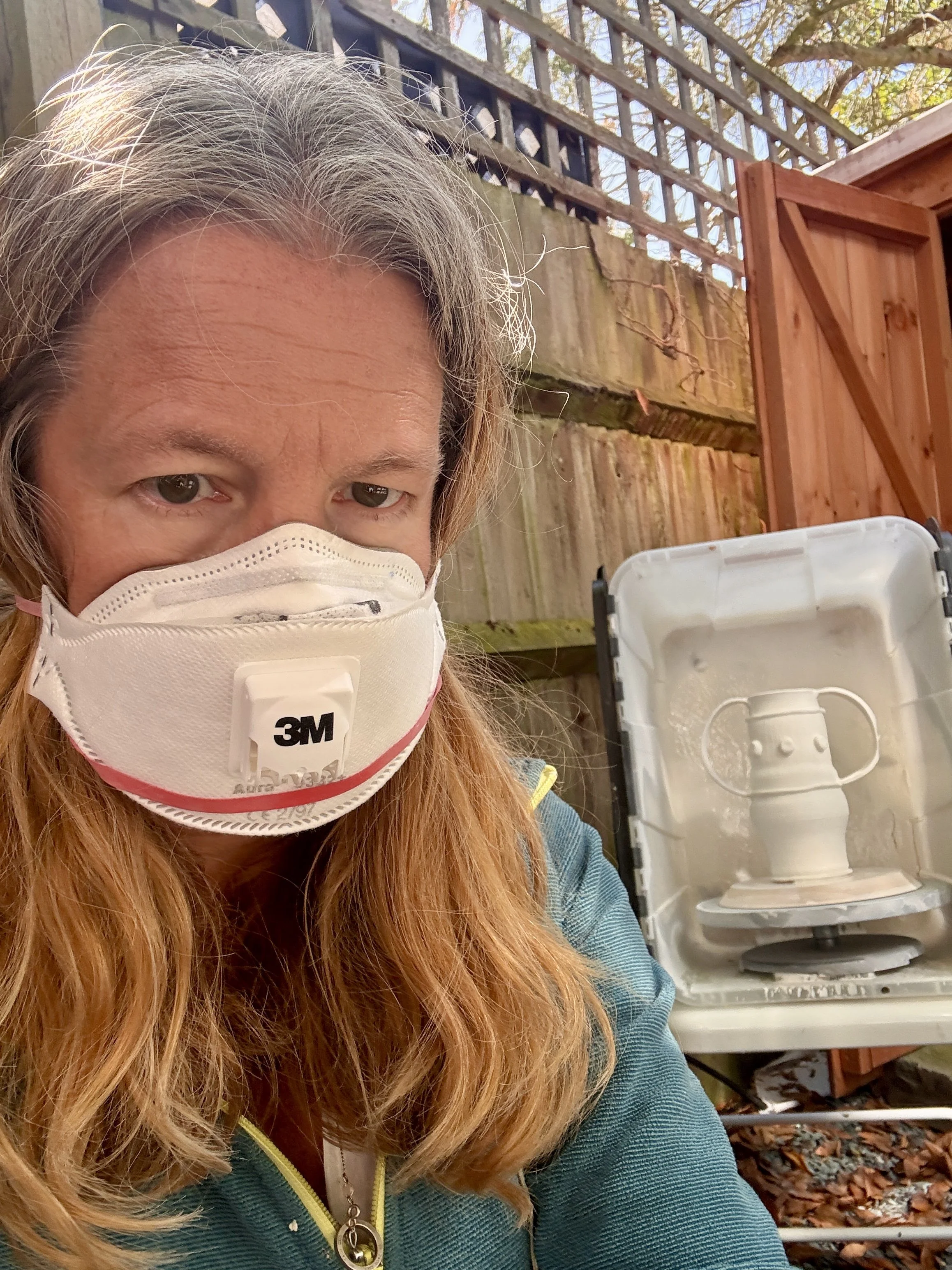
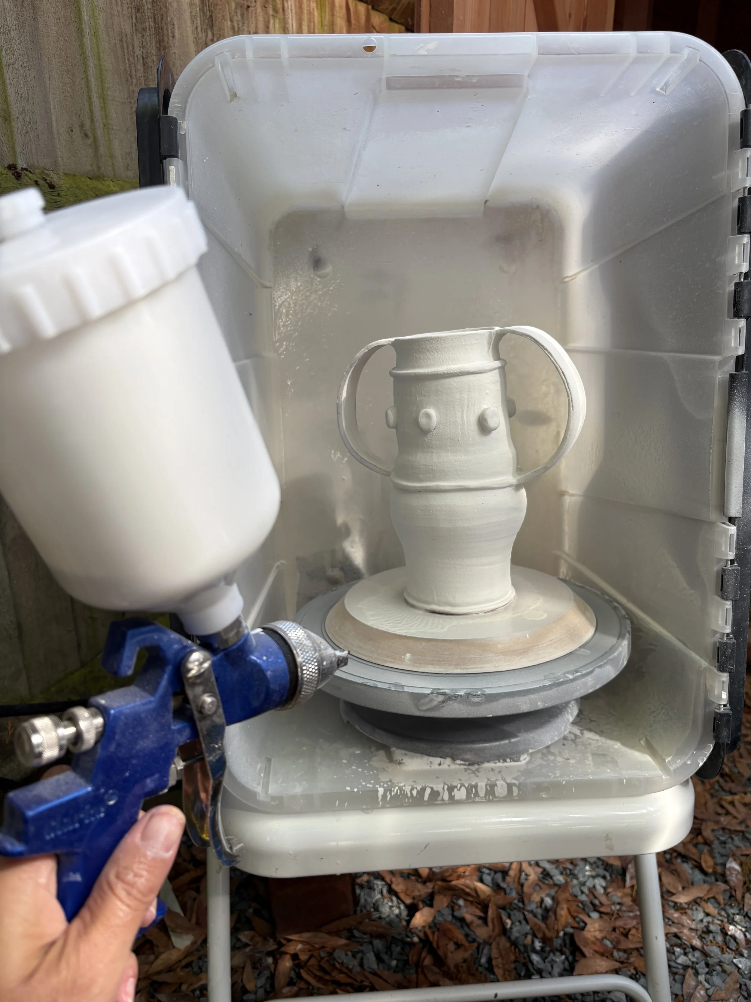
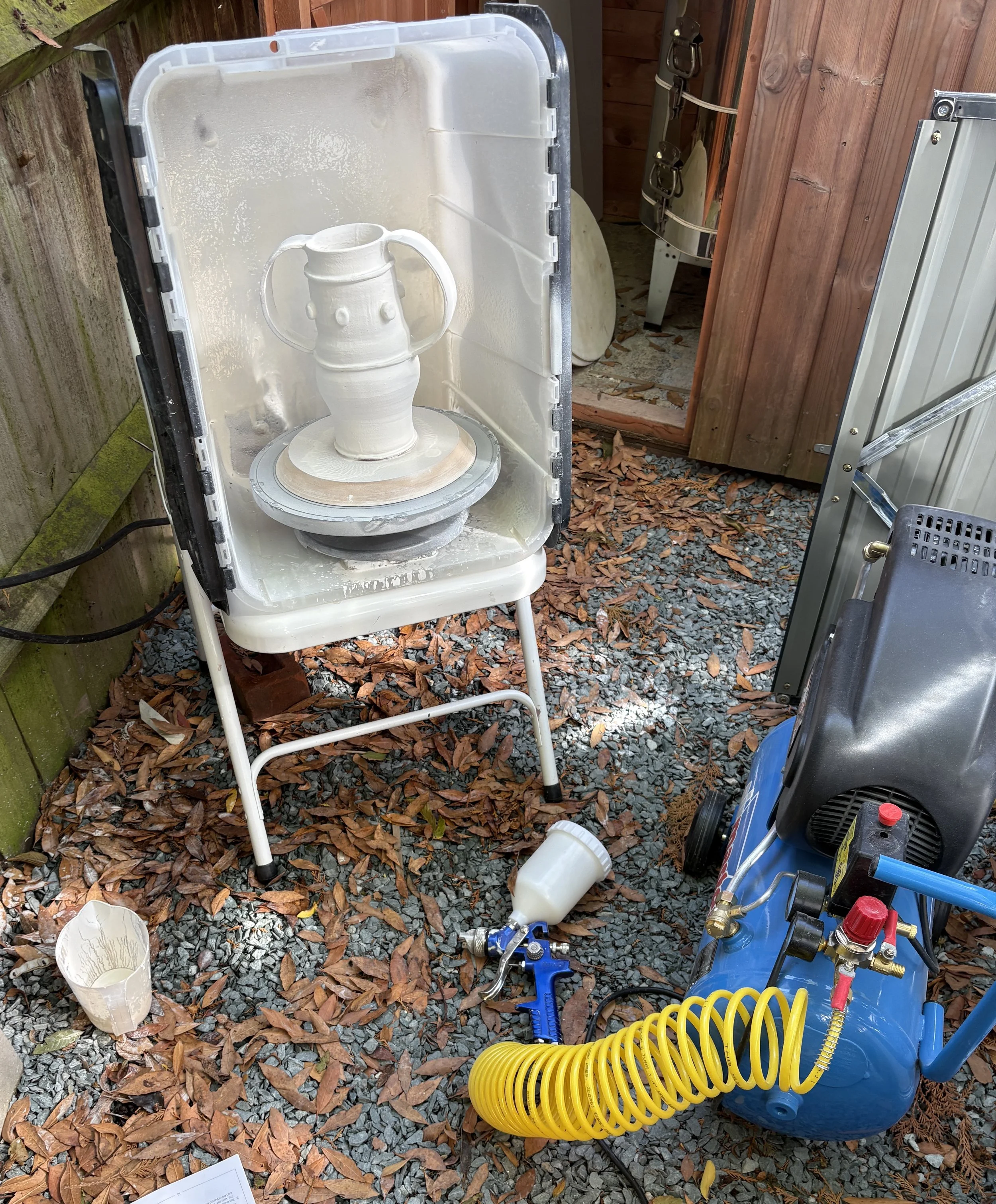
I am using a spray booth to spray glaze on larger pieces to get even coverage - A mask is important here as the glaze is full of toxic partices.
The lead in this this glaze is particularly problematic - it is important to always wear a mask and gloves.

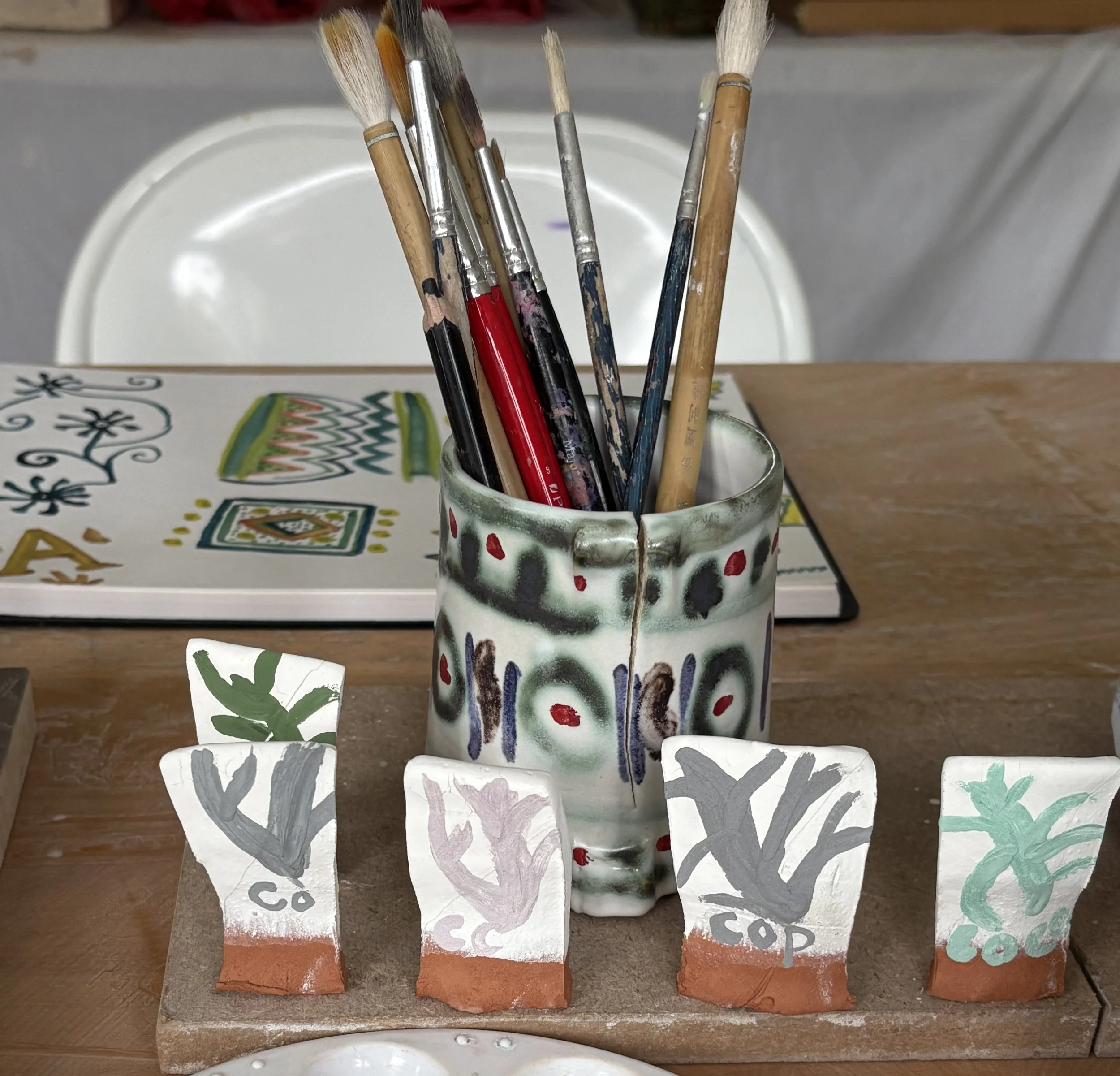
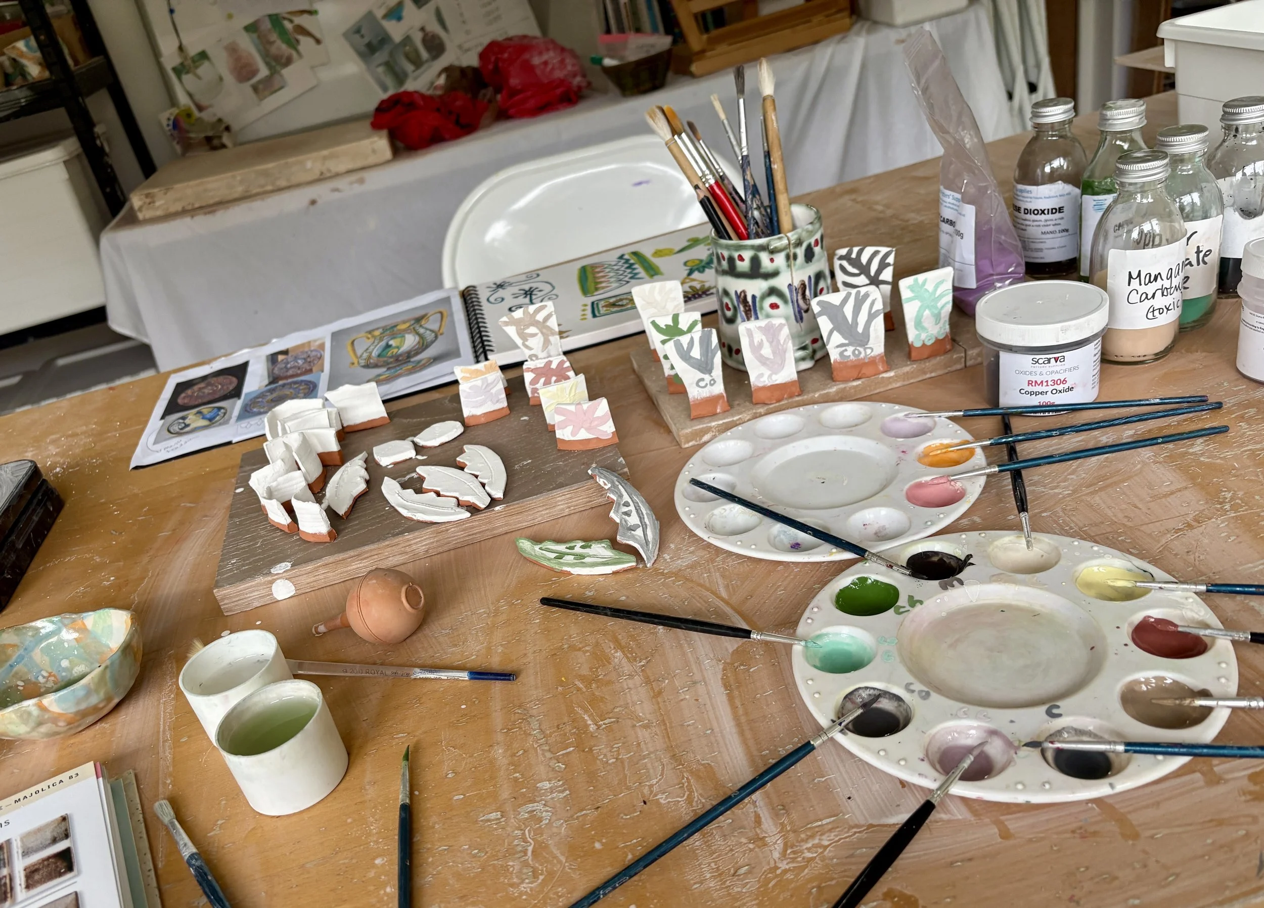
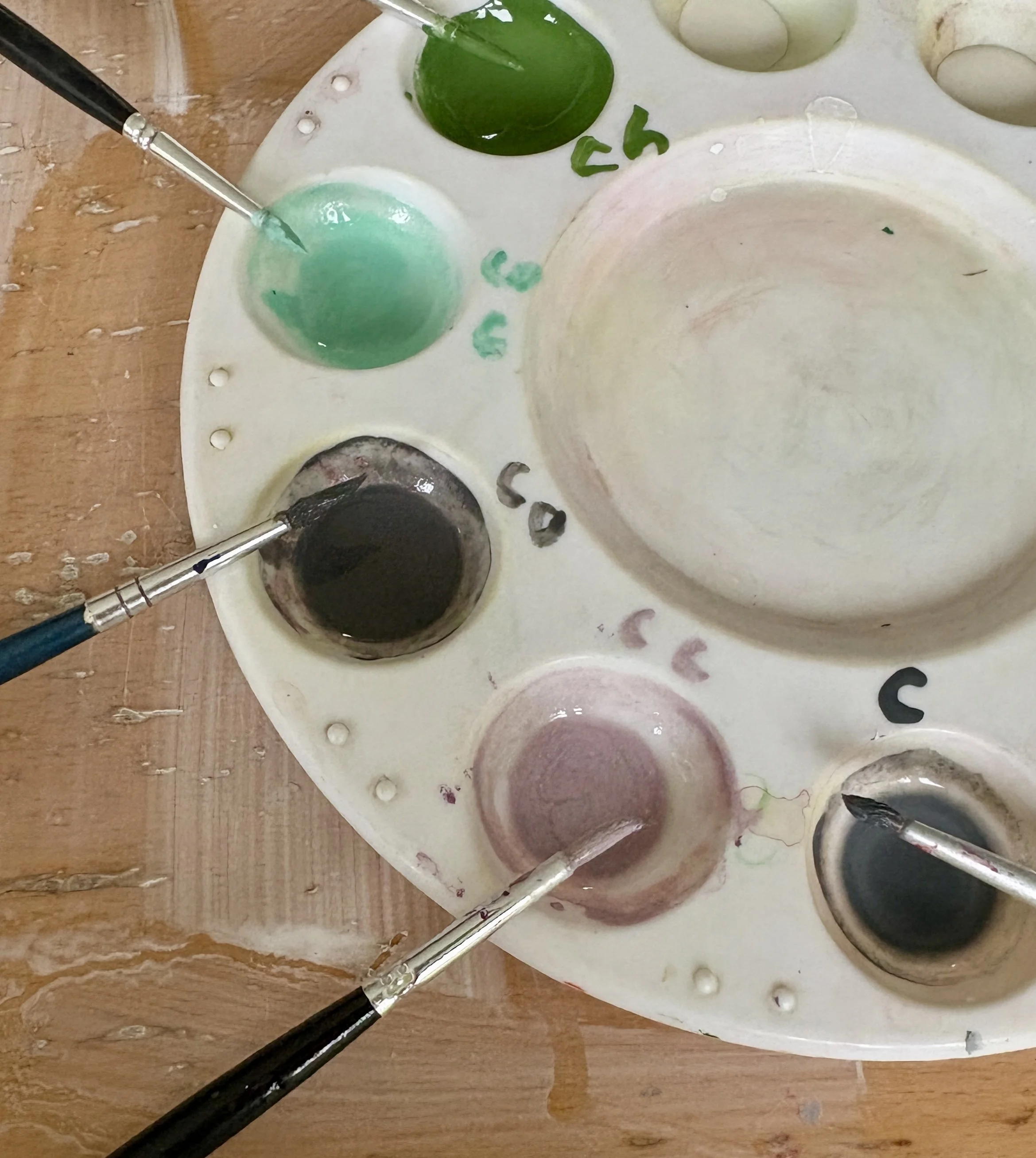
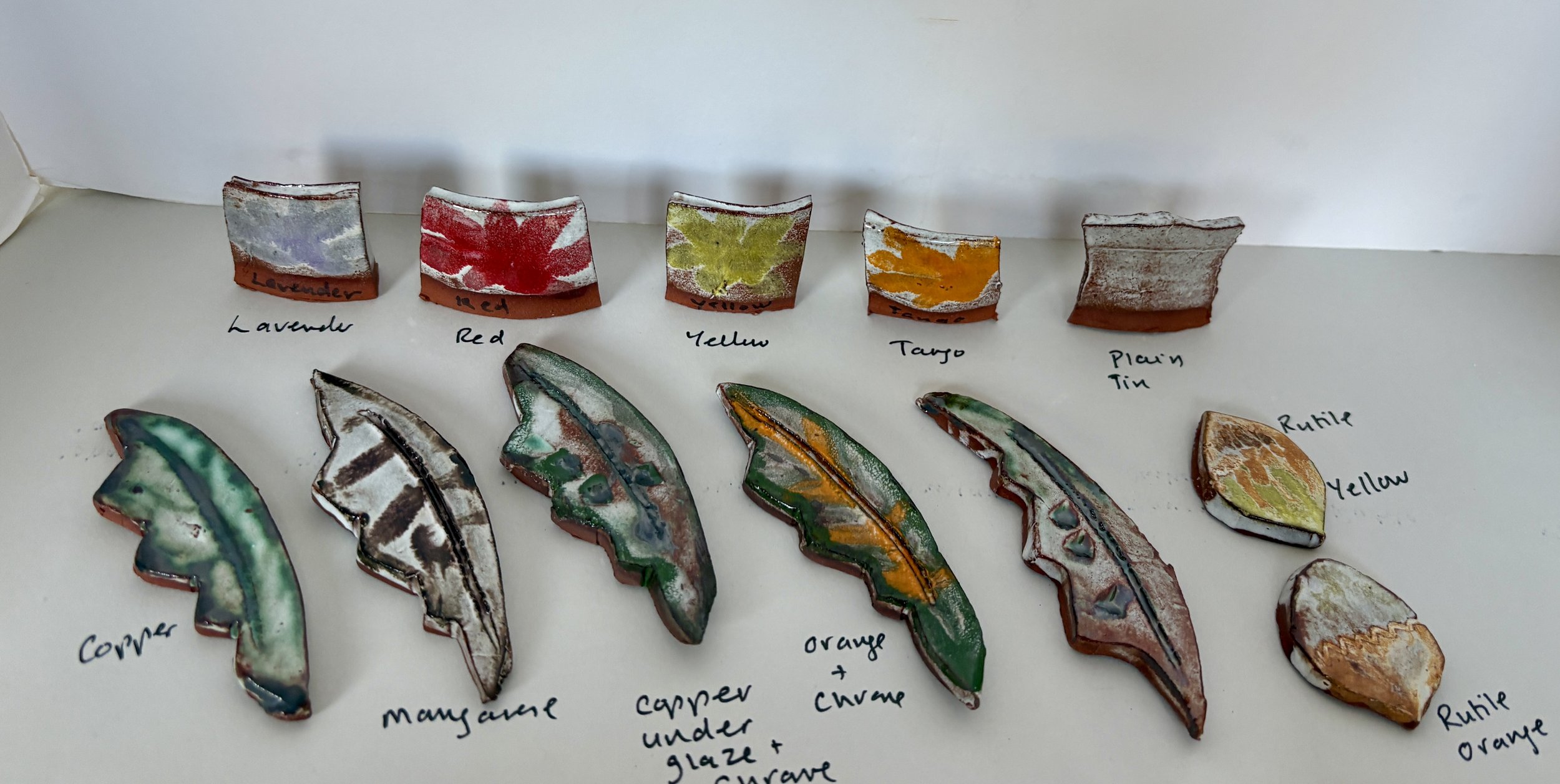
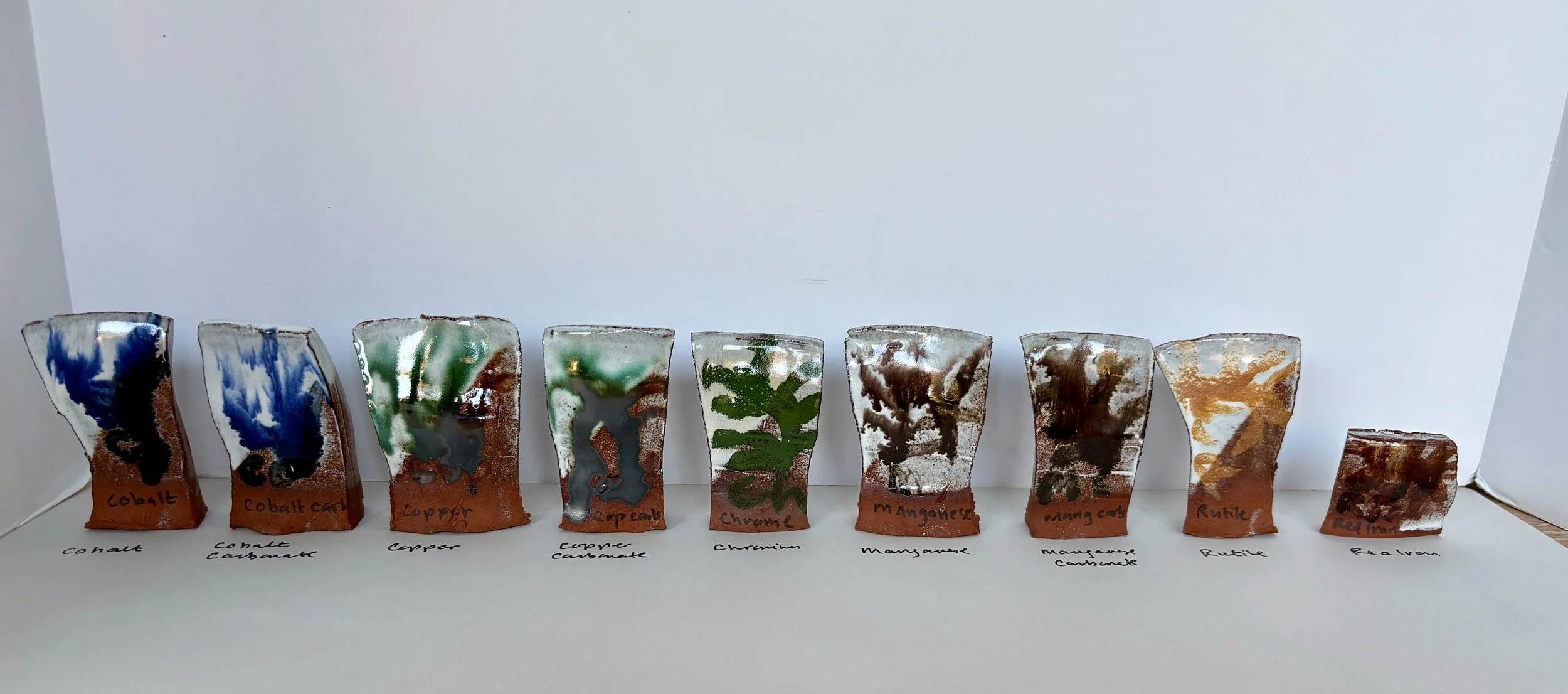
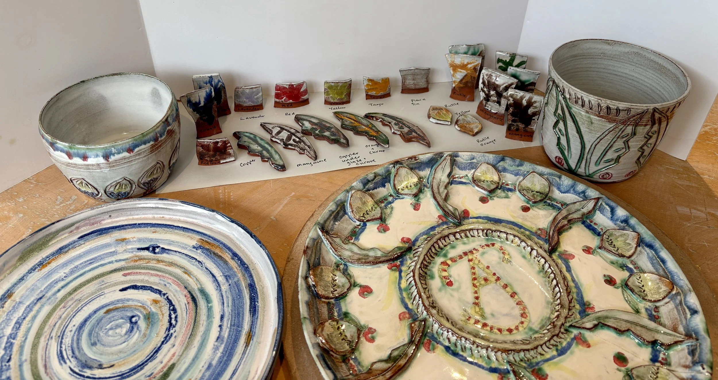
Test tiles - I experimented with painting coloured pigments and oxides on top of the tin white glaze - copper, cobalt, chrome, manganese and rutile
I ran a couple of test kilns to try out the glazes - this was my first low fire earthenware glaze firing.
Lessons learnt
- rutile needed stronger dilution to get a rich orange colour
- a thicker coat of base glaze was needed - although I like the red clay revealed beneath and breaking through the edges
- oxides will make the base run - but again I like that!
- the base white slip area on the plate made for a more opaque white area!
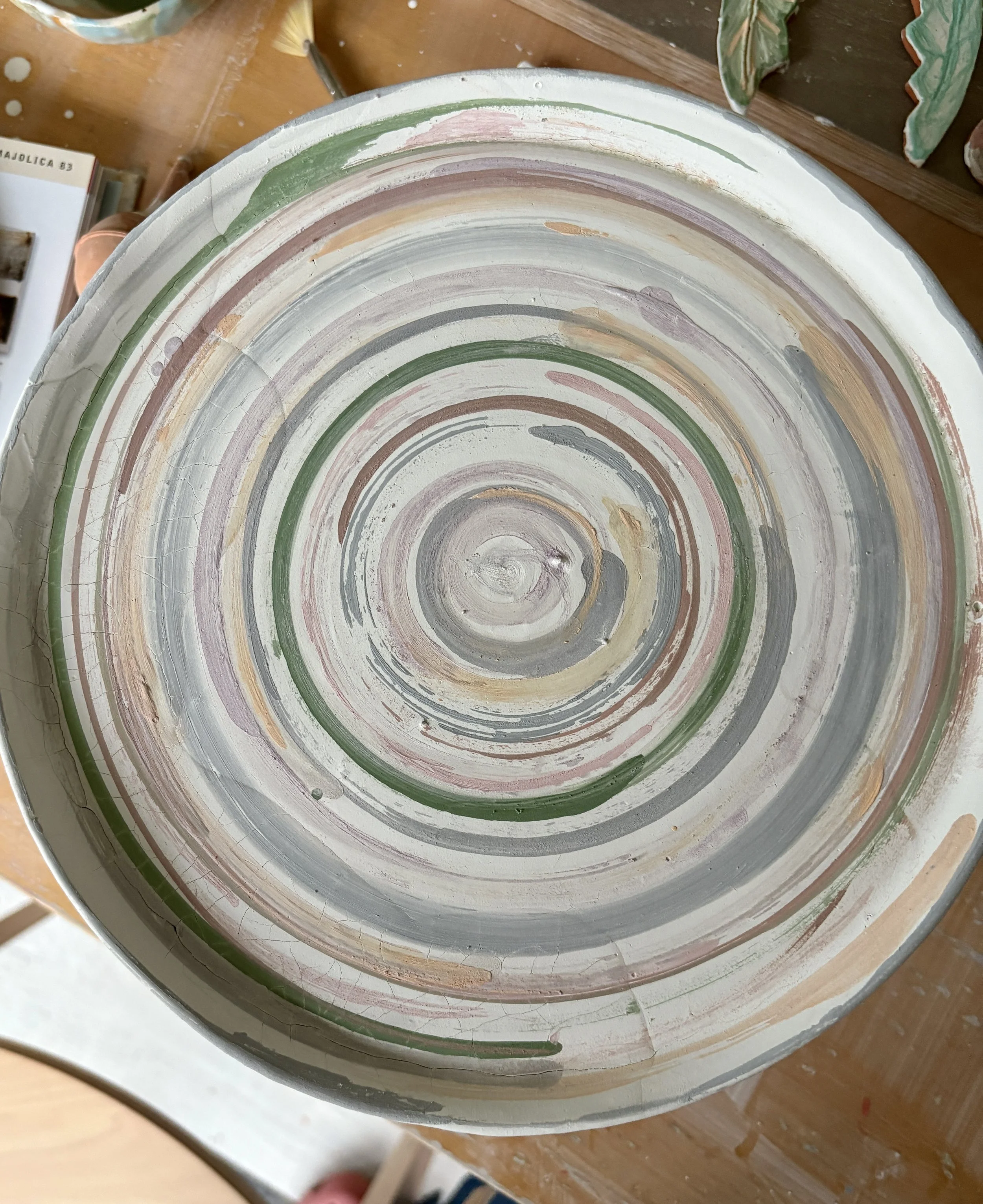
It was interesting to see how the colours mixed and bled together.
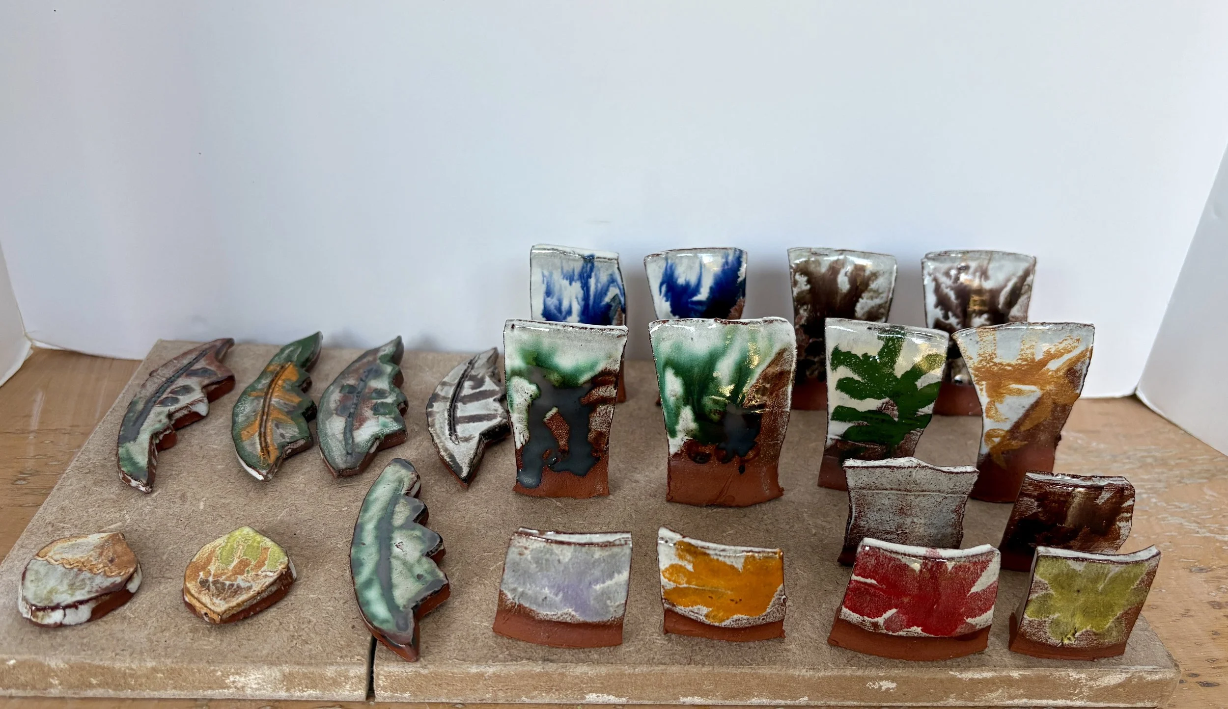
Things to tweak - but liking the results!
Lovely colours
Red clay peeking through
Subtle blendings
#learningfromhistory
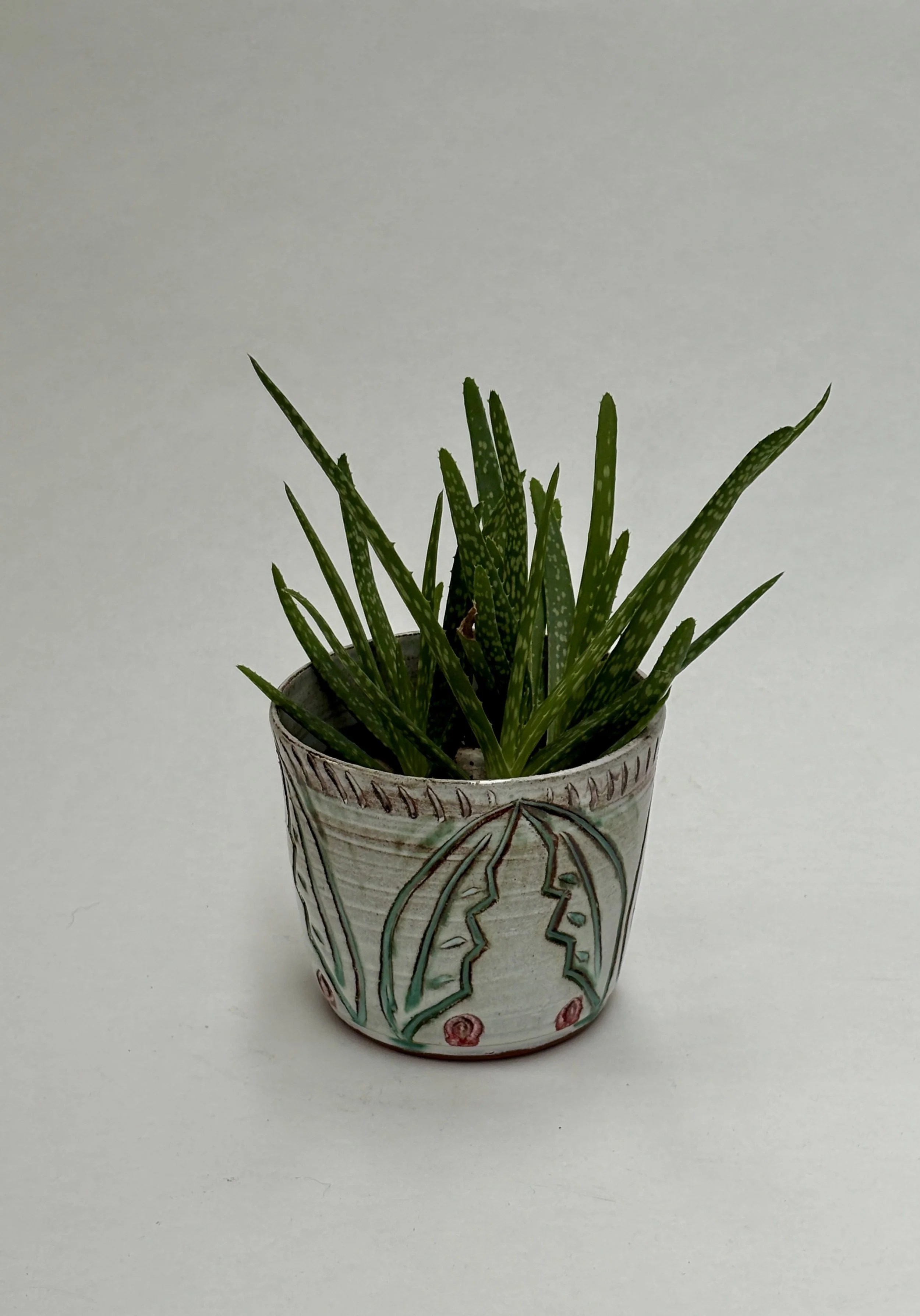
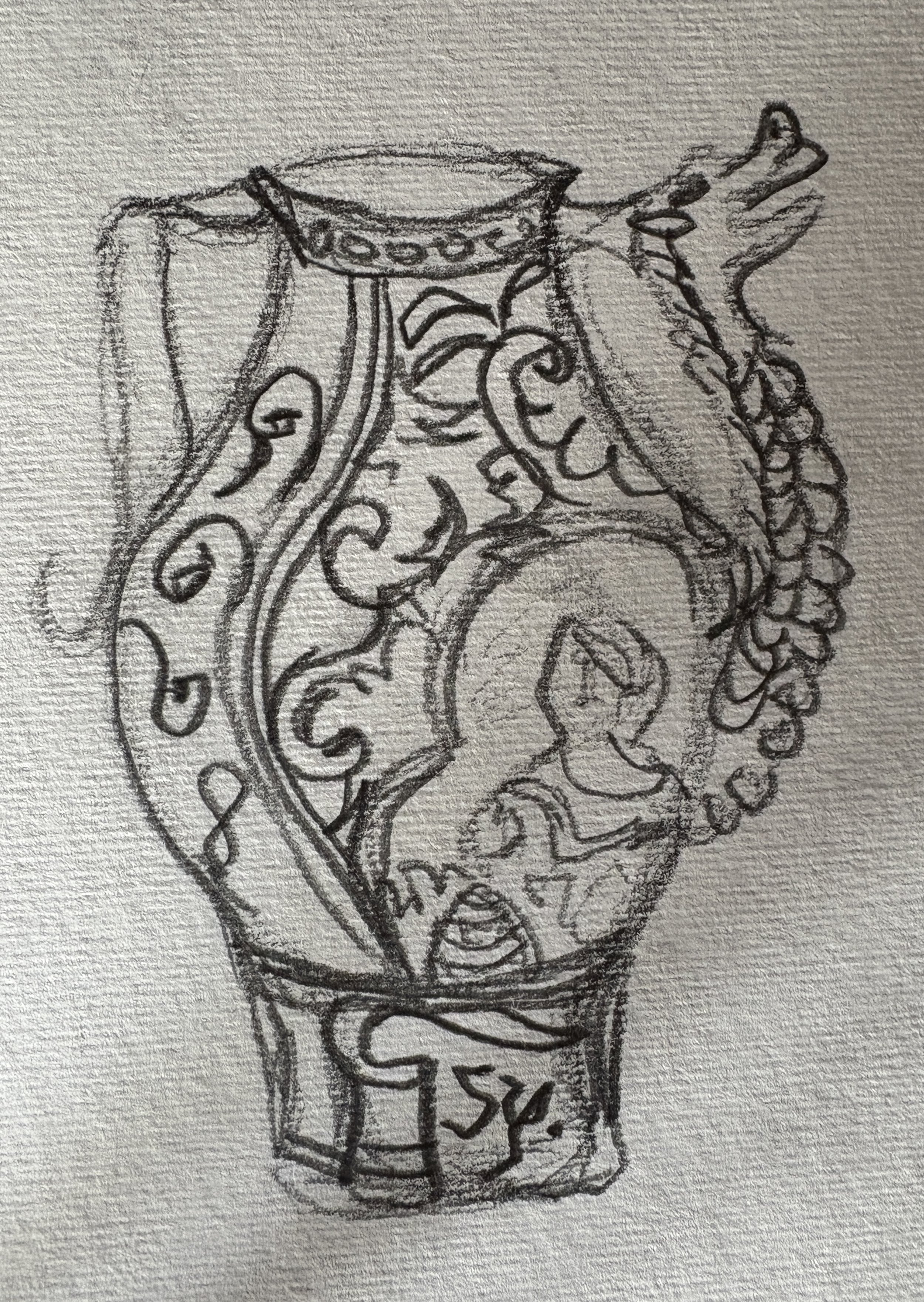
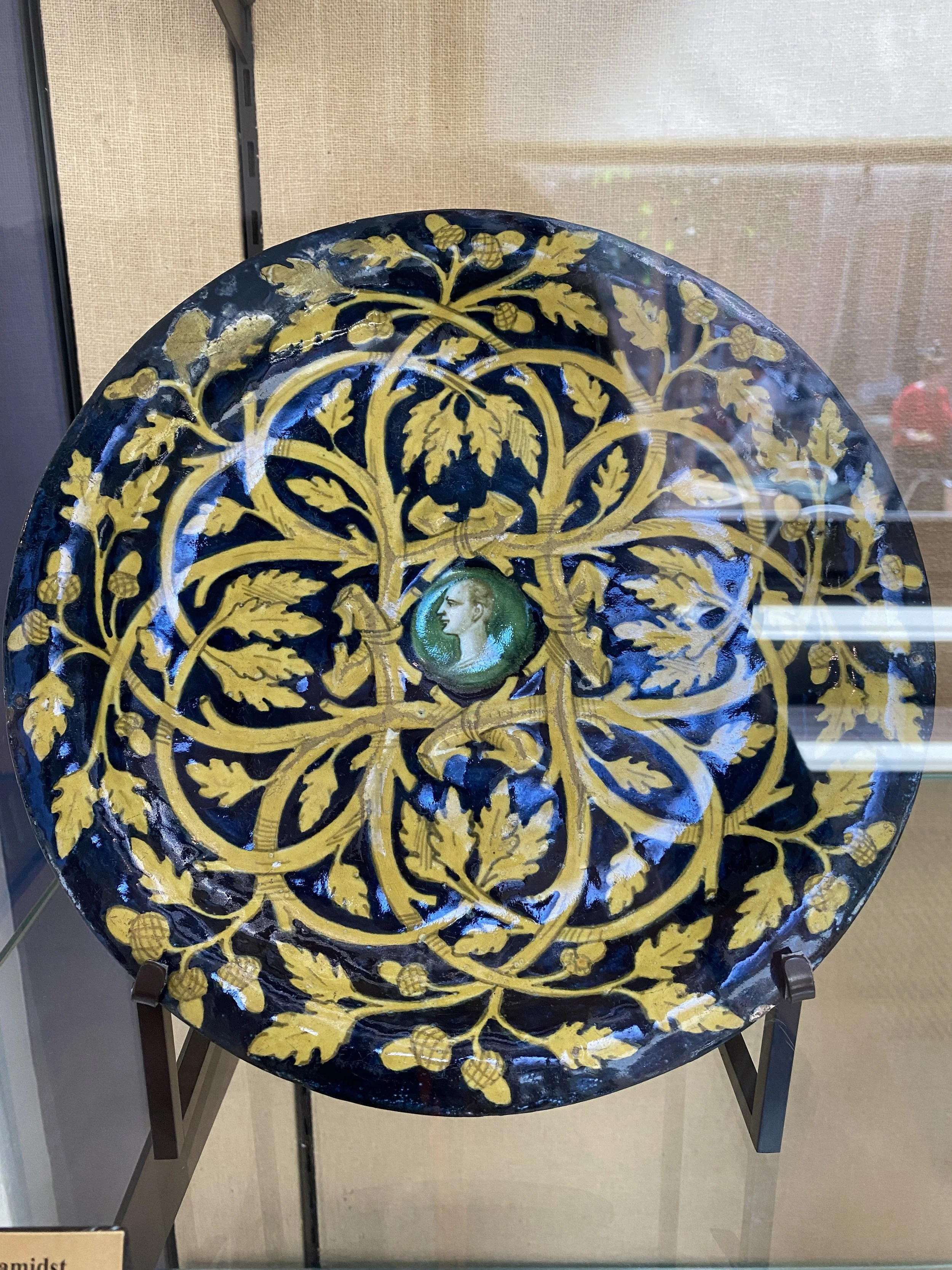
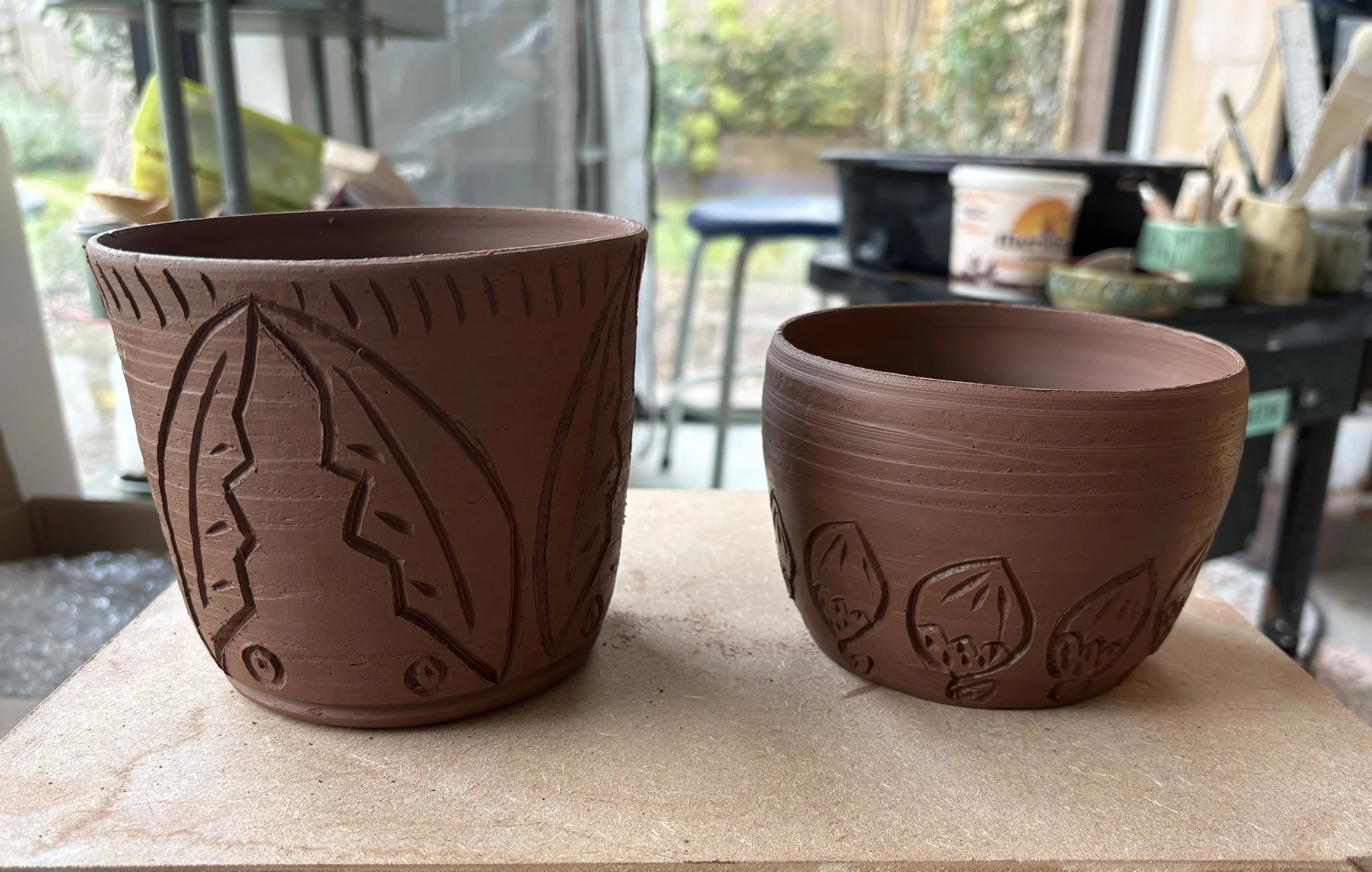
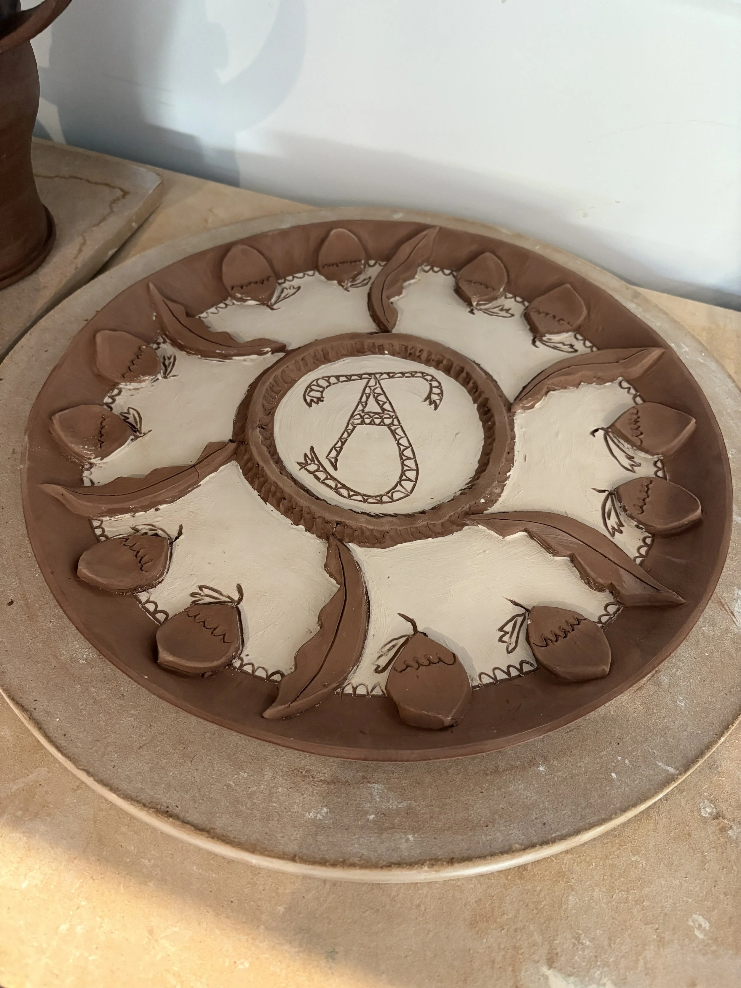
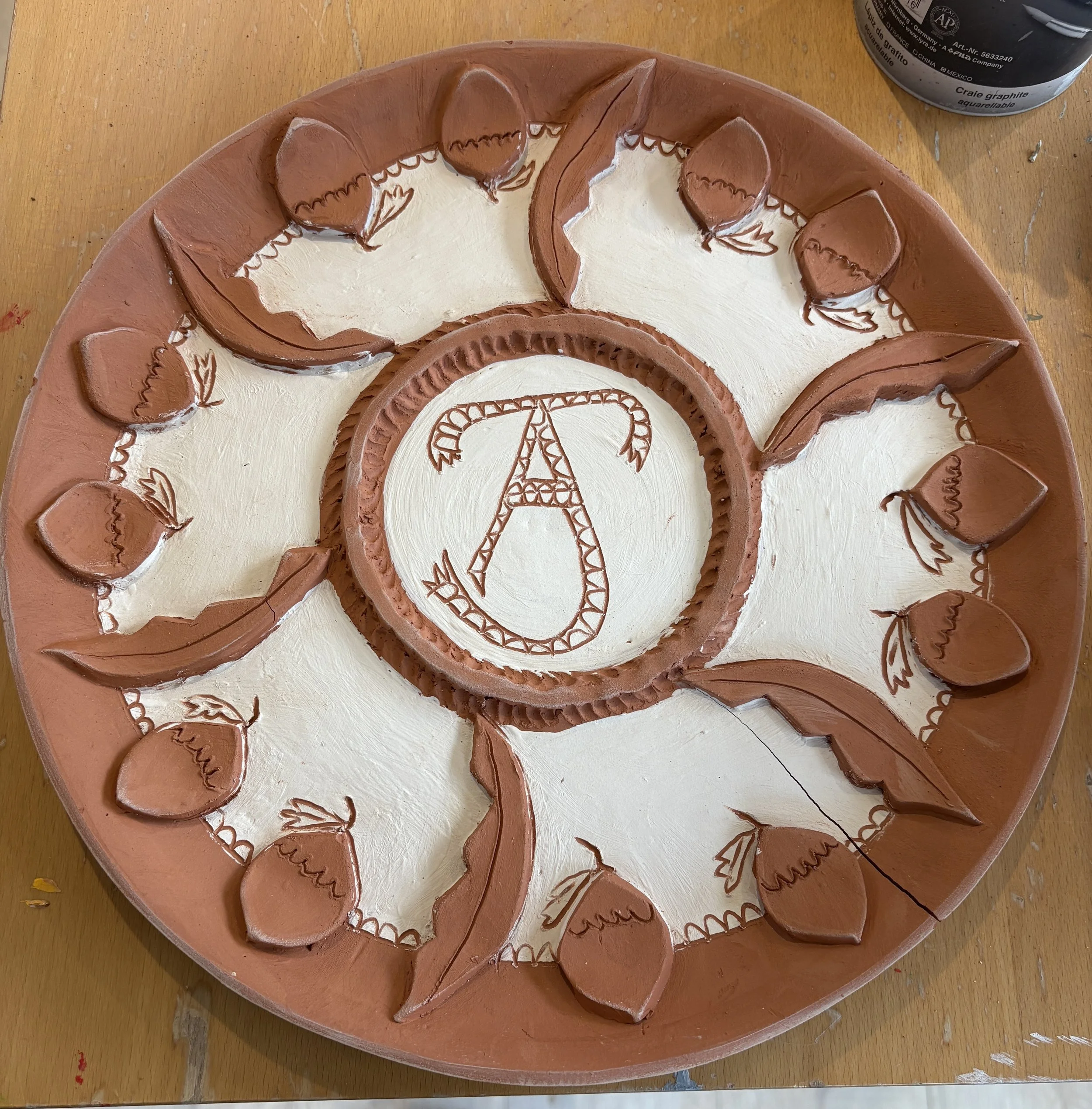
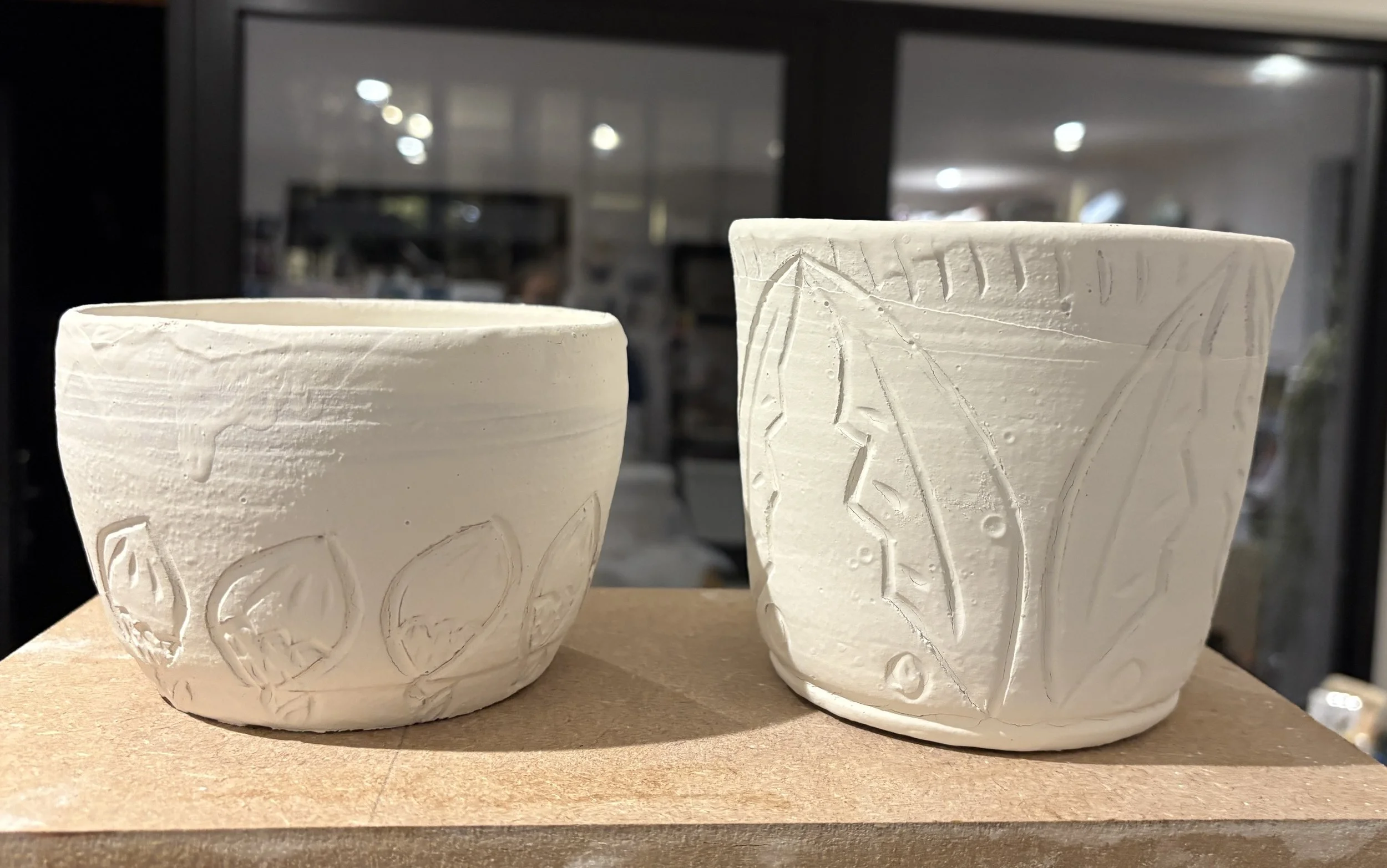
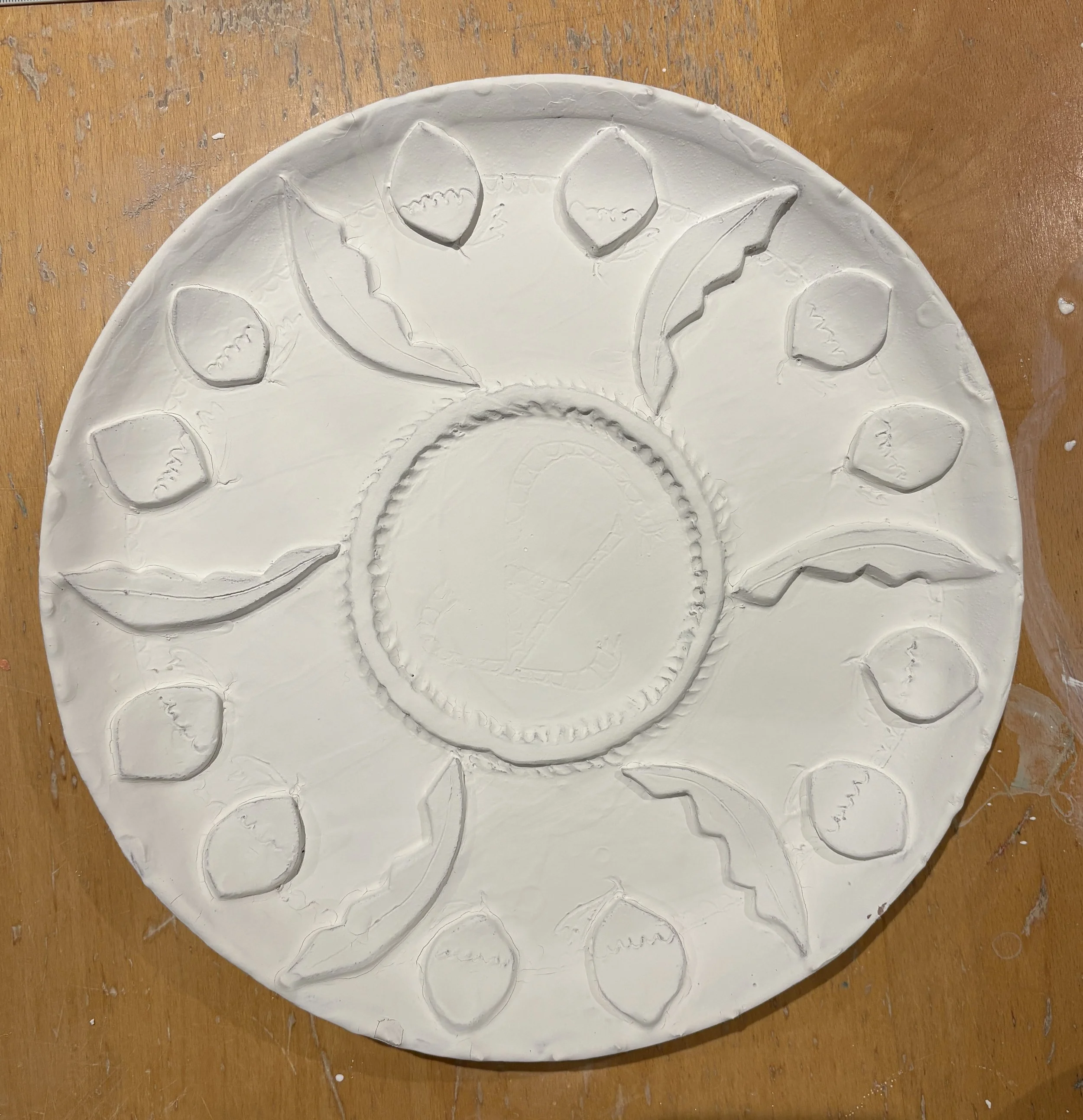
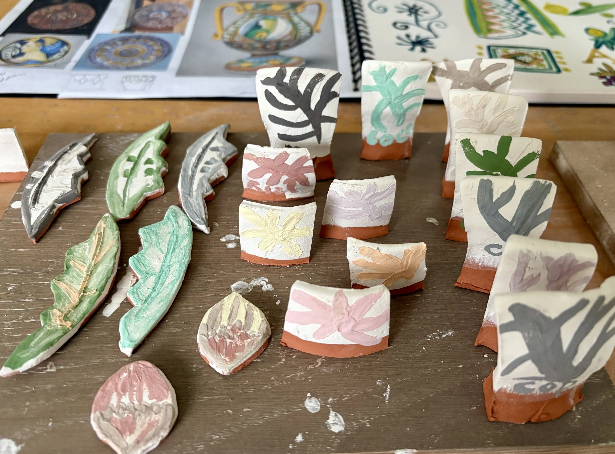
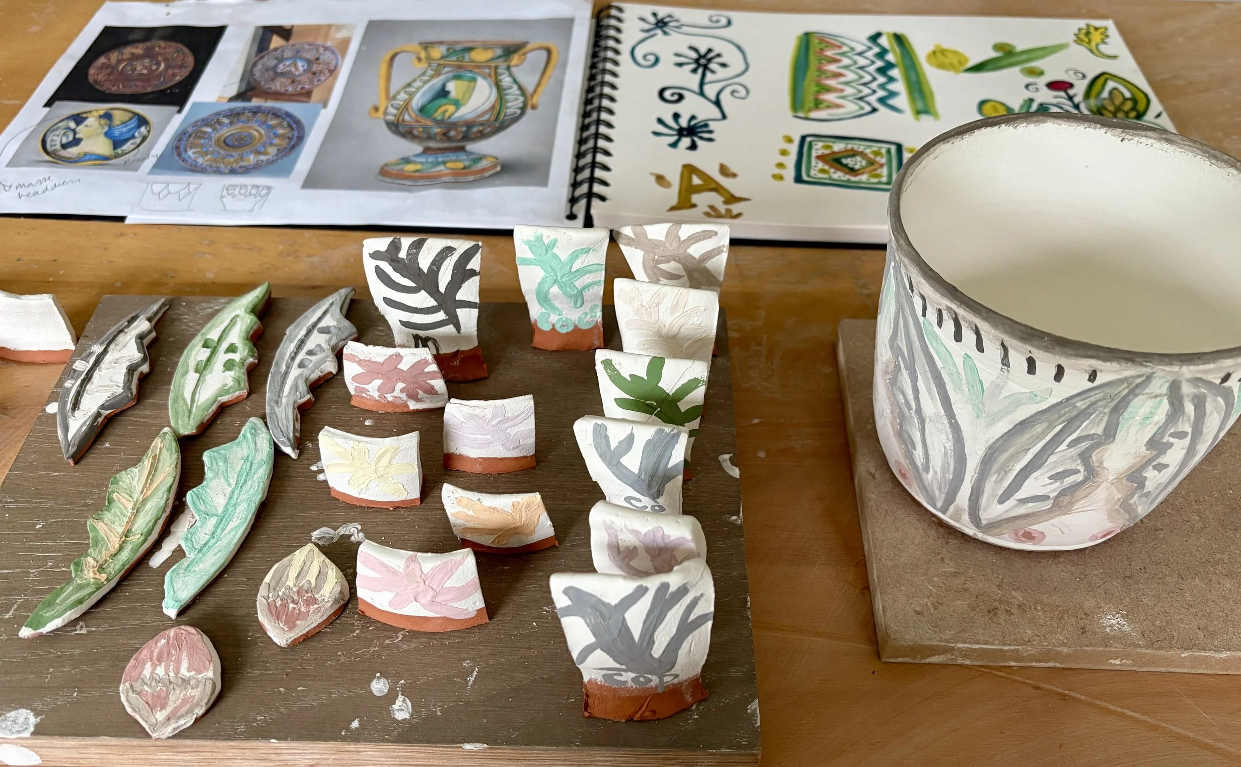
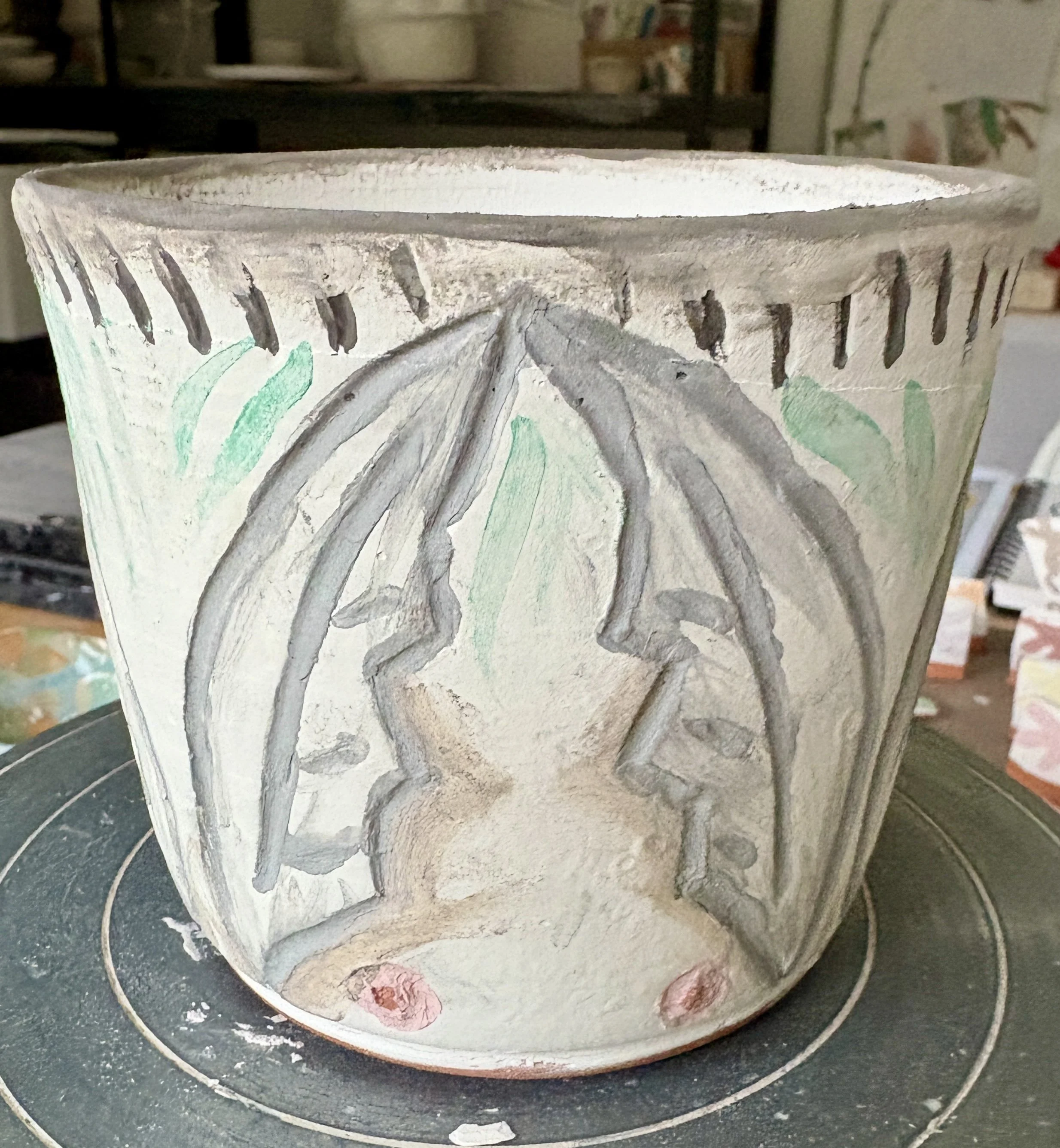
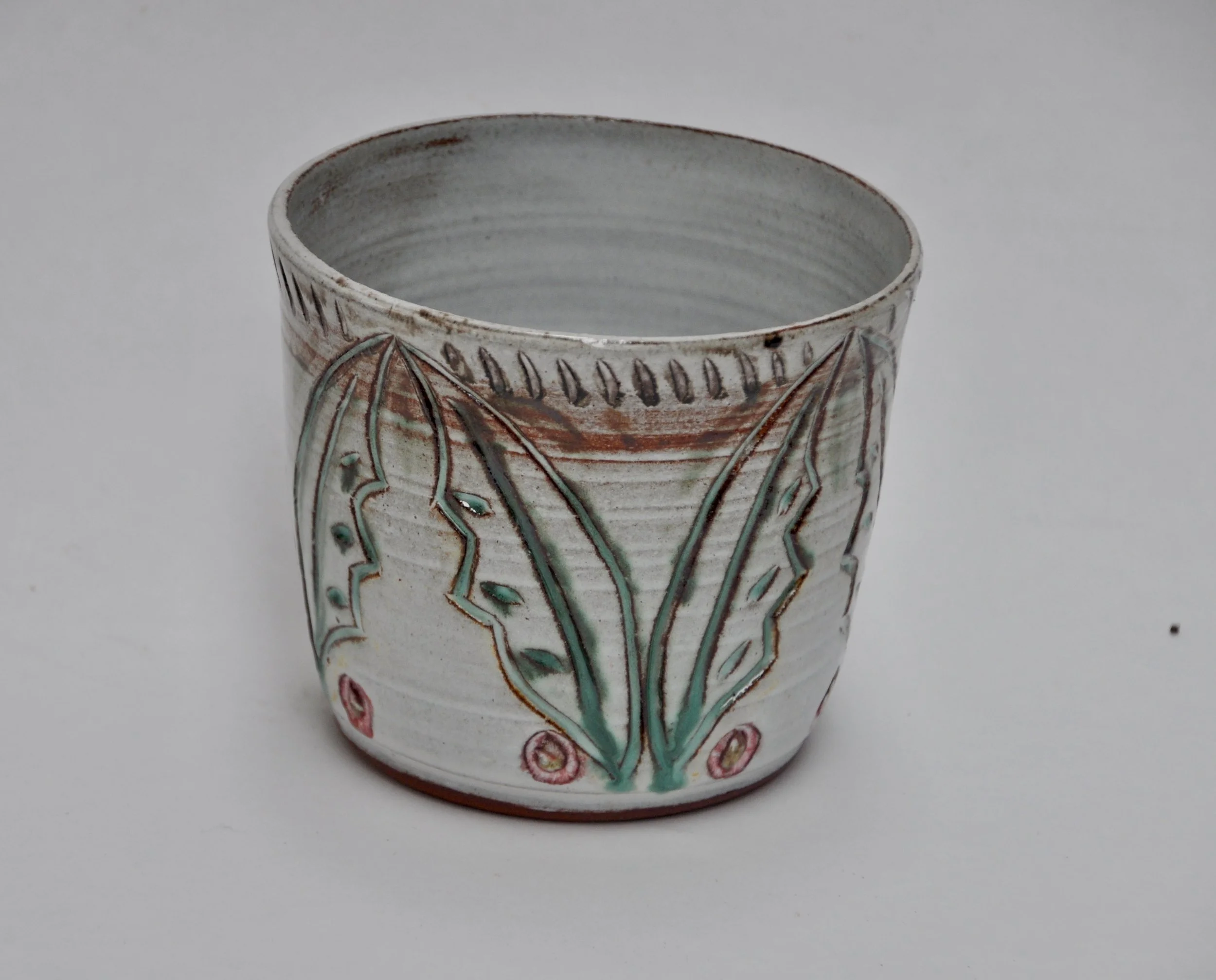
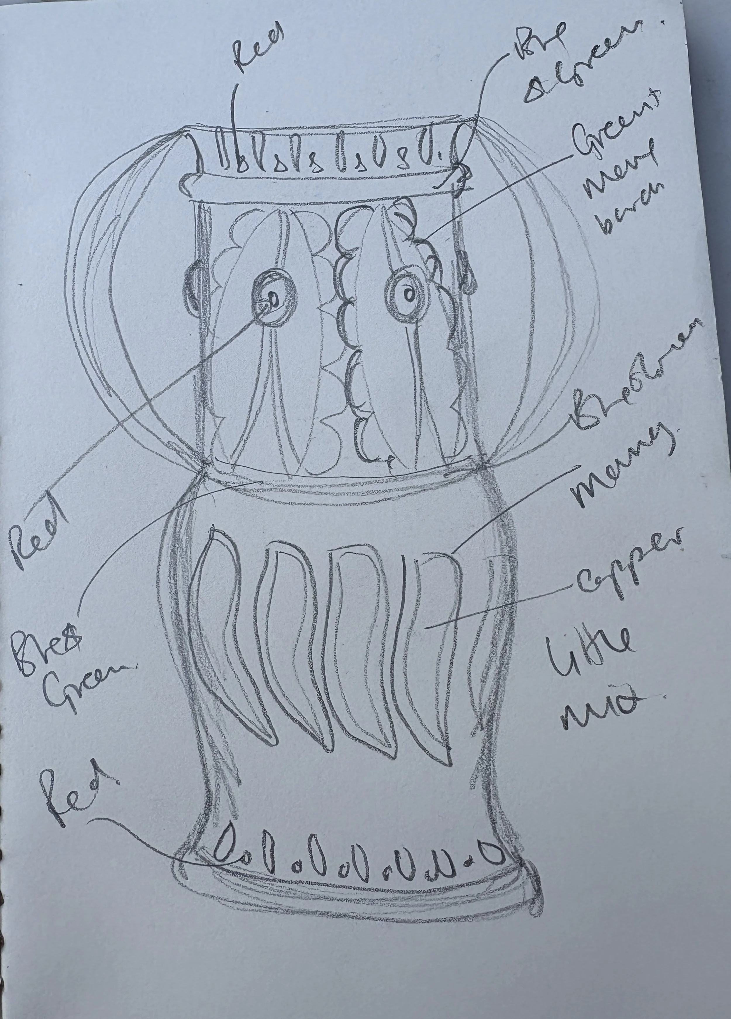
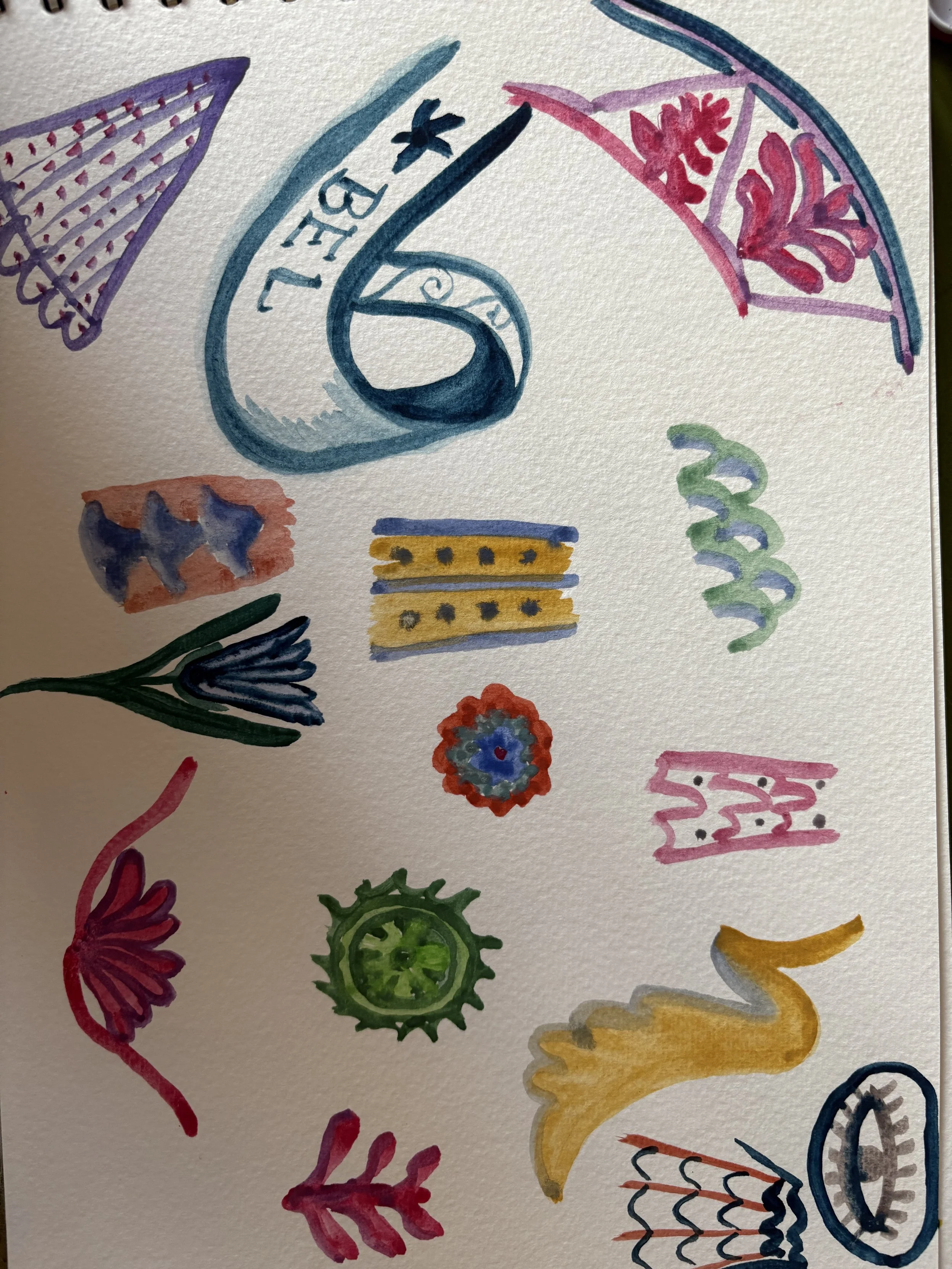
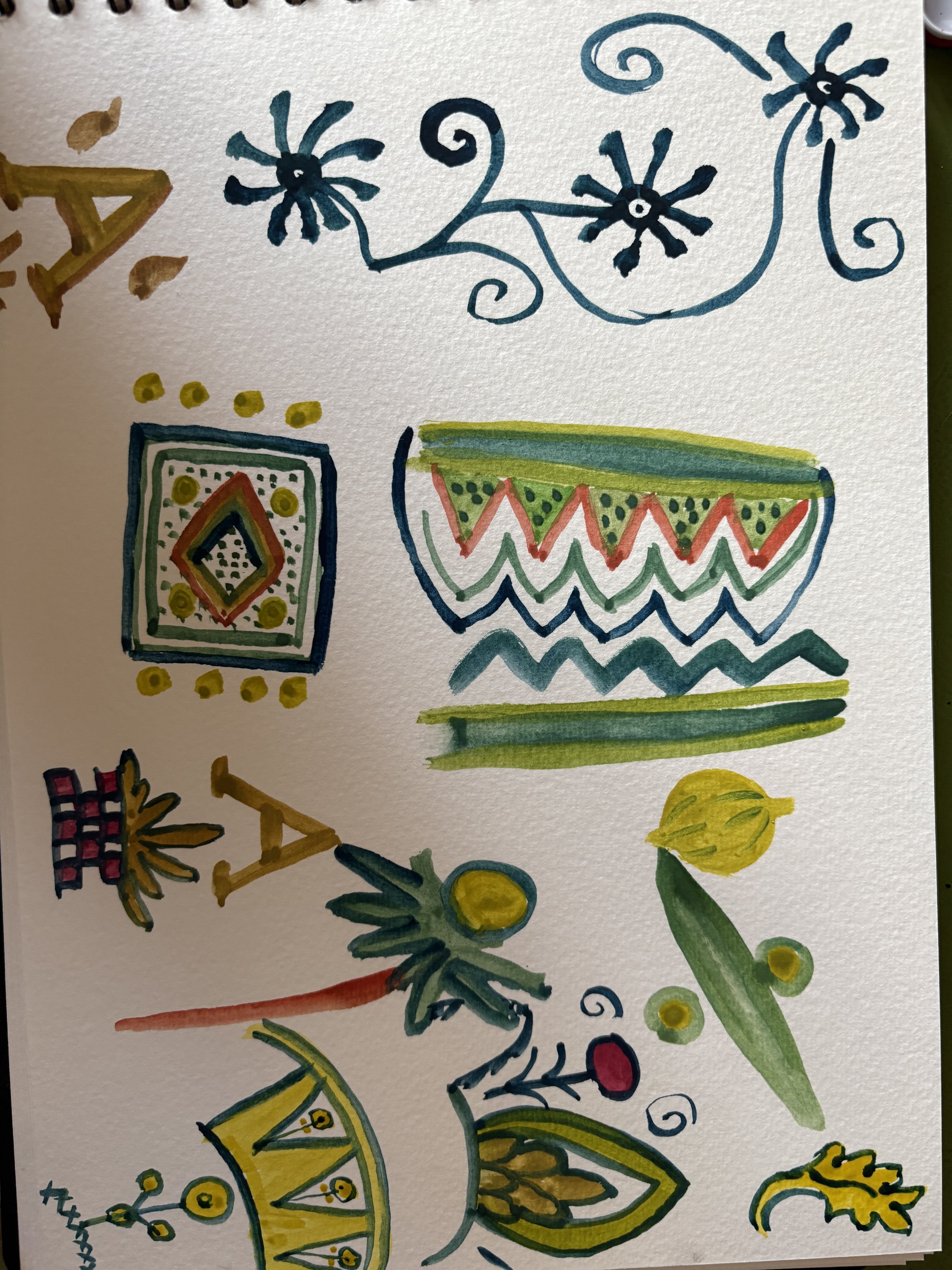
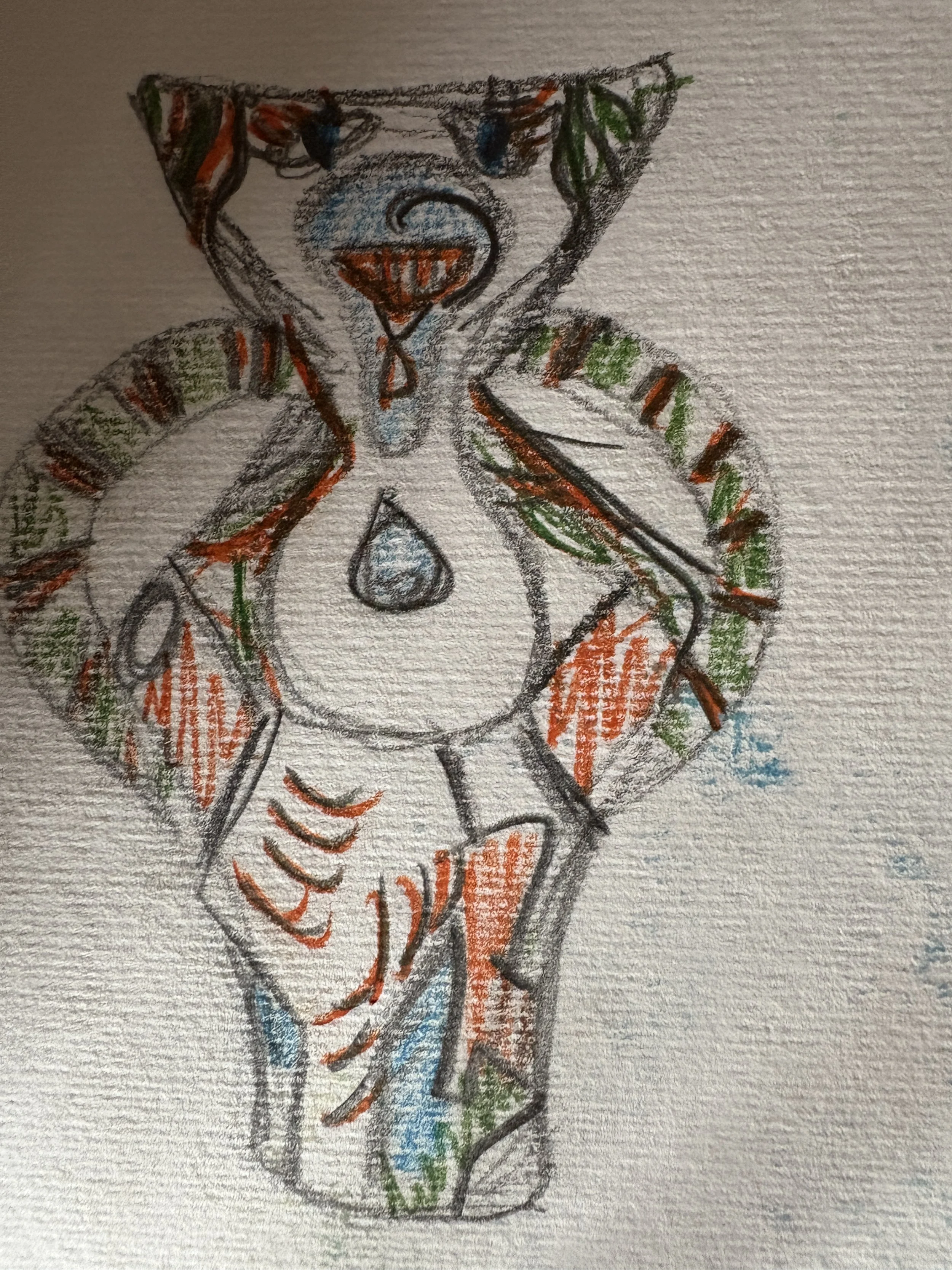
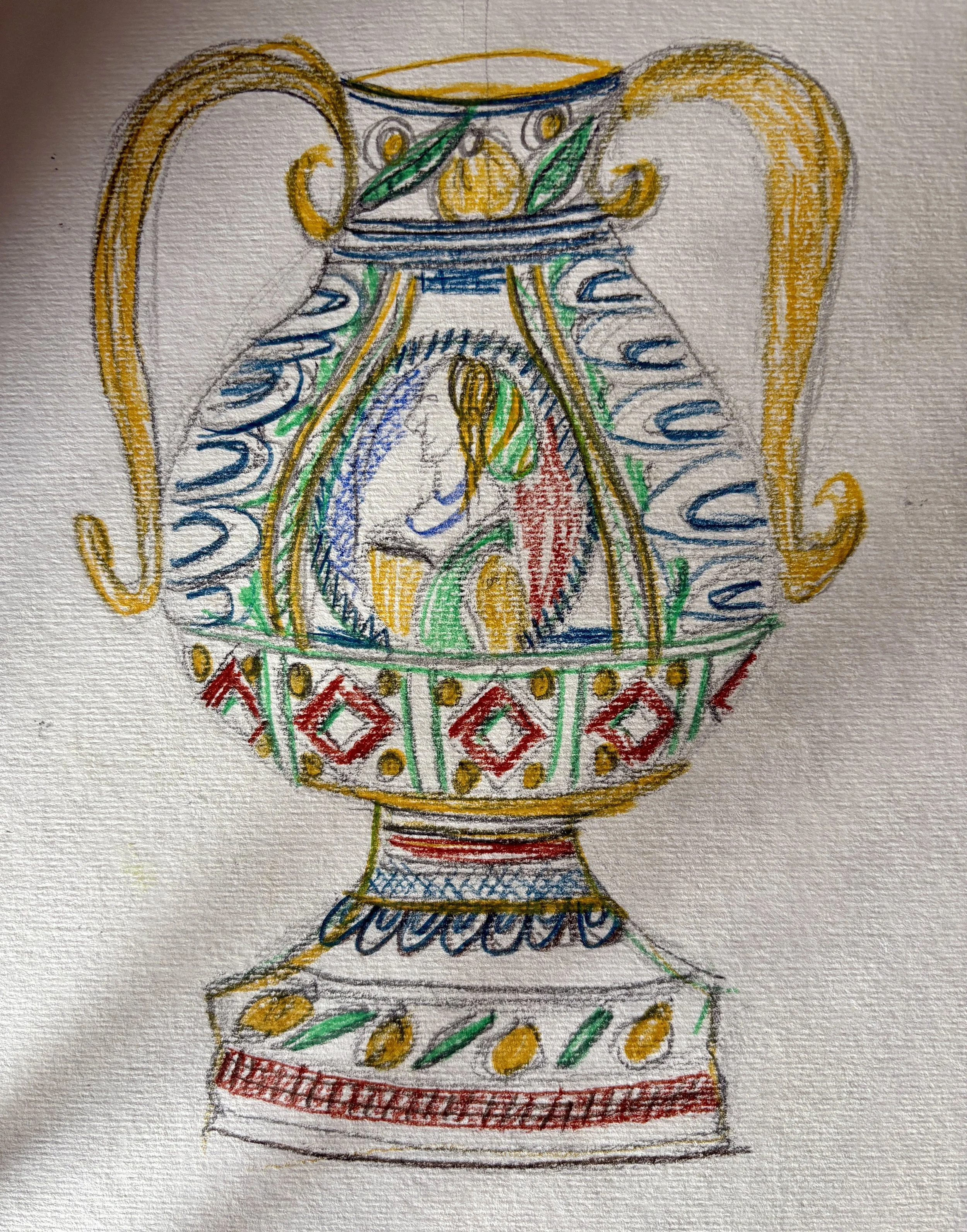
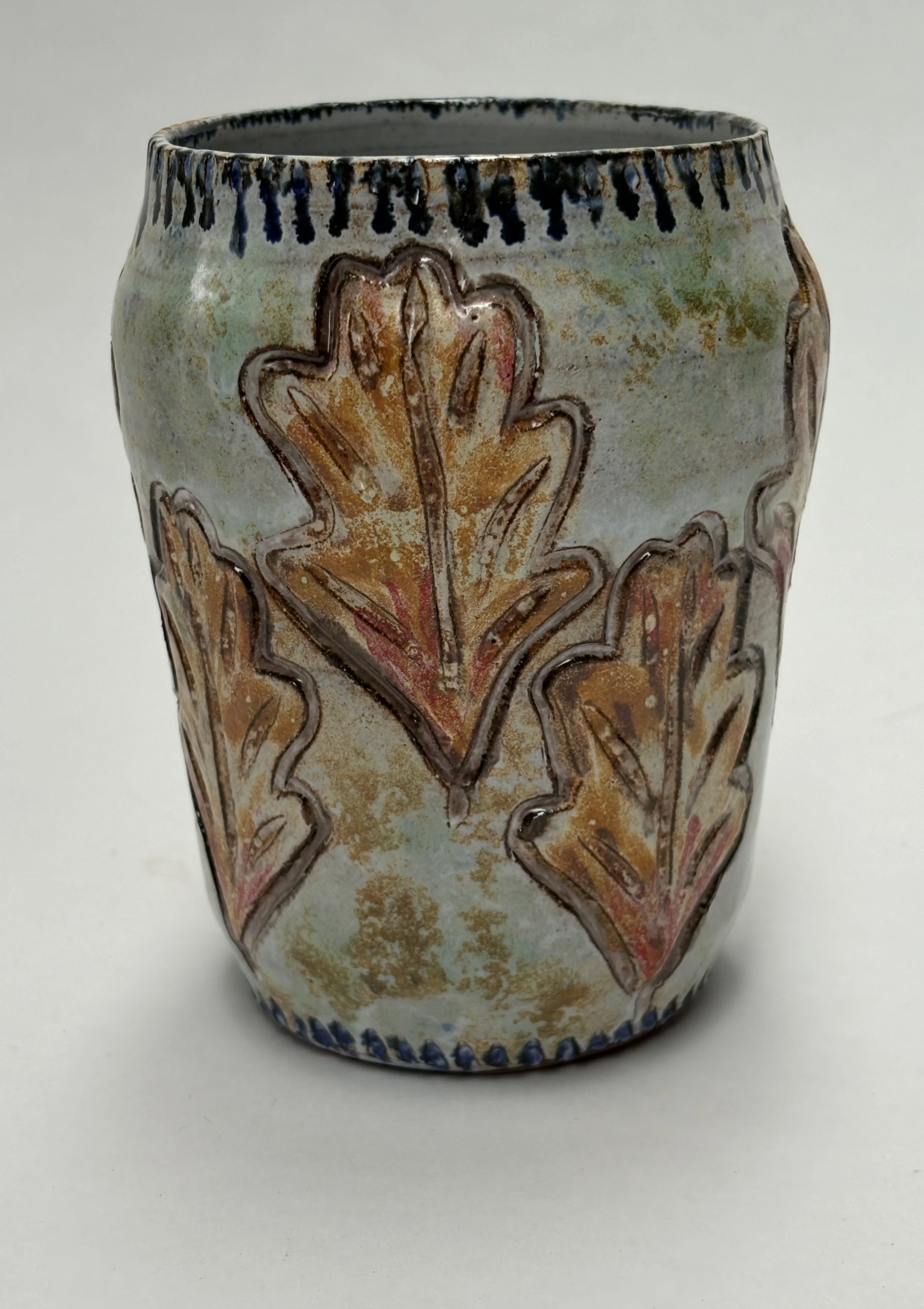
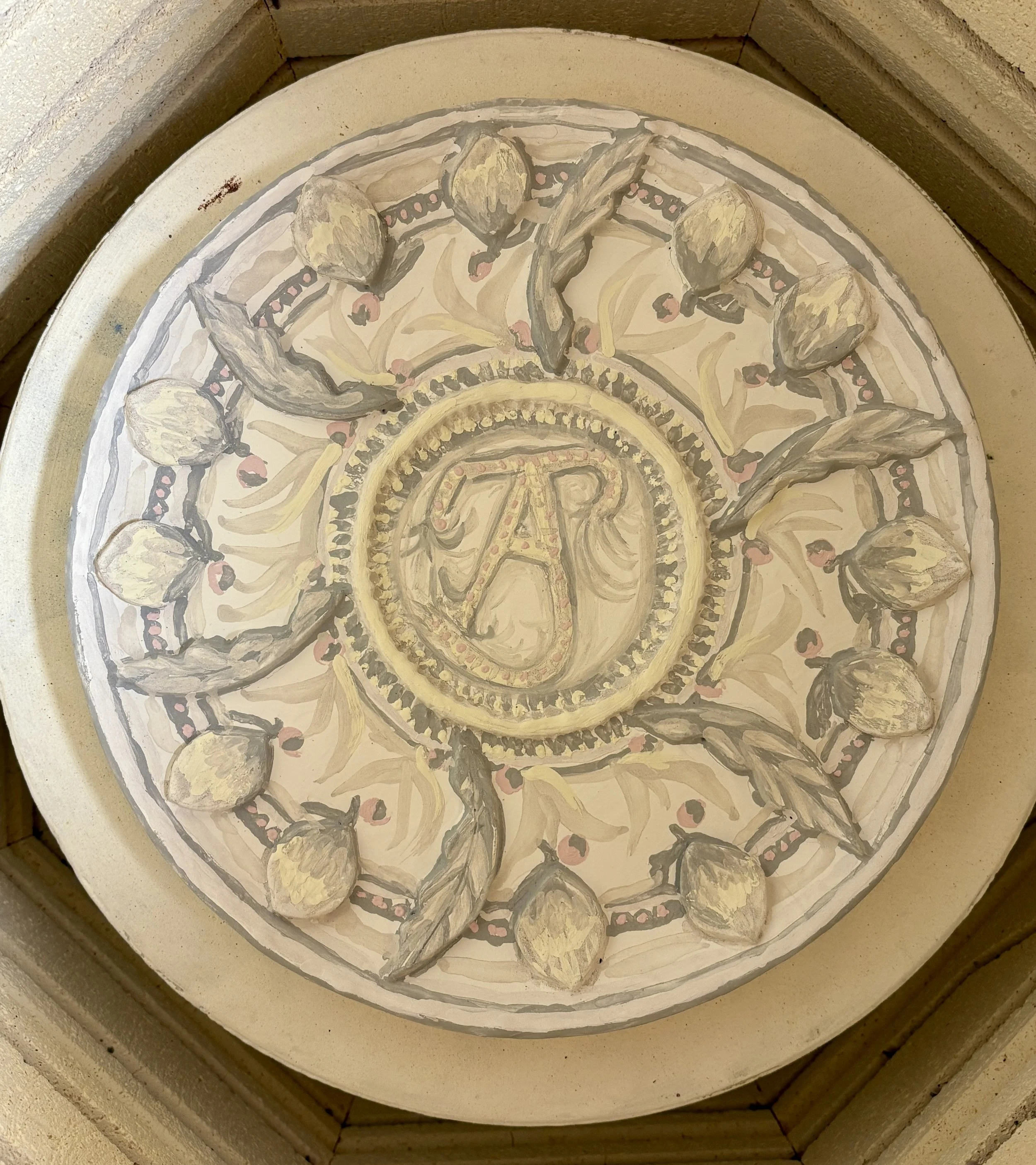
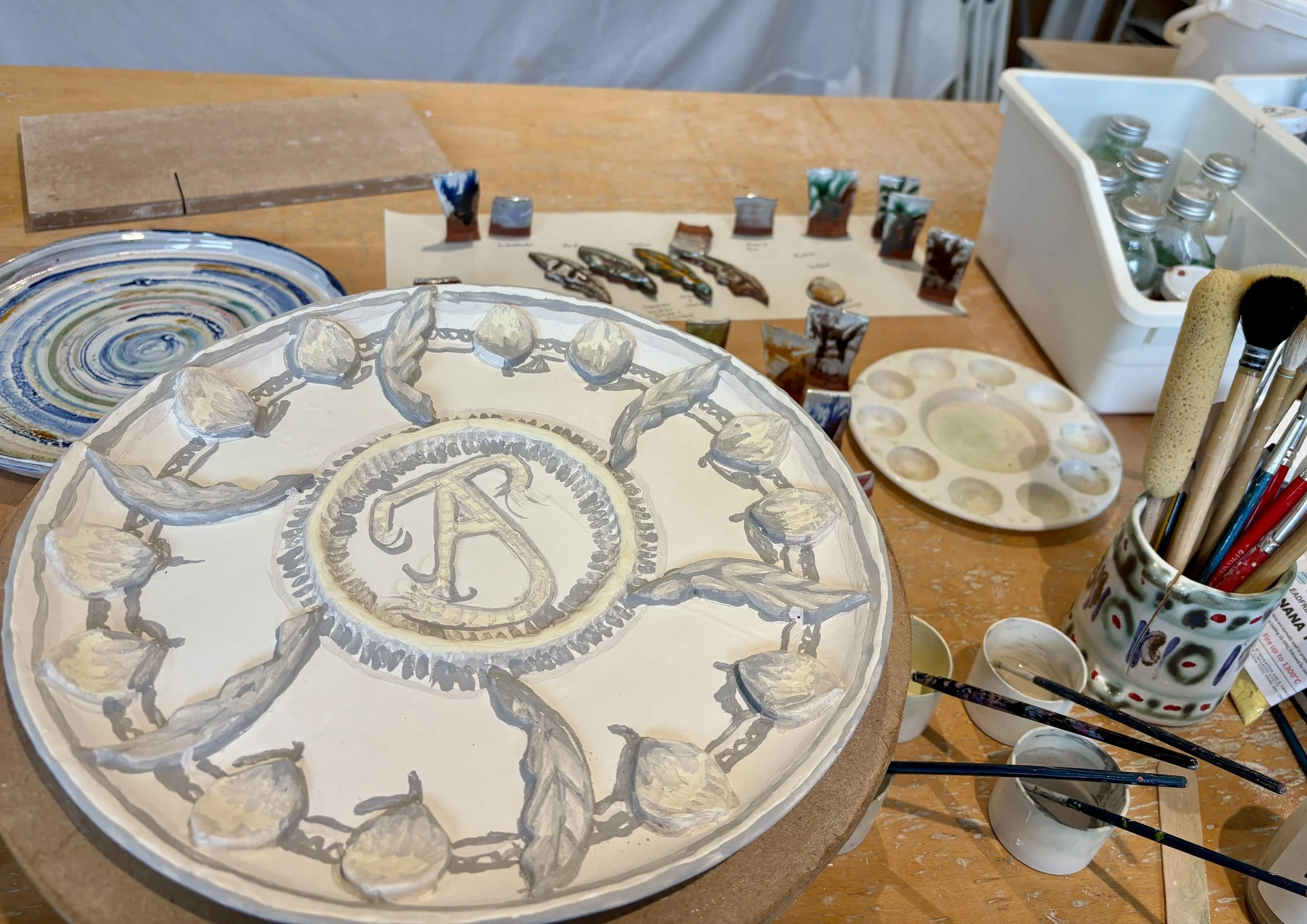
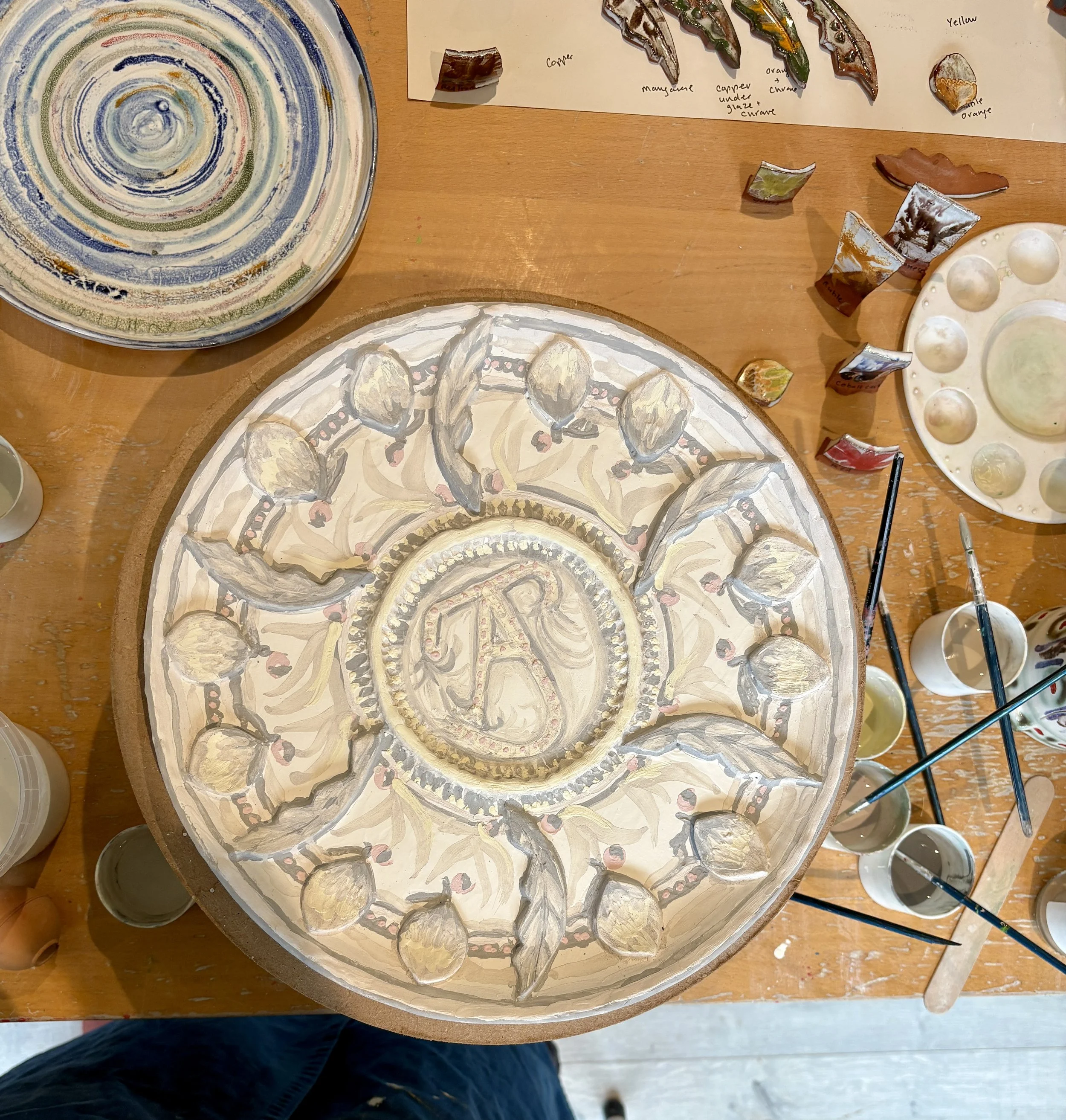
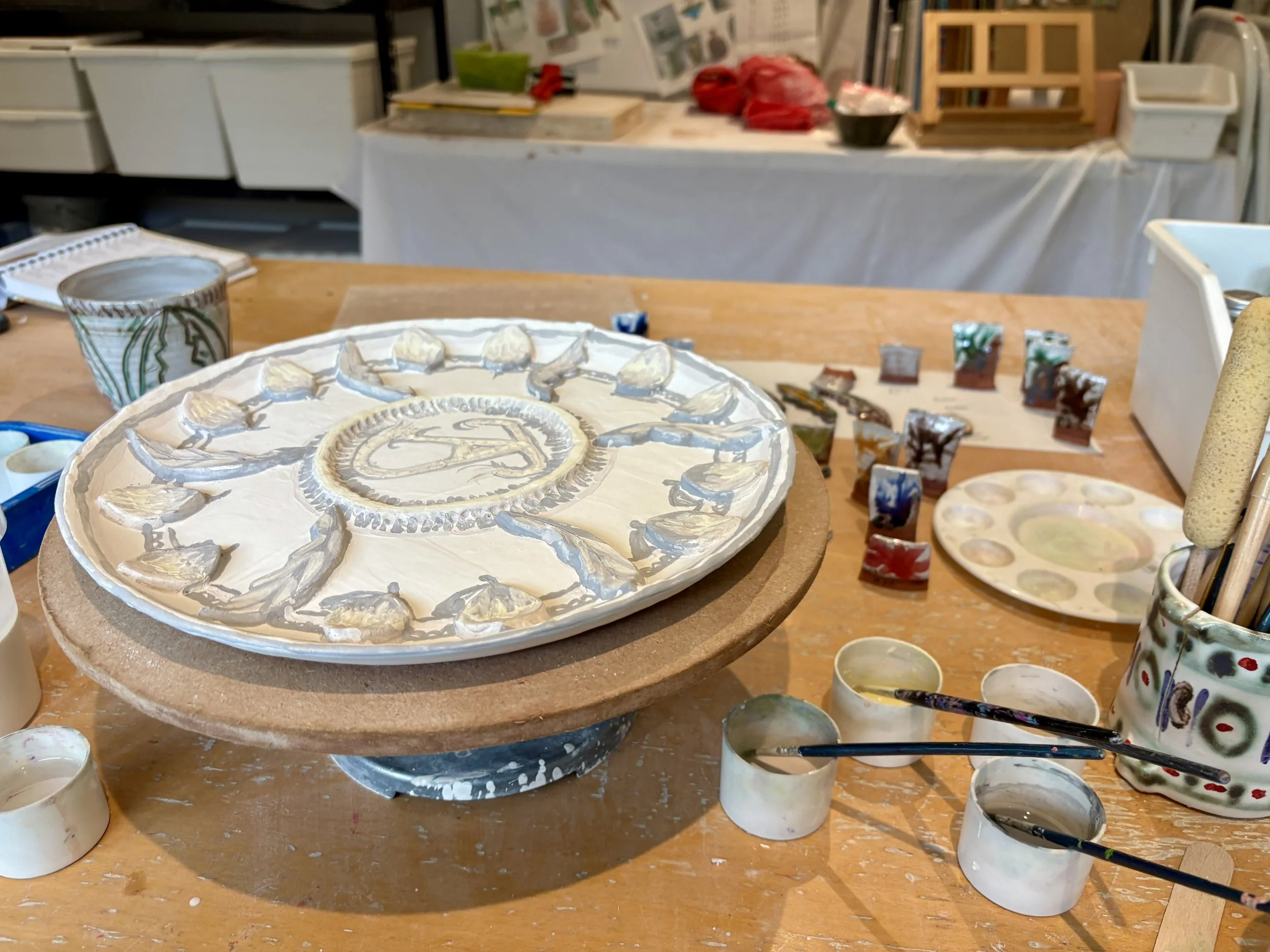
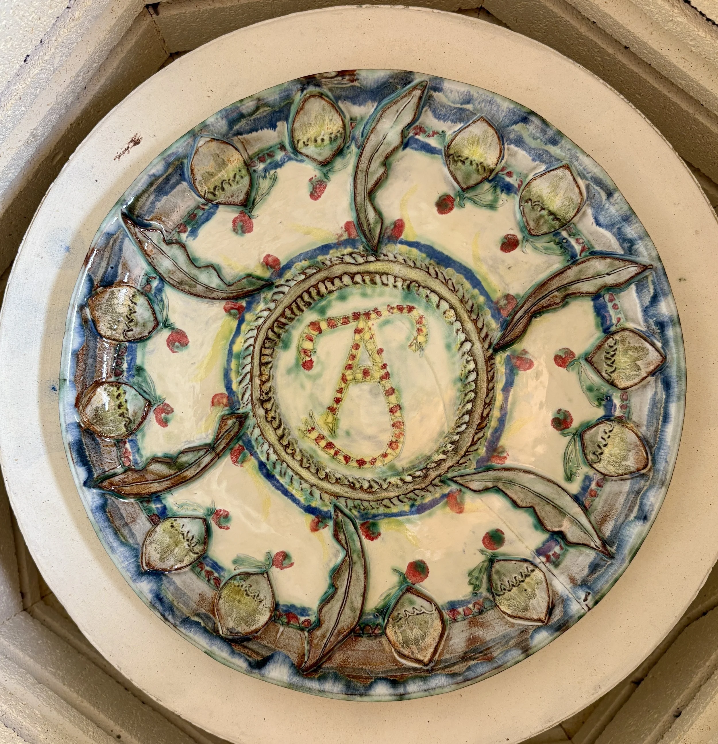
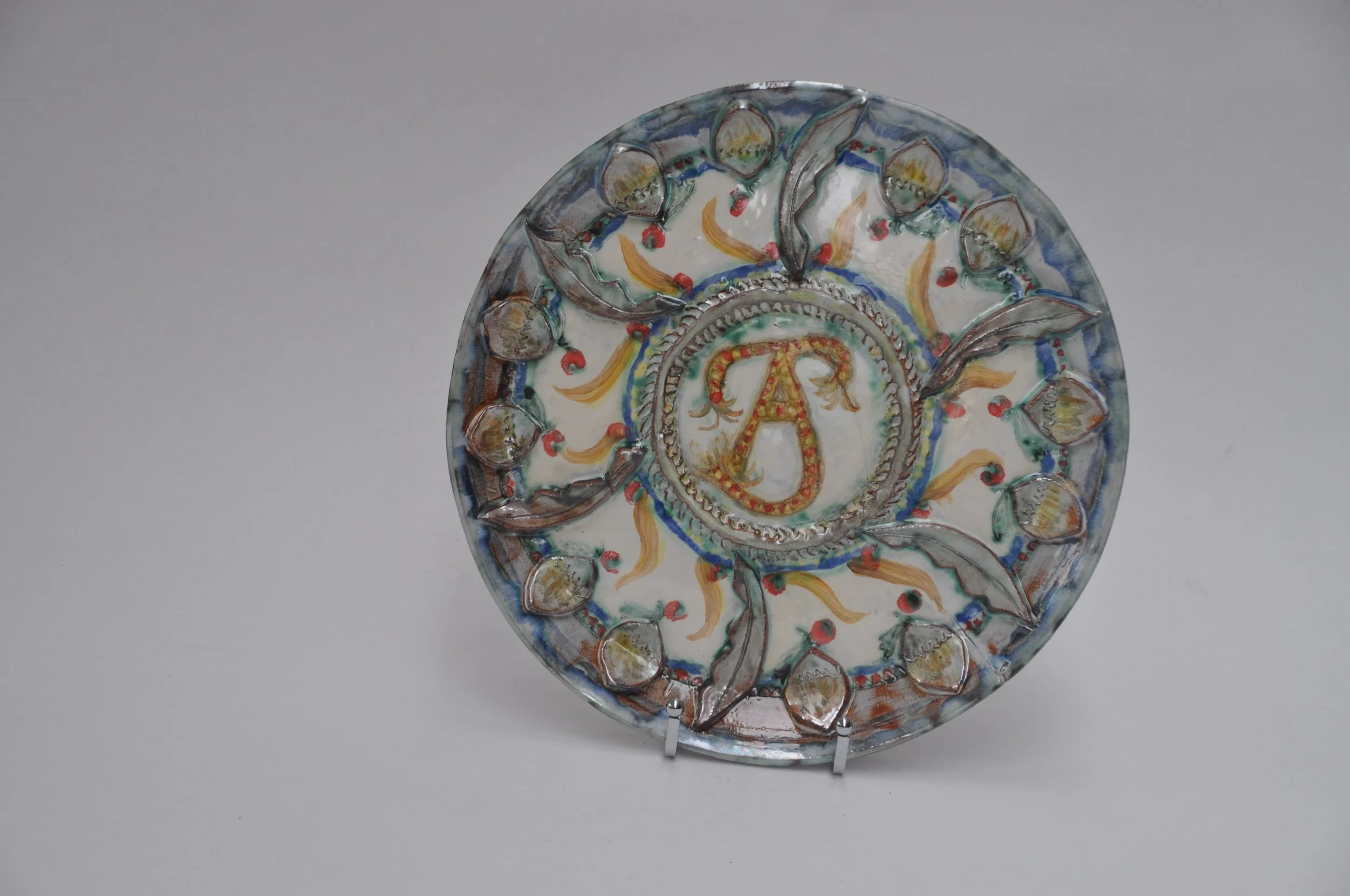
The sketches below show how I was playing with ideas for pattern and symbols observed in the Maiolica collections I was researching in my work at The Courtauld, Vand A and Wallace Collections. Although drawn to the discourses surrounding those idealised Renaissance beauties, there would be no portraits on my ceramics. Instead the humble acorn and oak leaf resonated with me, a motif picked up in my work alongside my initial and potters mark to make a sort of coat of arms. Once used by kings and powerful men as a symbol of power and might I was quietly referencing age, wisdom, strength and the resilience of women at my point in life.
I also enjoy using the ‘mark up’ tool on my iPhone when out and about to experiment with colours and marks over photographs of work in progress - useful on the bus and travelling around!
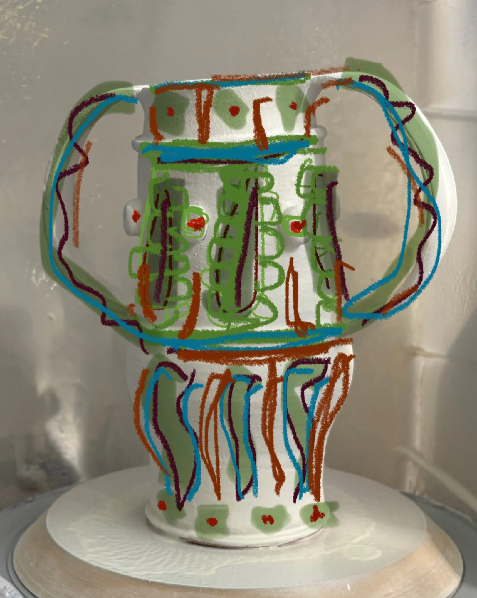
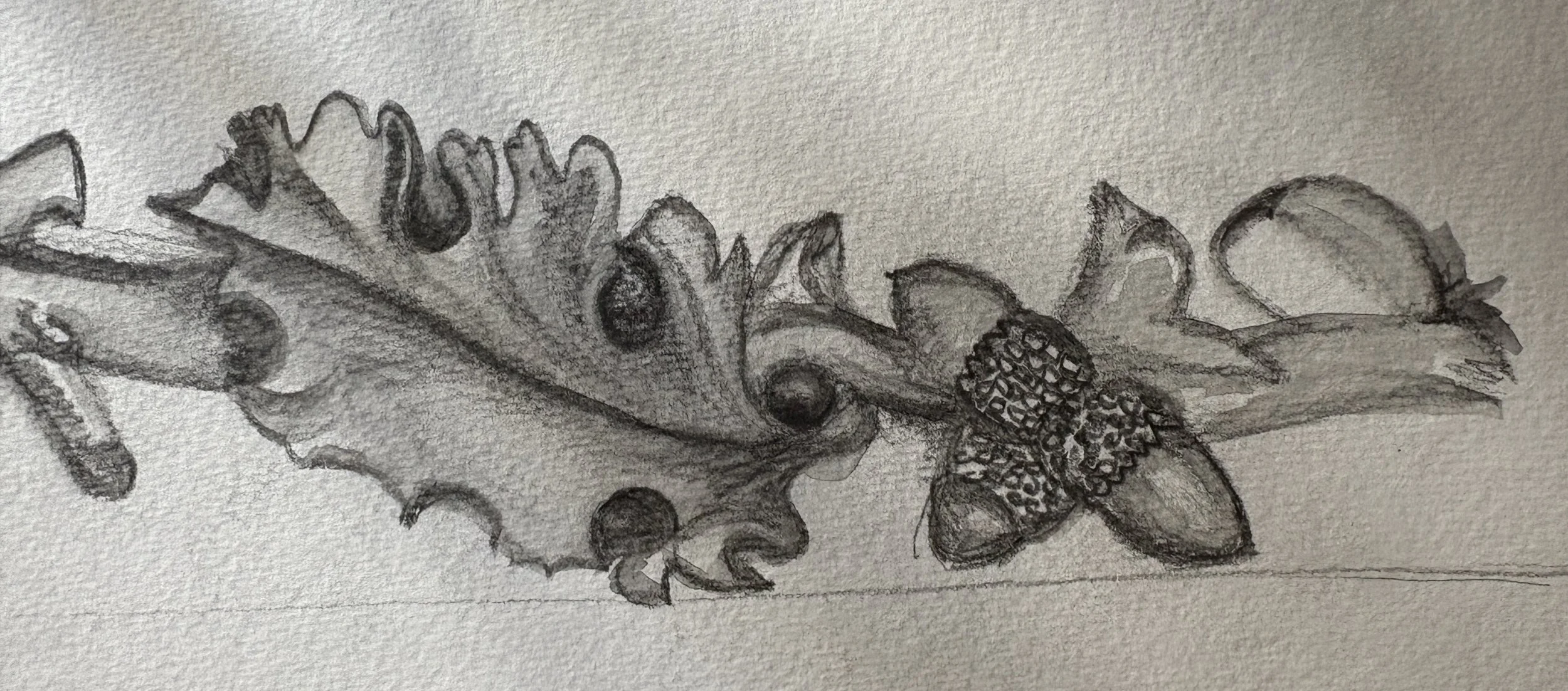
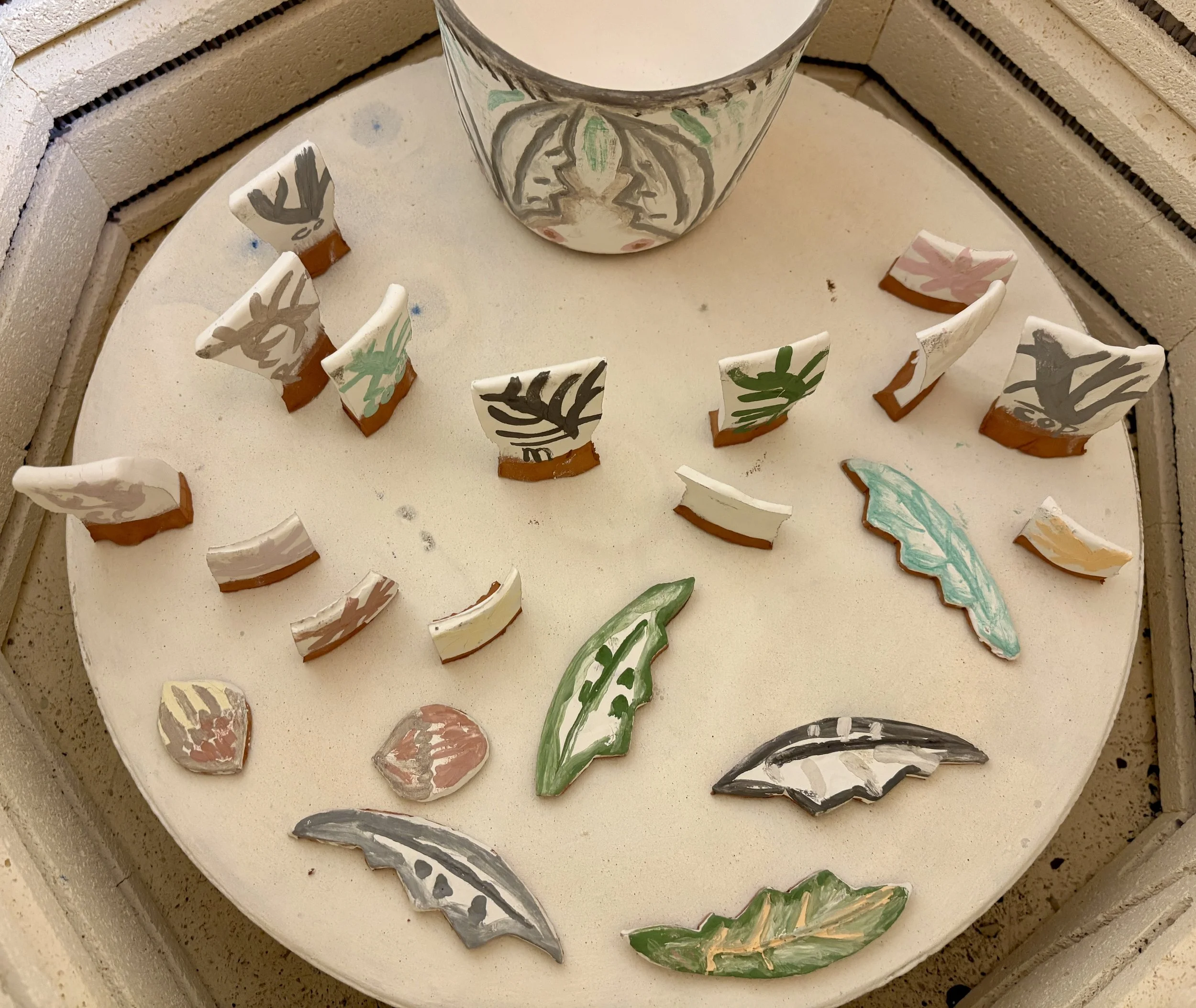
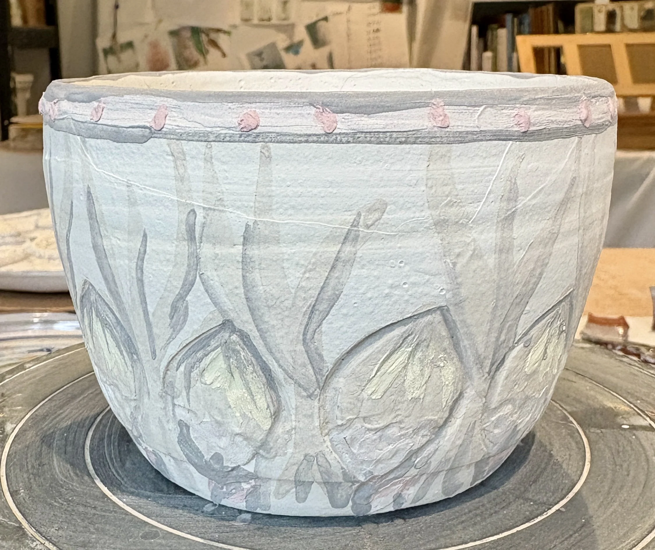
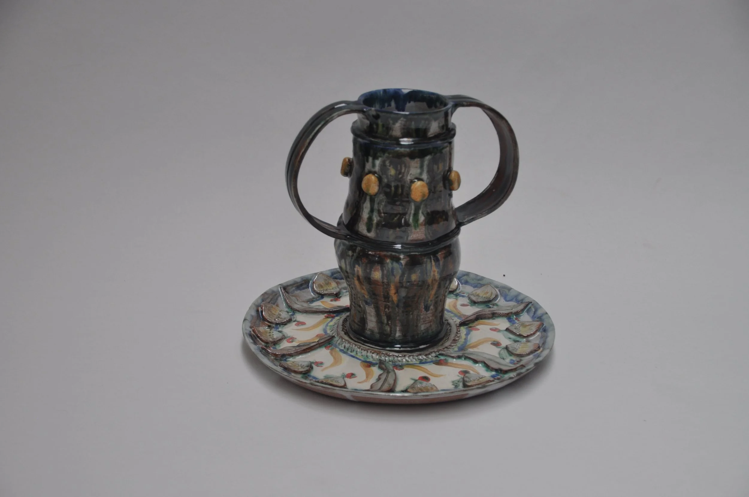
Here show my use of the oak leaf and acorn motif - successful use of rutile and red stain blending.
Sponging is used to blend copper and rutile.
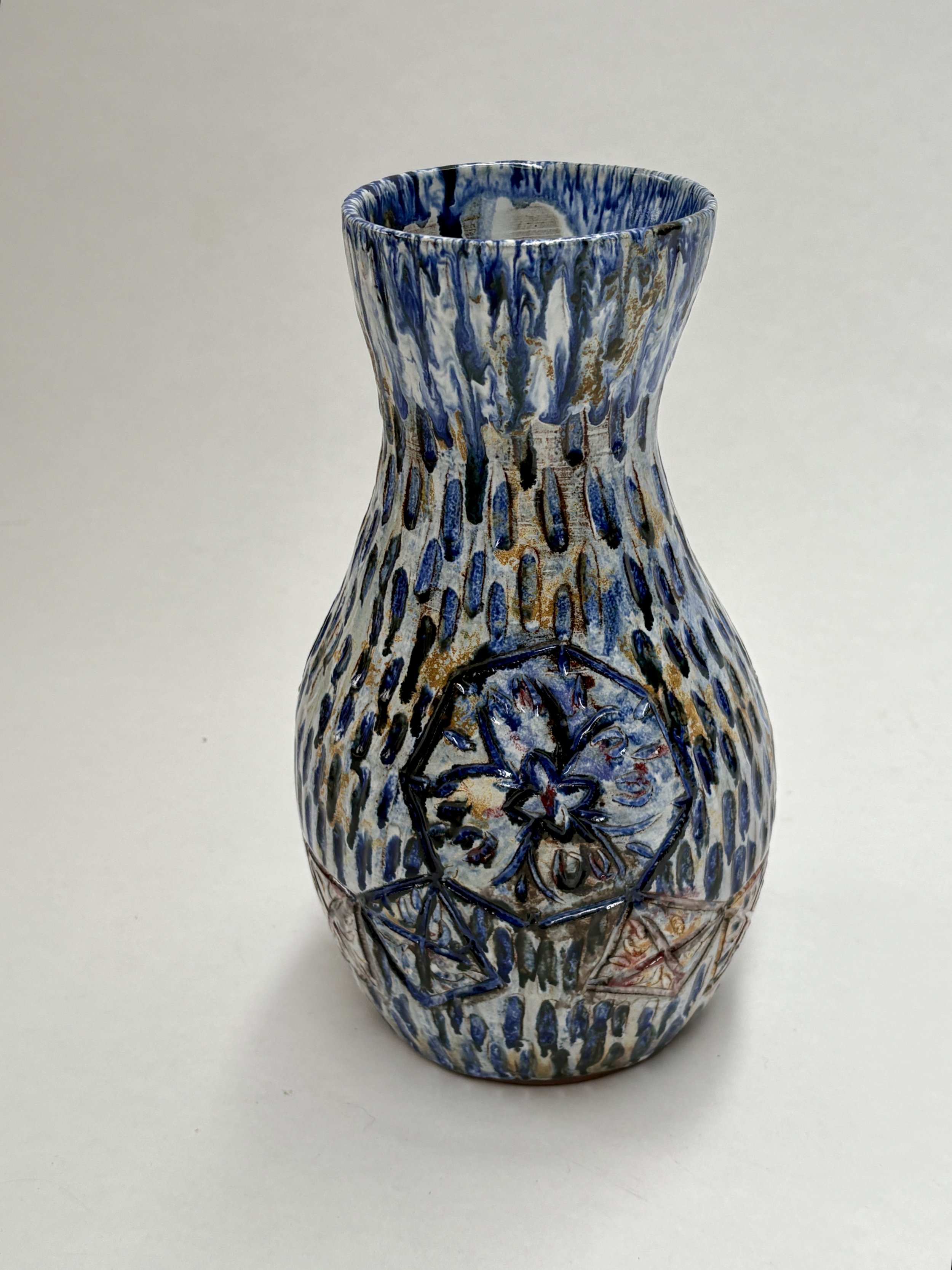
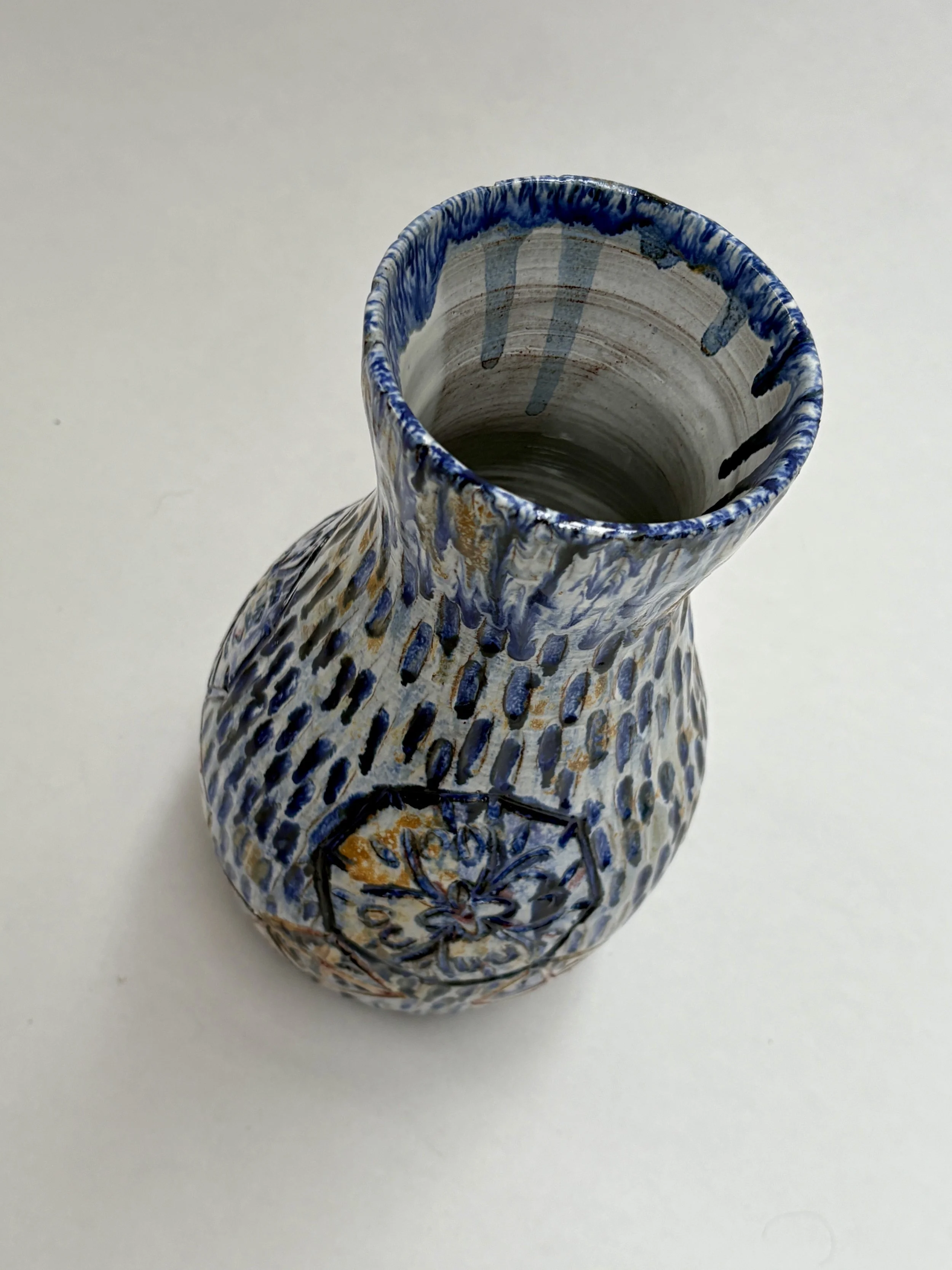
Painting the pigments on top of the tin white glaze. It’s a bit like painting blind as you only have a vague idea how the colours will change. That’s the beauty and frustration of ceramics and why testing is so important.
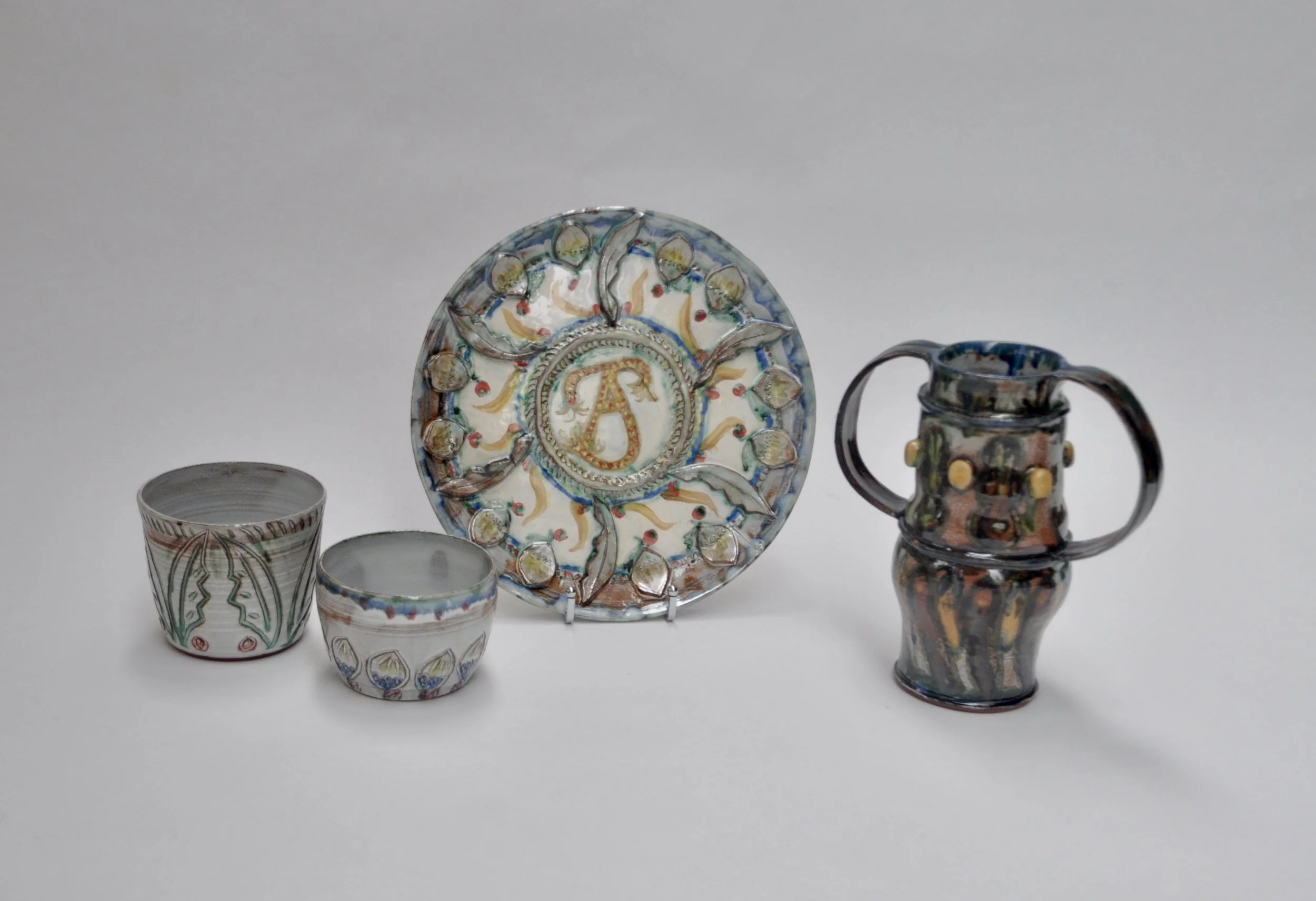
Very pleased with by first 2 batches of Maiollica inspired ceramics.
Here I was bolder with the oxide application which caused a bit of sliding of the glazes but I like the effects this bleeding brings - I don’t think my style suits precision. It’s far more intuitive.
It’s darker than expected, more brown (Manganese). But the surface effects are very pleasing!
The plate combines the acorn motif with my potters mark
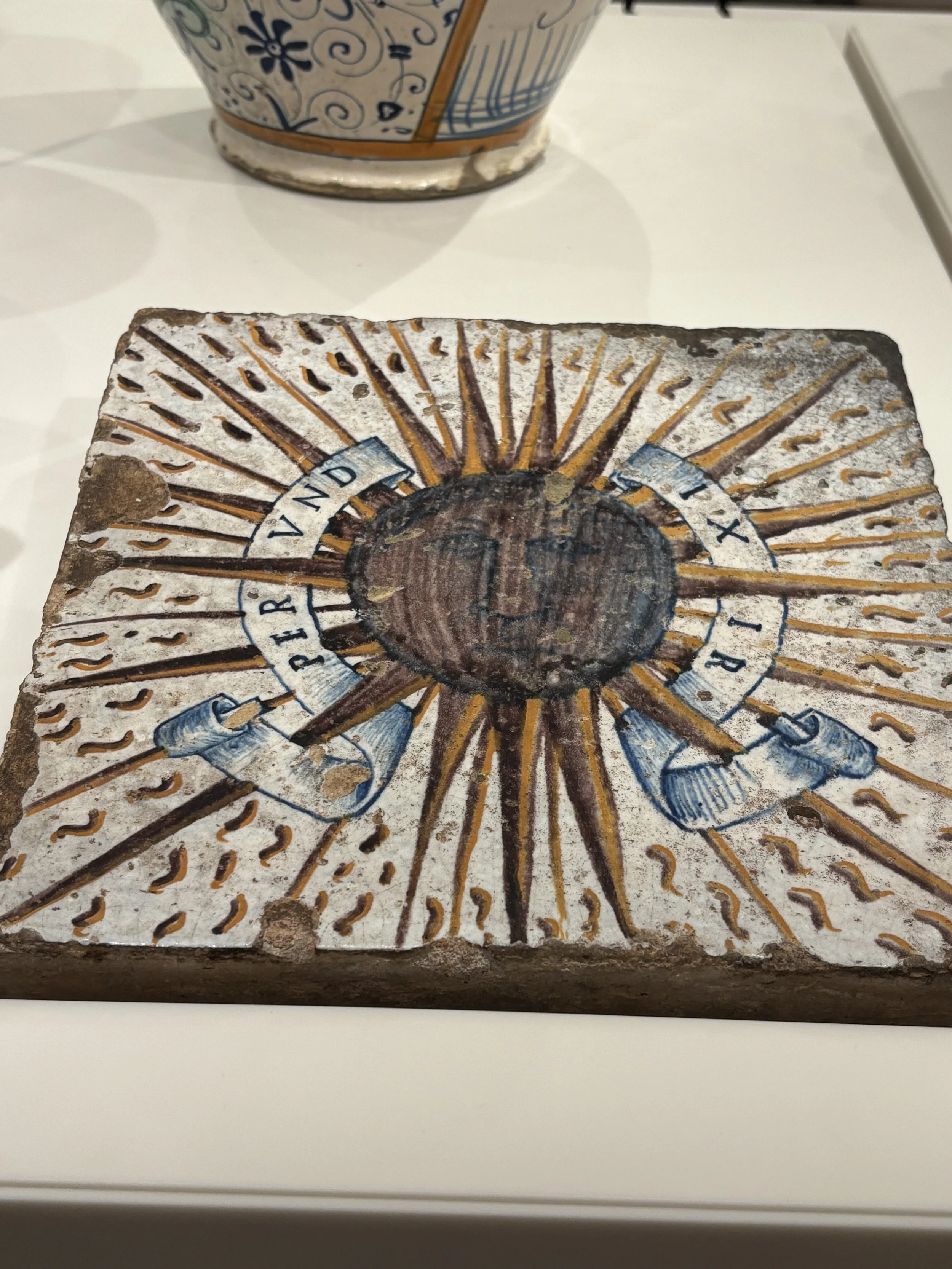
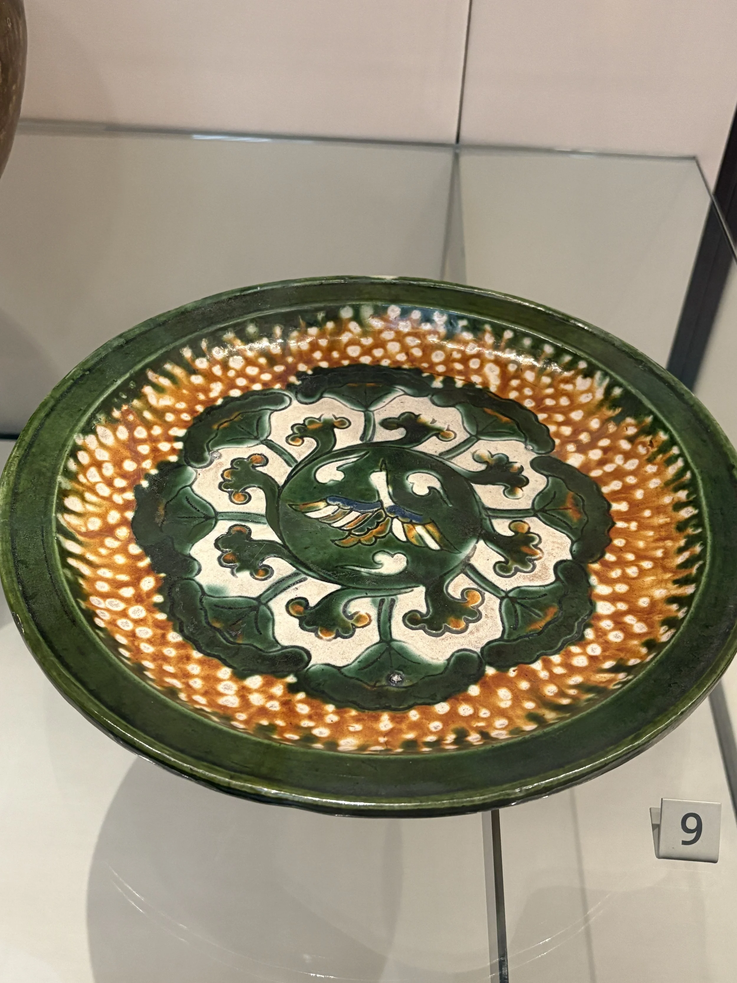
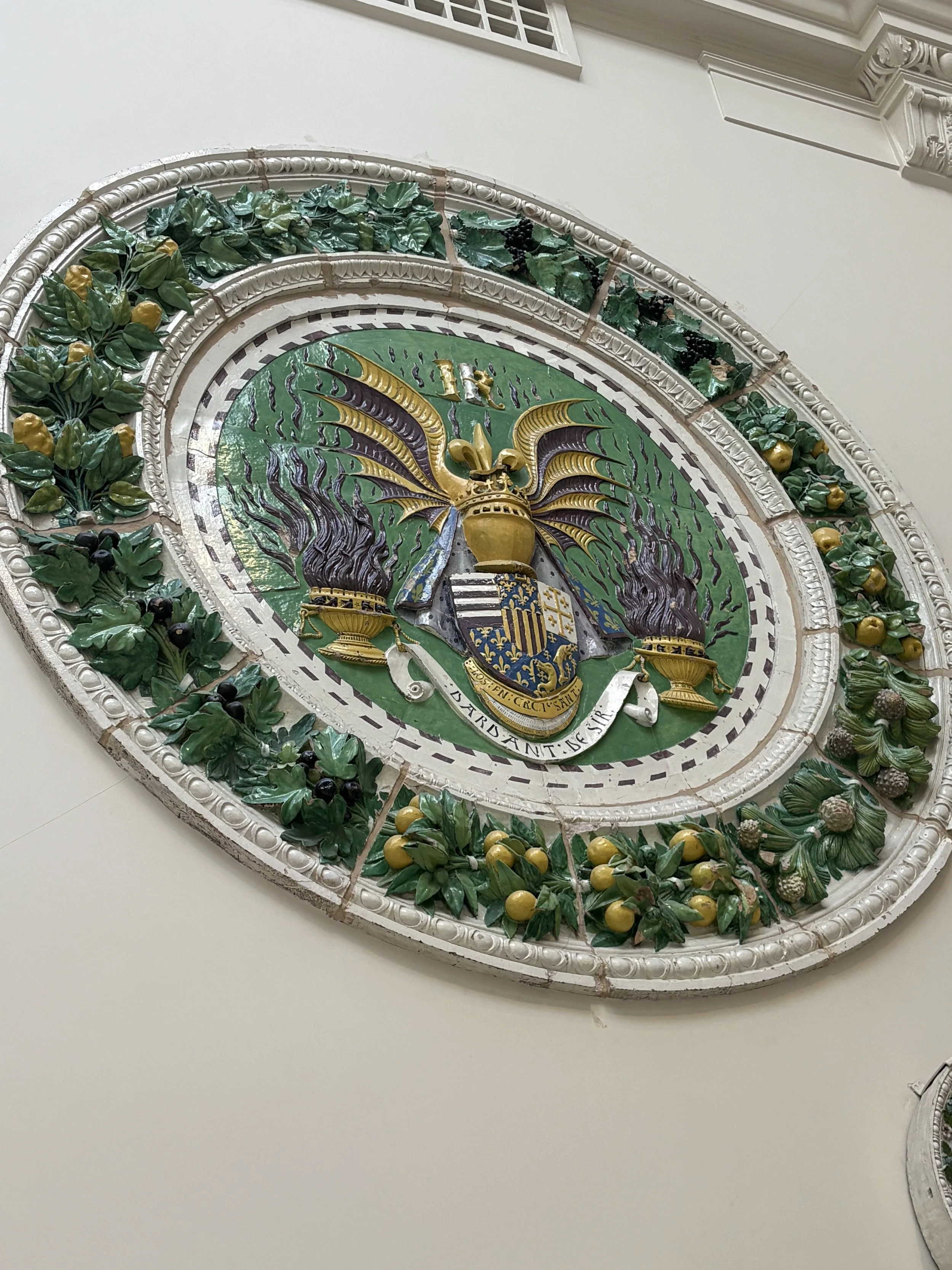
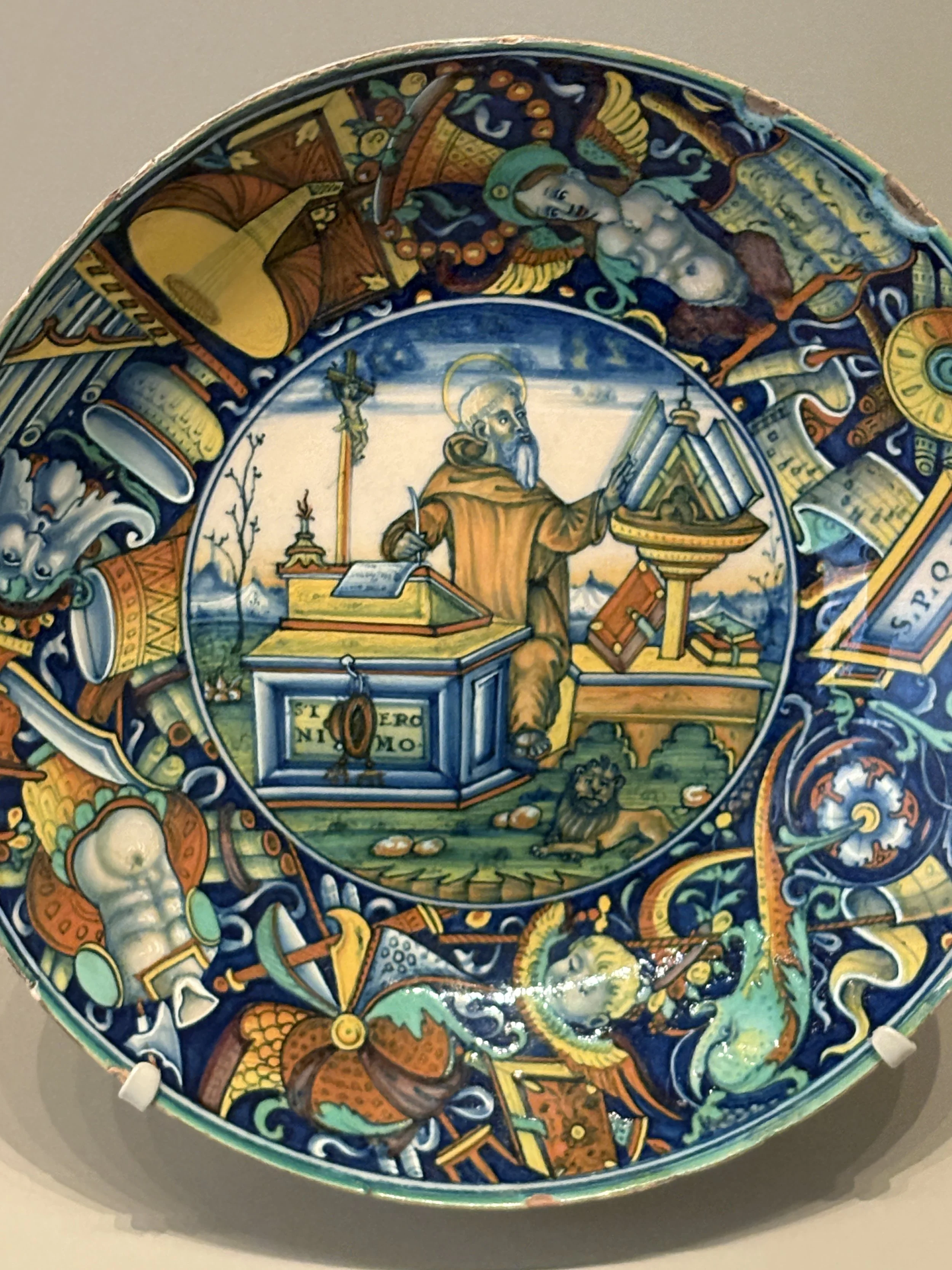
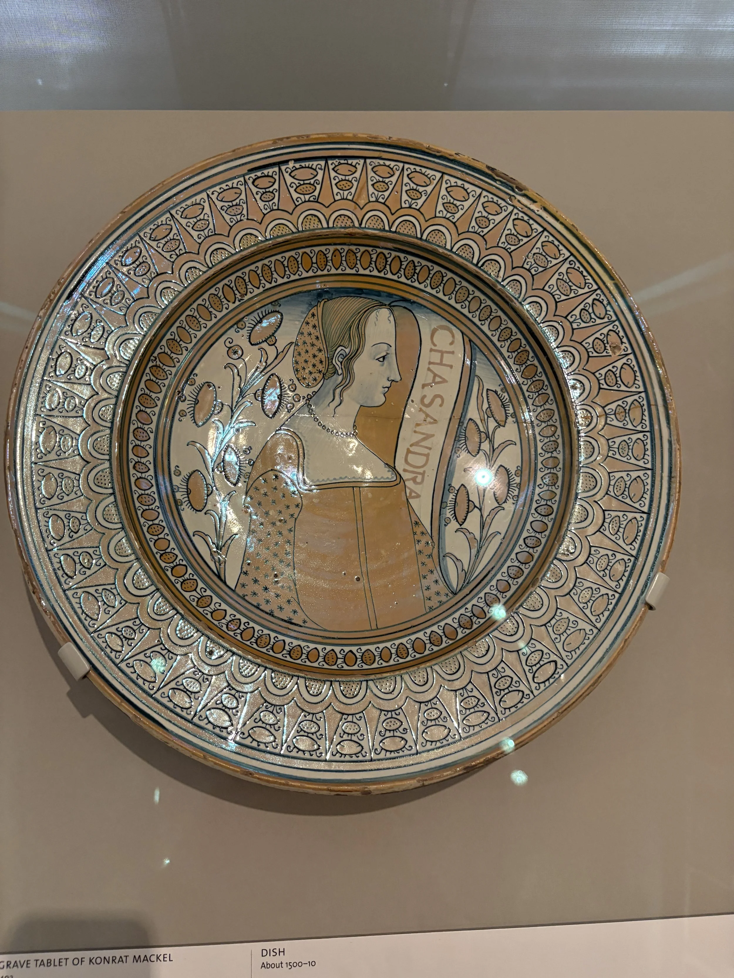
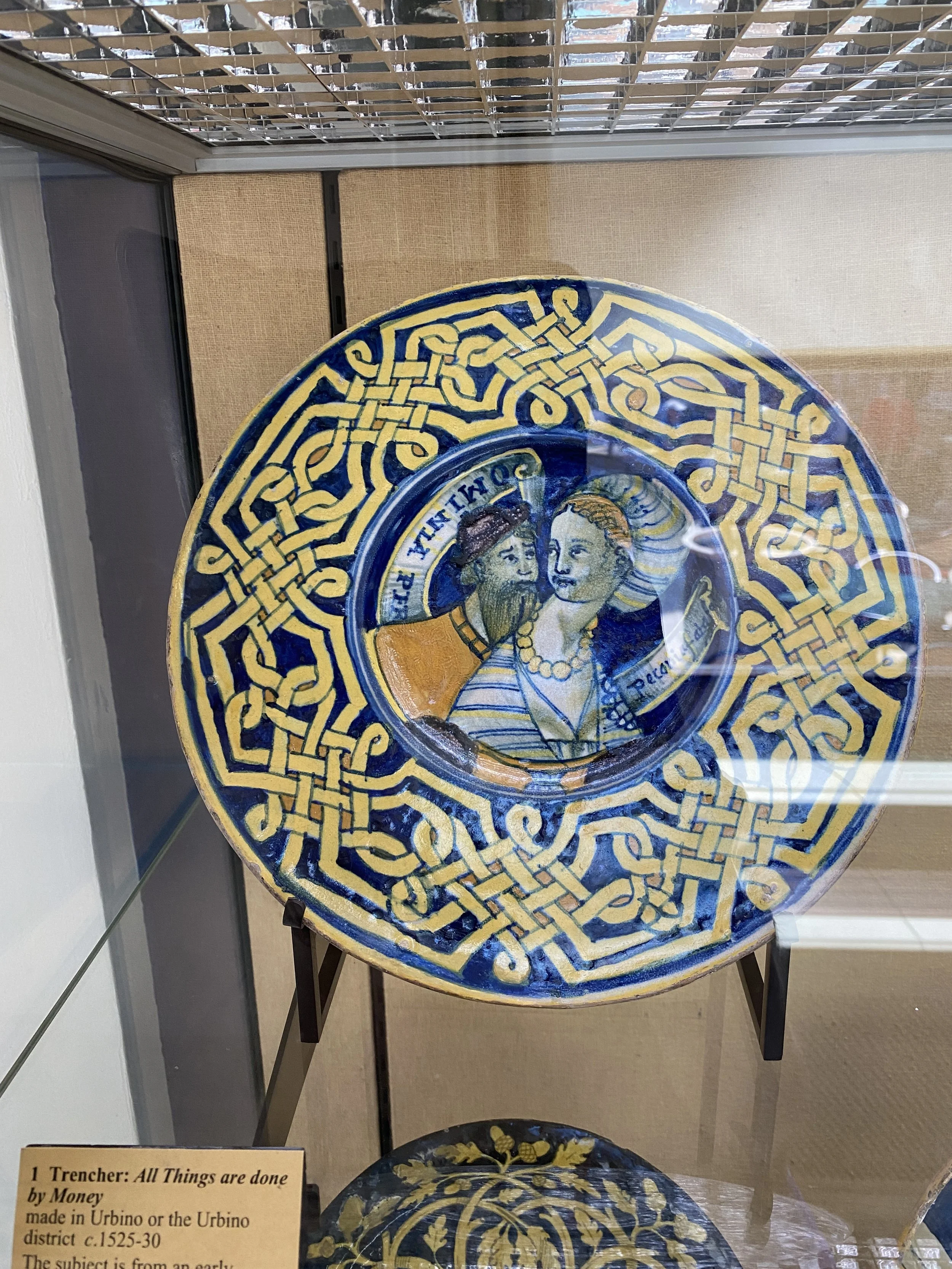
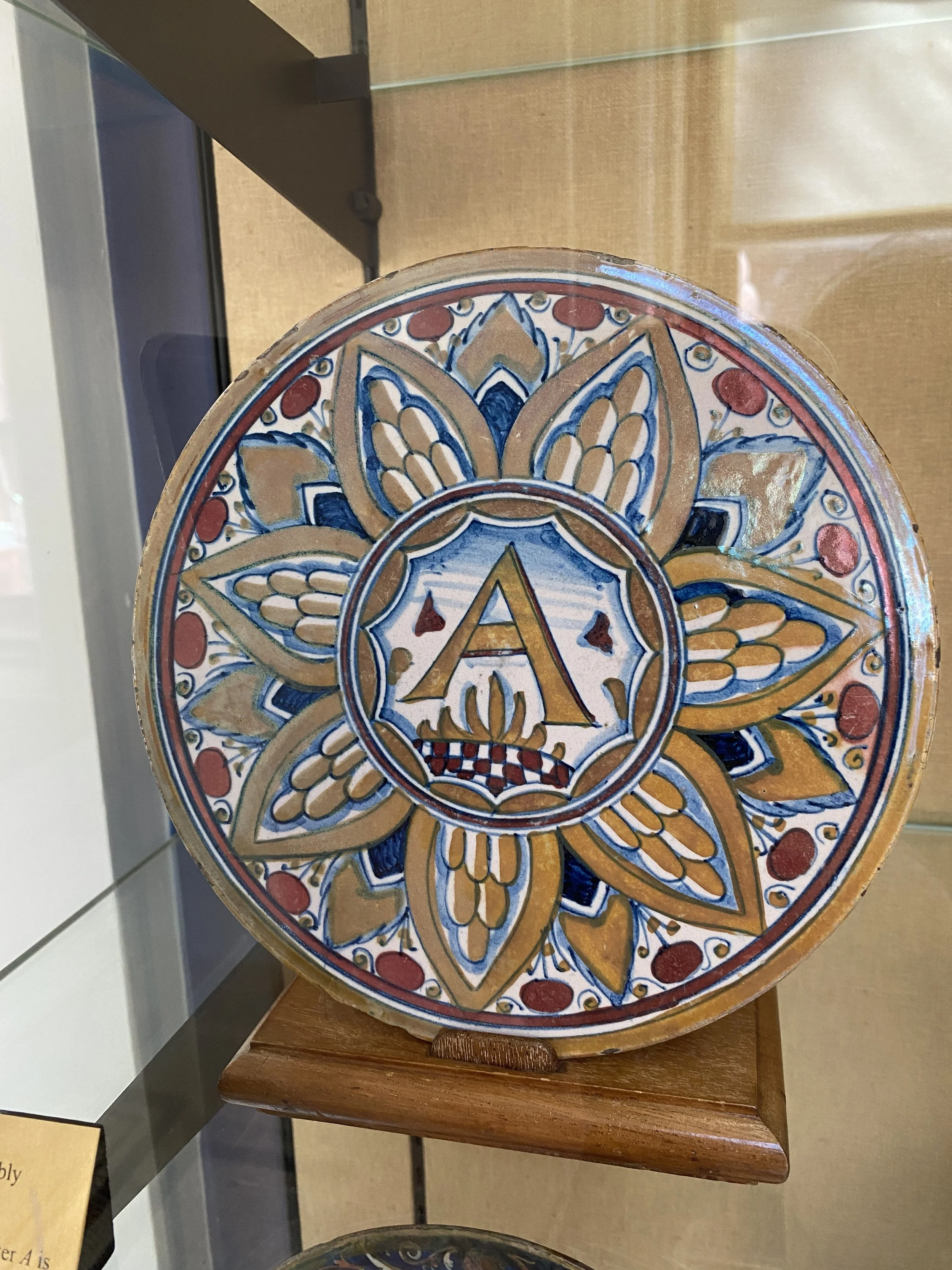
Some of my research references
Wallace collection
Contemporary Ceramicists
Thank you to Katrin Moye @katrinmoye and Michaela Gall @gallmichaela for sharing your practice so generously with me. I have learnt a lot and will continue to experiment with this beautiful historical technique to make it my own.
These films have been enormously helpful
https://www.youtube.com/shorts/8pBJq7QBwiU
https://www.youtube.com/watch?v=XqU5m5j69wM
https://www.youtube.com/shorts/xBV7fGLWSAA
Judy Chicago dinner party
https://www.brooklynmuseum.org/en-GB/exhibitions/dinner_party
Delusions of Grandeur @ Wallace Collection
Vicky Lindo – pattern and storytelling – one artist looking at her familial relationship with the Windrush generation and the effect on her family and community
https://www.artscouncil.org.uk/creative-matters/news/closer-look-dead-dad-book-vicky-lindo
Matt Smith
Works with ceramics to interpret museum collections – gender/colonialism
https://mattjsmith.com/about-2/ Vanessa Bell and Duncan Grant – famous women plates – Charleston farmhouse. Community and ceramics
https://www.charleston.org.uk/event/famous-women-dinner-service/